
Recomendados
Mais conteúdo relacionado
Mais procurados
Mais procurados (20)
Semelhante a Digi pack analysis
Semelhante a Digi pack analysis (20)
Último
Último (20)
Digi pack analysis
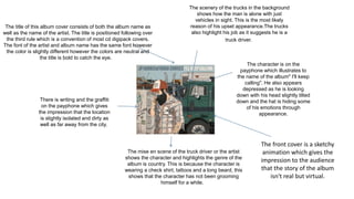
- 1. The title of this album cover consists of both the album name as well as the name of the artist. The title is positioned following over the third rule which is a convention of most cd digipack covers. The font of the artist and album name has the same font however the color is slightly different however the colors are neutral and the title is bold to catch the eye. The mise en scene of the truck driver or the artist shows the character and highlights the genre of the album is country. This is because the character is wearing a check shirt, tattoos and a long beard, this shows that the character has not been grooming himself for a while. There is writing and the graffiti on the payphone which gives the impression that the location is slightly isolated and dirty as well as far away from the city. The character is on the payphone which illustrates to the name of the album" I'll keep calling". He also appears depressed as he is looking down with his head slightly tilted down and the hat is hiding some of his emotions through appearance. The scenery of the trucks in the background shows how the man is alone with just vehicles in sight. This is the most likely reason of his upset appearance.The trucks also highlight his job as it suggests he is a truck driver. The front cover is a sketchy animation which gives the impression to the audience that the story of the album isn't real but virtual.
- 2. Another convention of this digipack is the barcode as it is always positioned on the bottom. The image of the phone links to the front cover as the way it is just hanging down and not out back properly shows carelessness most likely due to no answer on the phone call.This means he has finally gave up from trying to call the person clearly important to him. The back cover of this cd digipack shows the names of the songs in the album which is a convention of most cd digipaks. This is the address to the production company and shows the contact details as well as the postcode. The background color is a faded brown which makes it look quite old and dirty.
- 3. The artist's name is in bold as well as the musicians names. This helps the consumers to be aware of the people involved in the album The same trucks that are visible on the front cover are on the back as well.This links both covers together as the images link together. The size of the text is relatively small which highlights that the information isn't important. Click to add text The background is like a old rusty colour. This gives the impression to the consumer that it is an old track or from a dirty place like in from the countryside.
- 4. There is no disc tray inside on the back page. This unusual as a common convention is that there is a disc tray inside on the back. Therefore the disc must be inside the slip pocket which can be pulled out. The image here has the same colours as the other two sides. This links them all together as it still has the old corroding effect as there is different shade of the same colour Click to add text Here is information about contact details and the production company's location for consumers. This is to help the consumer find out more information.
- 5. The artists name title is positioned as you would expect. This is because it follows the over the third rule, this is where consumers pay most attention to. Which is why the positioning is so important. The style of the font is like an autograph to a fan. The title is also underlined and bold making it stand out from the image which is essential. The image shows a mid shot of the artist looking down. The image is in black white which suggests the album could be emotional and cold. The fact only the artist is appearing in the image suggests she is a solo singer which gives the impression that the genre is soul. The album name is positioned at the bottom. It is bold and the font is more thicker than the artists name which helps to attract the consumers attention. The background is a building which she is turned away from suggesting she wants to escape from it.
- 6. The bar code is positioned in an unusual place as normally it is on the bottom left or right. Here is the track list, it is positioned on the top left which is a common convention with the back cover. The font size is large and it is in bold which means it is important for the consumers. The bottom left shows information for the consumers who want extra information this is why the font is small as it is not as important. Such as the copyright law, the manufacturer, and the record label.
- 7. This is the name of the artist and of the album. They are both have the same font style however the artists name is in bold and the albums name is not. The positioning on the left side is not that visible for the consumer. The image of the artist is a close up to the head, however the artist is facing on the side. The lighting shows he is facing the light and looking down. The background color is like an old record and the pattern around the edges supports this. This is because it is an old retro style.
- 8. There is a image of a longshot of the artist walking down from a couple of steps. Behind him looks like a door to a church. He is facing to the right again as he did this on the front cover too. This creates a link between both covers. The setting suggests the genre to this album is soul. The pattern around the edges is the same as the one on the front cover. This creates another link to both pages. The effect used for this image gives the same color as the background on the front cover. Which suggests a link to the front page.
- 9. This is the name of the artist and of the album. The same as the front cover used again for the disc tray page. The background has an image of a longshot with a low angle facing the artist in a church standing next to the entrance. The lighting is the same colour as the other pages which links all of the pages together.
- 10. Here is the artist and album name. The font size of the artist is larger than the name of the album which is common compared to the other CD. The colour of the font is gold which is highlighted and bold which makes it more appealing to the consumer. Underneath this there are two symbols of the production company's involved which this album. Here is a close up of the artist looking down. The lighting is only covering half of his face which creates the unknown effect to the consumer. By the looks of this front cover it suggests the genre of this album is soul.
- 11. The disc tray has no information or image which is fairly common with most cd Digi packs.
- 12. This the tracklist of the album which is in the same font as the albums name which links both of these pages together. Below is some information for the consumer for extra information which is why the font is so small. There is also a link to the artist's website and the copyright act with this album. There is also the sam symbols from the front cover of the production companies. There is a barcode on the top right this is essential for the back cover.