
Recomendados
Mais conteúdo relacionado
Mais procurados
Mais procurados (20)
Semelhante a Mario Testino
Semelhante a Mario Testino (20)
Último
Último (20)
Mario Testino
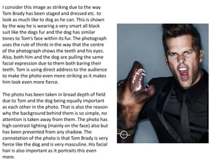
- 1. I consider this image as striking due to the way Tom Brady has been staged and dressed etc. to look as much like to dog as he can. This is shown by the way he is wearing a very smart all black suit like the dogs fur and the dog has similar tones to Tom’s face within its fur. The photograph uses the rule of thirds in the way that the centre of the photograph shows the teeth and his eyes. Also, both him and the dog are pulling the same facial expression due to them both baring their teeth. Tom is using direct address to the audience to make the photo even more striking as it makes him look even more fierce. The photo has been taken in broad depth of field due to Tom and the dog being equally important as each other in the photo. That is also the reason why the background behind them is so simple, no attention is taken away from them. The photo has high contrast lighting (mainly on the face) also but has been prevented from any shadow. The connotation of the photo is that Tom Brady is very fierce like the dog and is very masculine. His facial hair is also important as it portraits this even more.
- 2. This is a photograph that Mario took of two models in New York for a fashion shoot. I consider this photograph as striking due to the uneasy direct address that the two models are making with the audience. The way the photo has an aggressive sense of movement in the photo is also striking. This is shown through their hair and also clothing. This photograph has a broad depth of field due to the background also being important as it helps shows the higher class off the models as well as the clothes they are wearing. By this I mean that the background is just a normal street in New York shown by the clothing stand behind the models. This has been done by Mario to make the models standout. The weather in the photograph also reflects the models moods which is another reason the photograph has cleverly been done in a broad depth of field. The lighting in this photo is mostly focused on their faces to make the models stand out even more. Also, the photo has high contrast lighting but has been slightly softened by the use of black and white. Both models are wearing very similar clothing, make up and even have a similar facial structure. The photo has a kind of sinister feel to it which has been created by the look on their faces, contrast of the models to their background and also as I said, the weather and how it reflects the models mood.
- 3. What I find most striking about this photo is the way the rule of thirds is used to make the ring on Kate’s finger stand out. Not only does the rule of thirds help this but so does the way that Mario clearly has told Kate to position her hand. Although there is natural lighting in the photo their has also been artificial lighting placed to avoid shadowing the ring. The direct address used in the photograph reflects the rest of the photo as its warm and inviting to the audience. This photo has a narrow depth of field due to the fact that it was important that all attention was placed upon them as it was their official engagement photograph. Even though the photograph is supposed to look very natural you can tell by the way added lighting is used and how strong the hug Is that the position of the two are very staged. The fact Kate’s hand is on his chest shows love but it is also clearly done to show off Diana’s ring. This photo is warm due to the neutral colours used but also the low contrast of lighting to make the photo look as natural as possible. It is also apparent that the male is the dominant in the photo as he is holding her tightly to show he is protective of her. The two also have been made to look more like normal people in the photograph too as it has deliberately not been shot in a palace but more of a natural setting.
- 4. This photograph was taken as a celebrity shoot for Jennifer Aniston for an interview in Vogue. This photo is striking due to the way that Mario Testino has captured Jennifer’s direct address to the camera and how blue her eyes look. This photo makes her look naturally beautiful due to her skin tone contrasting well against the colour of the sand. This has been done to give the photo a warm kind of feel and using low contrast lighting. She also looks naturally beautiful due to the way Mario has caught her curves and her hair blowing slightly in the wind to give the photo a slight feel of movement. The way this photo has been taken has made Jennifer look flawless due to the tones in her skin and setting used to make the photo look even more natural even though it has been highly staged. This photo has been taken in a narrow depth of field so that it is in enough focus to show the setting but not take the importance of her away from the photograph.
- 5. What I find most striking about this photo is the randomness behind it. For this photograph Kate didn’t have a mirror, just a paint pallet of make up which she blindly applied to her face. The photo uses the rule of thirds in the way that as well as the make up, it makes her eyes stand out even more. The use of a simple background is effective due to the amount of impact it adds to the photo, without making the audience take their eyes off her. This is due to it contrasting well with the colours on her face and giving it a slight retro look. This photo uses high contrast lighting to enhance the bright colours on her face and her facial structure. Again, this is the same reason the photo has been taken with a broad depth of field. The fact her hair is tied up also helps her facial structure stand out as no attention is anywhere other than her face – This is also why a close up shot has been used. The direct address to the audience is also important as it adds impact and makes the photo and the colours even more bold and intense.