

Recomendados
Recomendados
Mais conteúdo relacionado
Mais procurados
Mais procurados (20)
Semelhante a Day trading using candle sticks
Semelhante a Day trading using candle sticks (20)
Mais de sivakumar pichai
Último
Último (20)
Day trading using candle sticks
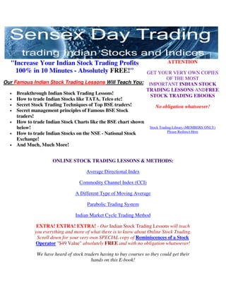
- 1. "Increase Your Indian Stock Trading Profits ATTENTION 100% in 10 Minutes - Absolutely FREE!" GET YOUR VERY OWN COPIES OF THE MOST Our Famous Indian Stock Trading Lessons Will Teach You: IMPORTANT INDIAN STOCK TRADING LESSONS ANDFREE • Breakthrough Indian Stock Trading Lessons! STOCK TRADING EBOOKS • How to trade Indian Stocks like TATA, Telco etc! • Secret Stock Trading Techniques of Top BSE traders! No obligation whatsoever! • Secret management principles of Famous BSE Stock traders! • How to trade Indian Stock Charts like the BSE chart shown below! Stock Trading Library (MEMBERS ONLY) Please Redirect Here • How to trade Indian Stocks on the NSE - National Stock Exchange! • And Much, Much More! ONLINE STOCK TRADING LESSONS & METHODS: Average Directional Index Commodity Channel Index (CCI) A Different Type of Moving Average Parabolic Trading System Indian Market Cycle Trading Method EXTRA! EXTRA! EXTRA! - Our Indian Stock Trading Lessons will teach you everything and more of what there is to know about Online Stock Trading. Scroll down for your very own SPECIAL copy of Reminiscences of a Stock Operator "$49 Value" absolutely FREE and with no obligation whatsoever! We have heard of stock traders having to buy courses so they could get their hands on this E-book!
- 2. ONLINE STOCK TRADING TOOLS & EBOOKS: Memoirs of Extra Ordinary Popular Delusions Reminiscences of a Stock Operator Pivot Point Calculator Art of War Penny Stock Trading ------------------------------------------------------------------------------------------------ ----- Stock Trading Library (MEMBERS ONLY) Please Redirect Here First of all I Thanks for your I can't say how At first I thought have to thank trading lesson many lives are you were trying to you for the by E mail mini going to sell something and "superb" course course. It helped transform after it will soon turn up
- 3. that you have me a lot while reading your after few mails, but been mailing to going for day courseware but you proved me me. It is trading. my life has been wrong. Your awesome. Every transformed. courses are very move you have Particularly You are like an professional and mentioned in your lesson on angel, a holy the best part is its your lessons is pivotal points grail for me in free. working 100% and 5 point my life. accurate. I think system has I'm indebted to you that even if I given a new Saying merely for your valuable spend money dimension to thank you service. Please for technical the way I plan shouldn't serve continue your great analysis course, for day trading. the purpose so I work in nobody would say for all my enlightening teach me like Thanking You, success in amateur investors this in India. Rajesh equity markets in the field of Actually, I was Barnwal credit goes to investing. searching for you. this kind of Zeeshan Ghause course, but With Due could not find Regards, one in the Peeyush K. market." Sandhir Kamal Kumar Your privacy is SAFE with us, as we hate spam as much as everyone else. Your email address will never be sold or rented - Read our Privacy Policy... Links Page
- 4. Trading the BSE with the ADX Stock Trading Library (MEMBERS ONLY) Please Redirect Here ADX is an oscillator that fluctuates between 0 and 100. Even though the scale is from 0 to 100, readings above 60 are relatively rare. Low readings, below 20, indicate a weak trend and high readings, above 40, indicate a strong trend. The indicator does not grade the trend as bullish or bearish, but merely assesses the strength of the current trend. A reading above 40 can indicate a strong downtrend as well as a strong uptrend. First Some History J. Welles Wilder developed the Average Directional Index (ADX) in order to evaluate the strength of the current trend, be it up or down. It's important to determine whether the market is trending or trading (moving sideways), because certain indicators give more useful results depending on the market doing one or the other. In other words the ADX attempts to measure the strength of the direction the security is moving in. The reason we mention this is that many of our students get confused when first introduced to ADX and see the indicator rising as the trend goes down. A rising ADX means a strong trend, whether it be bullish or bearish. In its most basic form, buy and sell signals can be generated by +DI/-DI crosses. A buy signal occurs when +DI moves above -DI and a sell signal when -DI moves above the +DI. Be careful, though; when a security is in a trading range, this system may produce many whipsaws. As with most technical indicators, +DI/-DI crosses should be used in conjunction with other aspects of technical analysis. Below is an hourly hart of the BSE Sensex showing +D crossed over above -D and the Black Index line of the ADX indicator also crossing above a reading of 30 (Thin blue line) indicating a strong trend.
- 5. Advanced Method As mentioned previously you should use the ADX in conjunction with other aspects of technical analysis. We like to use the ADX (14 setting) together with Bollinger Bands (20 setting). Below is the same hourly chart of the BSE Sensex, now with the Bollinger Bands drawn in and indications of where we like to normally enter and exit the market using this trading strategy:
- 6. Trading Rules: • Plot the Average Directional Index with a setting of 14 • Plot Bollinger Bands with a setting of 20 • Confirm a reading above 30 on the ADX - Green Index Line, also a cross up of +D over -D. • Enter on the first candle closing OUTSIDE the top Bollinger Band line after the ADX has signaled (Green arrow) • Exit on the first candle that closes below the top Bollinger Band line again (Red arrow) • Keep your stop tight below the last candle that closed on/below the middle Bollinger Band line.
- 7. Trading BSE Stocks with Moving Averages Moving averages are one of the most popular and easy to use tools available to the BSE Stockstechnical analyst. They smooth a data series and make it easier to spot trends, something that is especially helpful in volatile markets. They also form the building blocks for many other technical indicators and overlays. The two most popular types of moving averages are the Simple Moving Average (SMA) and the Exponential Moving Average (EMA). Simple Moving Average (SMA) A simple moving average is formed by computing the average (mean) price of a security over a specified number of periods. While it is possible to create moving averages from the Open, the High, and the Low data points, most moving averages are created using the closing price. Exponential Moving Average (EMA) In order to reduce the lag in simple moving averages, technicians often use exponential moving averages (also called exponentially weighted moving averages). EMA's reduce the lag by applying more weight to recent prices relative to older prices. The weighting applied to the most recent price depends on the specified period of the moving average. The shorter the EMA's period, the more weight that will be applied to the most recent price. Simple Versus Exponential From afar, it would appear that the difference between an exponential moving average and a simple moving average is minimal. For this example, which uses only 20 trading days, the difference is minimal, but a difference nonetheless. The
- 8. exponential moving average is consistently closer to the actual price. By giving more weight to recent prices, the EMA reacts quicker than the SMA and remains closer to the actual price. Which is better? The simple moving average obviously has a lag, but the exponential moving average may be prone to quicker breaks. Some traders prefer to use exponential moving averages for shorter time periods to capture changes quicker. Some investors prefer simple moving averages over long time periods to identify long- term trend changes. SMA's will be more sensitive and generate more signals. The EMA, which is generally more sensitive than the SMA, will also be likely to generate more signals. However, there will also be an increase in the number of false signals and whipsaws. Longer moving averages will move slower and generate fewer signals. There are many ways to trade using moving averages and we would like to show one way we like to trade with a moving average set at 200. Below is an hourly chart of the BSE Sensex with the Commodity Channel Index (CCI) set at 14, Bollinger Bands set at 20 and a 200 Simple Moving Average (SMA). Always use longer time periods as this shows true trend and will keep you out of market whipsaws and consolidation periods.
- 9. Trading Rules (Going Long): 1. Plot the Commodity Channel Index (CCI) indicator at 14 2. Plot a 200 Simple Moving Average (SMA) 3. Plot the Bollinger Band indicator set at 20. 4. Wait for close of price outside the top Bollinger Band line and above the 200 SMA and enter as show above (Enter) 5. Exit whenever price closes BELOW the top Bollinger Band. You could also enter another contract and exit when price retraces back to the middle Bollinger Band line. 6. Place your stop on the lower Bollinger Band line. Conclusion Because moving averages follow the trend, they work best when a security is trending and are ineffective when a security moves in a trading range. With this in mind, investors and traders should first identify securities that display some trending characteristics before attempting to analyze with moving averages. This process does not have to be a scientific examination. Usually, a simple visual assessment of the price chart can determine if a security exhibits characteristics of trend. In its simplest form, a security's price can be doing only one of three things: trending up, trending down or trading in a range. An uptrend is established when a security forms a series of higher highs and higher lows. A downtrend is established when a security forms a series of lower lows and lower highs. A trading range is established if a security cannot establish an uptrend or downtrend. If a security is in a trading range, an uptrend is started when the upper boundary of the range is broken and a downtrend begins when the lower boundary is broken.
- 10. Trading the BSE with the CCI The Commodity Channel Index (CCI) measures the variation of a security's price from its statistical mean. High values show that the price is unusually high compared to the average price, whereas low values indicate that the price is unusually low. 85% of the data points will fall between +100 and -100. The levels of +200/-200 may be considered extremes. However, the CCI is not bound by maximum or minimum values. Contrary to its name, the CCI can be used effectively on any type of security, not just commodities. Interpretation There are two basic methods of interpreting the CCI: one is divergence and the other is as an overbought/oversold indicator. • Bullish divergence occurs when price is making new lows while the CCI is rising. This classic divergence is usually followed by a correction in the price. Bullish divergence is the opposite of bearish divergence. • The CCI typically oscillates between 100. To use the CCI as an overbought/oversold indicator, readings above +100 imply an overbought condition (and a pending price correction) while readings below -100 imply an oversold condition (and a pending rally). Below is an hourly chart of the BSE Sensex with the Commodity Channel Index set at 14 showing Bullish divergence:
- 11. Bullish divergence occurred from point A-B (the price was declining as the CCI was advancing). The market subsequently rallied. Note that this divergence occurred at extreme levels (i.e. below - 100) making it even more significant. Advanced Trading Method: In the hourly chart example of the same BSE Sensex below we have added Bollinger Bands set at 20 to help us with our exact entry point, possible target and exit point.
- 12. Trading Rules (Going Long): • Identify bullish divergence as shown in the first chart example. • Enter on the break of price above the top Bollinger Band line (Green arrow). • Your target is the first close of price below the top Bollinger Band line ( Red arrow) • Place your stop below the last candle to close below the middle Bollinger Band line. Conclusion As with most trading indicators always use the CCI with other indicators like Bollinger Bands shown in the trading method above, to filter out price whipsaws and consolidation periods. Pivot points also work well with the CCI because both methods attempt to find turning points.
- 13. Trading BSE Stocks with the Stochastic Oscillator Developed by George C. Lane in the late 1950s, the Stochastic Oscillator is a momentum indicator that shows the location of the current close relative to the high/low range over a set number of periods. In this lesson we will show one very accurate stock trading method we like using the Stochastic Oscillator. First Some History Lane observed that as prices increase in an up trend, closing prices tend to be closer to the upper end of bars and in a down trend closing prices tend to be nearer the lower end of bars. Lane developed stochastics to discern the relationship between the closing price and the high and low of a bar. Typically used to identify overbought and oversold conditions the indicator consists of two lines: % K and %D. These two lines fluctuate in a vertical range between 0 and 100. Readings above 80 are considered overbought and readings below 20 are considered oversold. Calculation 14 is a popular number of periods for calculation:
- 14. A 14-day %K (14-period Stochastic Oscillator) would use the most recent close, the highest high over the last 14 days and the lowest low over the last 14 days. The number of periods will vary according to the sensitivity and the type of signals desired.
- 15. Slow versus Fast versus Full There are three types of Stochastic Oscillators: Fast, Slow, and Full. The Fast and Full Stochastic is discussed later. For the purposes of this trading method we will only be looking at the Slow Stochastic Oscillator. The driving force behind all three Stochastic Oscillators is %K (fast), which is found using the formula provided above. Below is a 1 hour chart of the BSE Sensex showing the stochastic settings for this trading method: Be sure to set the slow stochastic oscillator to K period:15, D period 5 and MA period 5. Advanced
- 16. Look for bullish divergence between price and the stochastic oscillator as shown in the image below: A 1 hour chart of the BSE Sensex showing divergence and the stochastic oscillator at 14: Trading Rules (Going Long): • Identify stochastic divergence, in the image above this is represented by two lines, make sure price is on the move down (green line) and the stochastic oscillator moving up (yellow line) fromOVERSOLD conditions (blue arrow). • Enter the market when price breaks the area of resistance. • Place your stop below the lowest candle after divergence occured. • Place a trailing stop of 30 pips or depending on your style of trading you could also draw in Bollinger Band lines and wait for price to retrace to the middle Bollinger Band line as an exit signal. Conclusion Readings below 20 are considered oversold and readings above 80 are
- 17. considered overbought. However, a reading above 80 is not necessarily bearish or a reading below 20 bullish. A security can continue to rise after the Stochastic Oscillator has reached 80 and continue to fall after the Stochastic Oscillator has reached 20. Some of the best signals occur when the oscillator moved from overbought territory back below 80 and from oversold territory back above 20 but as usual it is best to use the oscillator together with some other indicator as shown above to filter out whipsaws and false signals. Thank you for joining us in this stock trading method. The Indiadaytrading Team
- 18. A Different Type of Moving Average Cross Virtually every stock trader has dabbled with or experimented with some sort of moving average. What I want to introduce you to in this lesson is a different sort of moving average cross method, which I have found to be very good at identifying short term trend changes. As we know a moving average is normally plotted using the close of a bar e.g. if you were plotting a 3 period moving average, then you would add the last three closes and divide the total by three to get a simple moving average. This is where I want you to think a little differently. I have always been an advocate of taking traditional thinking and changing it around. What if you used the open instead of the close? What if you used the close of one period of a moving average and the open of another? First, most charting packages will allow you to use the open, high, low or close to plot a moving average.
- 19. In the example below of the daily Dow Jones, I have used a 5 period exponential moving average of the close and a 6 period exponential moving average of the open. As you can see it catches the short term trend changes really nicely.
- 20. In the next example of the 1 hour EUR/USD, you can see that the close/open combination worked really well. Of course you will go through periods of consolidation with any market and any moving average method you use will be whipsawed. To get around this you need some sort of filter or approach that helps you keep out of the low probability trades. You could use ADX, Stochastic or MACD to help filter the noise but I also like to add a time frame. In the next example of the 4 hour GBP/USD you can see that on the 24th September 04 at 4:00 there was a cross of the 5 period exponential moving average of the close above the 6 period exponential moving average of the open. This signal has remained in place until today as I write on the 27th September.
- 21. Although there was a signal on the 4 hour, to help identify even better entry points you can drop down a few time frames to the 30 minute chart. As you can see from the 30 minute chart there have been quite a few crosses of the 5 period exponential moving of the close above or below the 6 period exponential moving average of the open. There are lots of ways to trade this but a neat little trick is to wait for the signal on a higher time frame and then drop down a few time frames and wait for a pullback. The first signal after the pullback on the lower time frame is normally a pretty good entry point e.g. If there were a cross up on the large time frame then drop down to a lower time frame and wait for the market to retrace and then give another buy signal (cross up). The opposite is true for short signals.
- 22. Once you get the signal on the shorter time frame depending on where support is you can usually place your first stop loss under the nearest support area (valley). If the market begins to make progress you can move your stop so that it trails the market by moving your stop to just under the most recent support area. In this lesson I have use an exponential moving average but experiment with different types of average such as weighted, smoothed or simple. You can also experiment with different lengths of moving average.
- 23. Trading BSE Stocks using Trendlines Technical analysis is built on the assumption that stock prices trend. Trend Lines are an important tool in technical analysis for both trend identification and confirmation. A trend line is a straight line that connects two or more price points and then extends into the future to act as a line of support or resistance. First Some History Using trend lines as a tool to technically analyze the markets has been around for a long time and was originally also used by floor traders. They saw that prices can only go in three directions; up, down, and sideways. A long line of past price ranges together gives you a pattern. There will be plenty of ups and downs along the line but you should still be able to discern a general direction up, down, or sideways. How to draw a trend line. The first consideration when looking at any market is the direction of the long term trend. Trendlines illustrate the direction of the market movement and provide a primary consideration in any analysis. Keeping in mind that the market can move inmore than one direction the following applies when drawing a trend line: Uptrends consist of a series of successively higher highs and lows.
- 24. Drawing trendlines during an up trending market: The trendlines above have been drawn by connecting as many successive lows as possible (along the bottom of the price range). An up trending trendline represents major support for prices as long as it is not violated. Downtrends consist of a series of successively lower highs and lows.
- 25. Drawing trendlines in a down trending market: Down trending trendlines are drawn by connecting as many successive highs as possible as shown above (along the top of the price range). A down trending trendline represents major resistance for prices as long as it is not violated.
- 26. Support and Resistance An important concept in the use of trendlines as mentioned above is that of support and resistance. A continued trend is based on underlying support for prices in the market, for whatever reason. Similarly, there is resistance to higher prices built into the market. The trendline is one way to capture and illustrate these zones of support and resistance. As long as the market stays within these zones of support and resistance, as shown by a trendline, the trend is sustained. Any penetration through a trendline warns of a possible change in trend. We may not know the reason behind such a change, but we do know that for some reason the support or resistance for a market is changing. The general idea behind trading trendlines is to look for a break of the trend in the opposite direction. A perfect set up would be for the market to break through an established trendline A-B as illustrated below. You could add Bollinger Bands and wait for price to also break through the middle line of the Bollinger Band at Point C before placing your trade.. Below is a 4 hour chart of the BSE Sensex:
- 27. Advanced A more advanced method is to use the break of the trendline A-B as confirmation of the overall trend change, then wait for price to hit point C (Purple Arrow) and then use the Commodity Channel Index (CCI) indicator to reaffirm the trade. Trading rules: • Wait for price to break the trendline A-B. • Place your trade when price hits the middle Bollinger Band line at Point C (Purple Arrow), but only if the CCI shows a cross above 100 as at Point E illustrated on the chart below. • Exit the trade when price hits the upper Bollinger Band line at Point D (Yellow Arrow). • Your stop is the first close of a candle below the lower Bollinger Band line. Daily chart of the BSE Sensex with the Commodity Channel Index indicator (CCI) set at 34:
- 28. Conclusion Trend lines can offer great insight, but if used improperly, they can also produce false signals. Other items - such as horizontal support and resistance levels or peak-and-trough analysis - should be employed to validate trend line breaks. While trend lines have become a very popular aspect of technical analysis, they are merely one tool for establishing, analyzing, and confirming a trend. Trend lines should not be the final arbiter, but should serve merely as a warning that a change in trend may be imminent. By using trend line breaks for warnings, investors and traders can pay closer attention to other confirming signals for a potential change in trend.
- 29. BSE Parabolic Stock Trading System This particular technique has been around a long time and is still widely used by many stock trading analysts because of its adaptability to most markets. History The parabolic time/price system was first introduced by J. Welles Wilder Jr. in his book 'New Concepts In Technical Trading Systems'. It is very often referred to as the SAR system meaning stop and reverse. This means when a stop is hit the system reverses so it is permanently in the market. The actual point at which the system is reversed is calculated on a daily basis (or whatever time period you are looking at) and the stop moved to create a new reverse point. The SAR point never backs up. In other words if you are long the market the SAR point will increase every day. The same is true for short positions. This is the time part of the system. The other important part of the system is the speed at which the SAR point moves. If the market is moving fast the SAR point will move slowly at first and then increase as the market moves higher, this is the price part of the system. The rate at which the system increases is called the acceleration factor. It is beyond this lesson to give the exact calculation of the acceleration factor and it is not really necessary to know the formula as most charting services now incorporate the system in their indicator range. Example of what SAR looks like:
- 30. So far so good. The system is simple to trade and is very visual so it's easy to know when you should be short or long. If the SAR point (dots) is above the market you should be short and if they are below the market you should be long. Here's the problem! It doesn't perform very well in the markets I have tested it on nor do I know any traders who trade it as a stand-alone system. Maybe in the markets of the past it would have worked well but not so now. The problem is there is just too much whipsaw. Now you may be asking if there is too much whipsaw why mention the system at all? Good question and here are two reasons I find a good use for the system.
- 31. Money Flow Index (MFI)and the BSE You are going to love this lesson. MFI is based on Money Flow but the two are not the same. Money flow analysis is a volume weighted relative strength index. It is effective for most markets selection because it gives a view of a stock market's essential strength or weakness. Normally, MFI shows the same trends as the price pattern; indicating that, in an uptrend, money is flowing into the market, and when prices fall, money is flowing out of the market. First Some History The Money Flow Index was developed by Laszlo Birinyi, Jr. as a real-time variation on the On-Balance Volume indicator. Instead of using each day as a reference point (as OBV does), MFI analyzes each trade. And instead of ignoring the price or the amount that the market is up or down, MFI weights each trade by price. Calculation The Money Flow Index requires a series of calculations. First, the period's Typical Price is calculated. Next, Money Flow (not the Money Flow Index) is calculated by multiplying the period's Typical Price by the volume. If today's Typical Price is greater than yesterday's Typical Price, it is considered Positive Money Flow. If today's price is less, it is considered Negative Money Flow. Positive Money Flow is the sum of the Positive Money over the specified number of periods. Negative Money Flow is the sum of the Negative Money over the specified number of periods. The Money Ratio is then calculated by dividing the Positive Money Flow
- 32. by the Negative Money Flow. Finally, the Money Flow Index is calculated using the Money Ratio. How to use the MFI indicator Positive and negative divergences between price and the MFI can be used as buy and sell signals respectively, for they often indicate the imminent reversal of a trend. If price is falling, but positive money flow tends to be greater than negative money flow, then there is more volume associated with daily price rises than with the price drops. This suggests a weak downtrend that threatens to reverse as money flowing into the security is "stronger" than money flowing out of it. Chart example: The MFI line can now be compared with the price of any security on the BSE or other stock exchange like the New York Stock Exchange to look for divergence. Below is a day trading chart. This chart shows how the MFI line can be used as confirmation of a trend change. The line on the price chart (Point A to Point B) shows price moving down with Point B lower than Point A while the corresponding line on the MFI (Point C to Point D) shows the indicator moving up with Point D higher than Point C.
- 33. MFI Uptrend (Going long) One way to trade the MFI is to trade divergence between price and the MFI line. Below is a day trading chart with the MFI indicator set at 14 and the Bollinger Band indicator set at 20.
- 34. Trading rules for going long (buy): • The MFI line (Point C to D) is rising while price is declining (Point A to B). • Enter on the first touch of price at the middle Bollinger Band line (Point E). • Your stop will be the first candle that closes below the lower Bollinger Band line. • Your target will be the first candle that closes above the upper Bollinger Band line (Point F). Summary The Money Flow Index (MFI) indicator shows positive and negative divergences between itself and price and can be used as a buy signal as it often indicates the imminent reversal of a trend. If price is falling, but positive money flow tends to be greater than negative money flow, then there is more volume associated with daily price rises than with the price drops. This suggests a weak downtrend that threatens to reverse as money flowing into the security is "stronger" than money flowing out of it.
- 35. India Stock Market Cycle In this lesson we are going to look at the different stages of a trend and how it can help you position yourself for a trade in any Stock market. It is commonly accepted that there are four stages of a trend. These stages make up a cycle and each cycle has smaller cycles contained within them. It doesn't matter whether you like to trade with 5-minute charts or monthly charts. Each market will be in some stage of the cycle as you are observing it. Before you even think about getting into a trade you should have some idea of where the market is in the cycle. This will help you avoid making the wrong entry. For example, if you have identified stage two of the cycle it doesn't make sense for you to be short in an up stage. If you look at the chart below you can see the 4 different stages clearly marked:
- 36. Stage One The start of the market cycle (stage one) is where there is very little happening and the market is generally flat. At this stage the market is normally oscillating in a certain range. As this stage ends you often see a breakout of the previous range. The breakout can often be explosive particularly if it has been in consolidation for a long period of time. For markets that can measure volume an increase of volume is an early indication that the breakout is real. Stage Two Stage two is after the breakout has occurred and we begin to head North. Depending on the force of the move the market may rally and not come back to the breakout point or it may come back and test that area. In the chart example the market broke out of the range and then rallied to R1 where it began to retreat to S1. These two points are very important. If S1 were lower than the breakout point or
- 37. S1 were to rally slight but still remain below R1 then break back down past S1 then the start of the cycle would be in doubt. What actually happened was that the market came down to S1 and then rallied past R1. The aggressive trader would already have taken a position on the breakout and most likely add to the position as R1 was taken. If you had not entered the market yet then this would be an ideal opportunity to jump in. The second point to note is that the moving average began to turn up after the breakout giving further support to the beginning of the cycle. In the case of the chart example I have selected a simple 40 period moving average of the closes. You can use any moving average that suits the time frame you are dealing in. Stage two continues making higher peaks and higher valleys and may come back to test the moving average a few times. Stage Three Stage three is the final thrust of the cycle. You may notice a spike or a double top formation as the trend begins to run out of steam. In our example the top is fairly flat. R2 is formed and the market retreats to S2. What happens next is the opposite of the start of the cycle. The market stops at S2 and then rallies slightly. The fact that the rally did not exceed R2 is what is significant. Instead the market only reached R3. As soon as the market broke through S2 it signified the end of the trend. You would also note that the moving average turned down at this point further give support to the end of the up move. If the top was not easily identifiable and positions closed at that time then once S2 was taken any long positions would have been closed.
- 38. Stage Four This is the final stage of the cycle and perhaps the most interesting. Depending on market conditions some traders may now go short. A potential shorting point would have been on the break of S2. The market in our example is making lower valleys and lower peaks. This tells us that there is now a move to the downside. Before initiating a short on the break of S2 you could measure the start of the whole move at the beginning of the cycle to where the market topped at stage three. You could then calculate the 61.8% retracement (see lesson on Fibonacci). This would give you a downside target to aim for and if there was enough meat left in the trade initiate a short trade. Stage four can be difficult as the market may either go into consolidation again or continue down. So how can this help your trading? Well, the first thing to do before you enter a trade is decide where in the cycle you are. If you are at stage two then it could be dangerous to go short. It could also be dangerous to enter short if stage two had been building for a long time. Remember the market can't go up for ever. On the other hand if we were entering stage four you wouldn't want to be long. Just by identifying the different stages of the market it can help you lock in profits, make better judgments decisions on whether you should be in the market at all and perhaps give you clues for entry and exits.
- 39. Trading BSE Stocks with MACD The MACD is a trend-following momentum indicator that shows the relationship between two moving averages of price. The MACD is calculated by subtracting the 26-day exponential moving average (EMA) from the 12-day EMA. A nine-day EMA of the MACD, called the "signal line", is then plotted on top of the MACD, functioning as a trigger for buy and sell signals. First Some History Developed by Gerald Appel, Moving Average Convergence/Divergence (MACD) is one of the simplest and most reliable indicators available. MACD uses moving averages, which are lagging indicators, to include some trend-following characteristics. These lagging indicators are turned into a momentum oscillator by subtracting the longer moving average from the shorter moving average. The resulting plot forms a line that oscillates above and below zero, without any upper or lower limits. Benefits of the MACD One of the primary benefits of MACD is that it incorporates aspects of both momentum and trend in one indicator. As a trend-following indicator, it will not be wrong for very long. The use of moving averages ensures that the indicator will eventually follow the movements of the underlying security. By using exponential moving averages, as opposed to simple moving averages, some of the lag has been taken out. MACD Setup The default settings for the MACD which we will use are: Slow moving average - 26 days Fast moving average - 12 days Signal line - 9 day moving average of the difference between fast and slow. All moving averages are exponential. Although there are three moving averages mentioned you will only see two lines. The simplest method of use is when the two lines cross. If the faster signal line crosses above the MACD line (The MACD line is calculated by the difference between the 26-day exponential moving average and the 12-day exponential moving average) then a buy signal is generated and vice versa. It is also used as an overbought and oversold indicator. The higher above the zero both lines are the more overbought it becomes and the lower below the zero line both lines are the more oversold it becomes.
- 40. It may also lead to a stronger signal if the signal line crosses down when it is overbought and crosses up when it is oversold. The last common use of MACD is that of divergence. If the MACD is making new lows and the price of the security is not making new lows that is one form of divergence (bullish divergence). Also, if the MACD has made a high and starts to head down but price continues up that is another type of divergence (bearish divergence) and may lead to an indication of a change in direction. (but more on this later in the course)... There are many ways to trade the MACD but one of our favourites are too use two different time frames. All you do is establish a trend in a higher time period than the one you intend to trade. For our higher time frame we like to use the 30 min chart and then drop down to the 5 min chart when conditions have been met on the 30 min chart.. As you can see from the 30 min chart example of the BSE Sensex below there was a bullish market signal on 12th December 06. The chart below (red arrow) shows the MACD (red line)crossing over above the 9-day EMA (blue line) signalling the market is going long. The histogram represents the difference between MACD and its 9-day EMA. The histogram is positive when MACD is above its 9-day EMA and negative when MACD is below its 9-day EMA.
- 41. After confirming the signal on the 30 min chart we then dropped to the lower time frame 5 min chart of the BSE Sensex and bought the rallies where the red arrows show, confident to stay long (to buy) as long as our higher time period MACD trend in the 30 min stayed intact. If the 30 min MACD signal line were to cross down we would have closed all long positions. The chart below (red arrow) shows the MACD (red line)crossing over above the 9-day EMA (blue line) signalling to go long(buy) the market or in other words the market is bullish.
- 42. Conclusion The MACD is not particularly good for identifying overbought and oversold levels even though it is possible to identify levels that historically represent overbought and oversold levels. The MACD does not have any upper or lower limits to bind its movement and can continue to overextend beyond historical extremes. Also the MACD calculates the absolute difference between two moving averages and not the percentage difference. The MACD is calculated by subtracting one moving average from the other. As a security increases in price, the difference (both positive and negative) between the two moving averages is destined to grow. This makes its difficult to compare MACD levels over a long period of time, especially for stocks that have grown exponentially. Having said that the MACD still is and will always be one of the few indicators that all traders love and use daily and in many ways it is like seeing an old familiar friend you know you can rely on.