
Recomendados
Mais conteúdo relacionado
Mais procurados
Mais procurados (20)
Destaque
Semelhante a Evaluation Question 1
Semelhante a Evaluation Question 1 (20)
Mais de korrine4150
Último
Último (20)
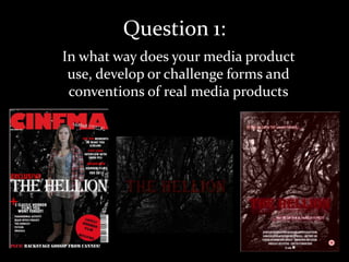
Evaluation Question 1
- 1. Question 1: In what way does your media product use, develop or challenge forms and conventions of real media products
- 2. A conventional antagonist found in many horror movies is a supernatural entity. In our Horror film we used a form of demonic possession to turn a seemingly innocent character into an unforgiving killer. The technique of turning a character into an unrecognisable villain has been used in some big horror movies of the last few centuries perhaps most recently in the paranormal activity series where the initial protagonist, Katie is discovered to be being possessed by an entity we had seen disturbing the happy life she was leading with her boyfriend. In The Hellion we decided to give the initial perception that there is a purely human villain at work and that this person is responsible for Willow’s disappearance (the reason the others enter into the woods in the first place). But then as the story gradually unfolds the truth becomes apparent and it becomes a race for survival. This is takes a conventional storyline and alters the beginning before retuning to the stereotypical horror roots.
- 3. LIONSGATE: This is a company quite heavily associated with some of the big, modern horror films and franchises such as The haunting in Connecticut and both the Saw and Hostel series. If you can be associated with a reputable company that has horror films to its name then you instantly have a fan base who could associate the institution and subsequently your film with some of the BAD ROBOT: greats in the genre. One of our biggest inspirations for our film was the another hand help camera style film, Clover field. We therefore decided that we wanted to draw further connections with a movie in the same style as our own, so we chose Bad Robot as one of the institutions that supports The Hellion. We Furthered the effects of the logos and instantly allowed the audience to draw a connection to the upcoming trailer and the horror genre through a mysterious growl and a distorted transaction between the two logos.
- 4. Once the audience feedback on our initial poster had been collected, it had been implied that the typeface needed changing so we looked through all of the fonts and chose an archaic looking one. We then specifically asked people what connotations this font and they immediately associated it with a horror and old feel. This is because the old, gothic texts were written in a similar font and it draws on the darker side of the old texts that are still with us today. Any connection available needs to be made to a horror film. And the conventions of trailers and promotion packs is to keep a recurring font/title so the audience can draw clear connections between them. We continued this theme within our work.
- 5. One of the typical conventions of any movie trailer is to feature the green screen before the trailer actually begins, this reassures the audience that the trailer is legit and it’s contents have been verified as being suitable to be viewed in a cinema showing of a certain certificate.]
- 6. One of the most conventional settings for a horror movie is the woods. Some of the horror films that we were inspired by are set in the woods, Cabin Fever and most prominently, The Blair Witch Project. The reason we decided to follow this convention is because the woods can act as a perfect place for people to hide behind things and for mysterious noises to occur. It begins to play tricks in the audience’s and characters minds because they begin questioning whether they are hearing things, whether they are hearing nature (i.e. Animals) or whether there really is something supernatural at hand. The woods we chose we deep and thick so that there is no clear exit points or places that they can see where they can feel safe. Its unforgiving and foreboding.
- 7. One of the crucial things Myself and Jess had to work at was the development of the characters. The conventional characters for horror movies is to have a group of young, attractive friends who each have different personalities, sometimes having different social cliques. • Olivia – the pretty blonde who becomes the prime scream queen •Jack – The Macho-man who takes charge of the situation and leads the others to safety •Grace – The Goth who initially refuses to show her fear about the whole situation •Willow – The seemingly innocent one who becomes the films biggest victim
- 8. Challenging the genre conventions of the characters: Charlie It is unusual to have a stereotypical, camp, gay character within the horror films but we decided to break these conventions by featuring amore modern, scream queen. We gave him a cardigan (a more feminine form of clothing) to where and featured him as one of the first to be killed. By doing this we allowed him to conform to the typical character a young blonde girl might have.
- 9. Light: We wanted the light to shine over Willow so that it could potentially obscure Graces’ vision, providing a further obstacle for her. We chose the thick tree for willow to stand behind so that it could hint that Grace feels safe as she has some form of shield between her and the antagonist but at the same time it shows there isn’t a big distance between the two characters Pan: We used a conventional shot of panning around a tree from the antagonist to the protagonist so that it slowly builds the mystery of the shot. Building the suspense as to who will be around the corner.
- 10. The addition of the wall means that Olivia can hide behind it, once again feeling safe an but she still cannot see behind the wall it therefore adds an extra message to the trailer that we are trying to convey, the idea that you do not know what’s around the corner. We chose to have Willow as the centre of the shot. The character holding the camera is looking at her and acting as the eyes for the audience. Having Olivia at the side of the action and looking at Willow in a similar angle to the audience means that the audience is feeling the same emotions as Olivia. The tree’s are there to obscure the vision, it adds a greater sense of uncertainty tot he scene as you are looking at the scene through leaves. The addition of the trees behind Willow also suggest that there is nowhere for Olivia to run to.
- 11. You can see that it is getting darker as there is a dimmer look to the shot but we can see the light coming from through the trees. The light shining on Olivia is almost angelic giving hints that she has passed away and is potentially in a more heavenly place, contradicting the darkness of the theme of the film. Camera Angle: We chose to have the camera at a tainted angle as it adds a sense of uncertainty for the audience. It could also signify that Olivia has dropped the camera and is now in trouble, which we can see in this shot. To achieve this angle we had to use varying objects to prop the camera up and ask the actress to lye flat on the ground.
- 12. We attempted to create the sense that something was leering over the character by using the technique found in many movies of manipulating the shadow looming over him. The area is well lit but he is in a shadowy surrounding which could also represent the darkness and secrets the character is hiding. High Angle Shot: We used a high angle shot which is a conventional method of making it look as though you’re looking at someone from another characters perspective. Conventionally in horror movies it would be from the villain’s perspective which is what we’re trying to achieve here. We tapped into the conventional look of horror movies by making the landscape look abandoned and dangerous. We put the character into this desolate place as it highlights the character and the danger he’s in. In horror movies such as The Blair Witch Project the woods create a sense of feeling tapped and everything feels a lot scarier than it actually is.
- 13. A typical convention of any movie is too create an extreme close up on a certain factor of a characters body. This conveys emotion to the audience in the clearest way. We chose to zoom in on her eyes as it represented that she was always looking over the other characters and building the anticipation as too what she will do next. We used make up and post production editing techniques to make the character of Willow paler so that she did have that conventional haunted, ghostly look to her image. This creates a depth of coldness in her character that we wanted to achieve. We challenged the conventions of the normal extreme close up shot of a paranormal being’s eyes, and chose not to manipulate the look of her eyes, by making them red or demonic looking. You can see by the look on her face alone that she is up to something but we wanted to remind the audience that she is still the best friend of the group of protagonists.
- 14. After watching some horror movies like Clover field we decided to do a scene where the characters we running away from something although you could not see what it was they were running away from. This always works well as it builds the tension and builds more anticipation as the audience now wants to see the antagonist The unsteadiness that is achieved through the use of a hand held camera is a technique that Jessica and Myself wanted to achieve. We watched some films that used the technique and decided that it was one of the best ways of creating a relationship between the audience and the characters they are seeing on screen. This technique also allows the shots to look out of focus or for the shots to be unsteady, it all just adds tot he characters story and how their feeling as the camera acts as a third camera for the audience.
- 15. The use of a low angles shot is conventional within horror movies as creates the feeling that something is leering over protagonists and allows you to look directly at the character but often without giving too much away about what they look like. There is a good example in this when one of the characters looks up at the alien in the movie, Cloverfield. It takes a moment for the audience to process what they’re seeing and gain focus on the situation as it becomes an unexpected occurrence. We also wanted to create this feeling for the audience as the shot itself is meant to be a reaction shot as the first time the characters and the audiences see the demonic Willow. We broke the conventional way that a horror movie gives the first shot of their antagonist and set the shot in the daytime . As I have mentioned before this is key to allowing the audience to react to the characters reactions as this is the key to building the crucial audience character relationship.
- 16. We wanted the audience to feel like their hero was being dragged away from them so that they didn’t feel as safe by having Jack drop the camera and leave it behind (as the audiences only way of seeing their hero. . Stereotypically the alpha male either doesn't die or lasts to the end so we wanted to challenge this and show him falling a cropper to his female nemesis. We wanted to create a stereotypical viewpoint of an antagonist and have something obscuring Jack and the audiences viewpoint of her however unlike a typical horror movie we have used lightness rather than darkness (as fond in Quarantine) to do this. One of the reasons the woods is a conventional setting for horror location because there is nothing in a woods that the characters can use to properly protect them and this shot proves that there is nothing Jack can get a grip on to try and stop Willow from pulling him towards her.
- 17. One of the techniques many editors of teaser trailers use is too create titles that describe previous works of the director, producers or actors as this entices people to come and see their movie. By connecting ourselves to another movie of a similar, highly popular movie, audiences are immediately attracted to the style of the movie as they think that if they made a masterpiece once they can do it again. We decided to keep the same style of title for all of our titles although we did experiment with the more stereotypical approach of creating titles that describe previous works in the same style of those works famous titles. We decided that we wanted to build a brand for our film and have something audiences can connect throughout all of our projects.
- 18. The image takes up Masthead that makes a direct The colour red is most of the front cover reference to the main subject focus of used because it is and covers some of the the magazine so audiences can see it eye-popping and masthead. relates to their interests connoted horror Date of issue’s It isn’t conventional for a publication mainstream film magazine to focus purely on one genre of Buzz Words to entice film as it may put off some the audience and build readers but wanted to highlight excitement the genre of the film. We didn’t include the The image on the front cover is strap line of an of the main character is the indicator of the article feature film of the magazine, info as we felt the title often this image would be of a was the strongest hint famous actor or a significant at the style of the film. image from the film Title of main film featured Unlike some magazines we featured only in magazine so the audience three colours, black whit and red to stick Barcode know what the feature to the horror conventions rather than article will be about those of some magazine front covers.
- 19. We have The colour we have used is red, a A convention for horror conventionally colour that connotes blood and film posters is to use the created a strap danger and is featured in many location (which is often line to adverts and promotion for horror key to the story) as the accompany our movies main image for the film . poster Stereotypically the films’ Unlike most title is the main feature of conventional film the film poster and is in an posters we have eye-popping red to make manipulated the main it stand out from the rest image , the audience of the poster. will not see an shot like this in the film, but Unlike many film posters normal woodlands. we have split the strap line to add emphasis on the play on words and horror genre Film Certification indicates to the A convention for almost any film poster is too feature the audience over what credits at the bottom which will tell the audience the age audience producer, director and the actors of the main characters. members are allowed It also features our self - designed production company, into see this film