Responsive Design - What you need
•Transferir como PPTX, PDF•
1 gostou•1,487 visualizações


Recomendados
Mais conteúdo relacionado
Semelhante a Responsive Design - What you need
Semelhante a Responsive Design - What you need (20)
Mais de Justus Wilde
Mais de Justus Wilde (10)
Último
Último (20)
Responsive Design - What you need
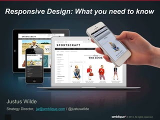
- 1. © 2013. All rights reserved. Responsive Design: What you need to know Justus Wilde Strategy Director, jw@amblique.com / @justuswilde
- 2. © 2013. All rights reserved.2 • eCommerce consultancy • Est 1999 ~60 team • Demandware partner • Proposition: Sell More
- 3. © 2013. All rights reserved. What is Responsive Design? “Responsive web design (RWD) is a web design approach aimed at crafting sites to provide an optimal viewing experience—easy reading and navigation with a minimum of resizing, panning, and scrolling—across a wide range of devices” Wikipedia
- 4. © 2013. All rights reserved. What is Responsive Design? “Sites that serve all devices on the same set of URLs, with each URL serving the same HTML to all devices and using just CSS to change how the page is rendered on the device“ Google
- 5. © 2013. All rights reserved.5
- 6. © 2013. All rights reserved.6
- 7. © 2013. All rights reserved.7
- 8. © 2013. All rights reserved. Technically speaking
- 9. © 2013. All rights reserved. #1 Media Queries 9 320 x 480 480 x 320 768 x 1024 1024 x 768 Anything larger
- 10. © 2013. All rights reserved. #2 Fluid Grids
- 11. © 2013. All rights reserved. #2 Fluid Grids Source:https://openframework.stanford.edu/features
- 12. © 2013. All rights reserved.12
- 13. © 2013. All rights reserved. Broad Browser Support Source: http://caniuse.com/css-mediaqueries
- 14. © 2013. All rights reserved. Design & Usability Considerations
- 15. © 2013. All rights reserved. Device Agnostic 15 Photo Source: http://thecodezombie.co.uk/
- 16. © 2013. All rights reserved. Adopt a Agile Approch 16 User Research Content Strategy Sketch Wireframe Visual Design Prototype Test Source: Ron Kattera
- 17. © 2013. All rights reserved. Mobile First 17
- 18. © 2013. All rights reserved. Content Inventory & Prioritisation 18 Source:http://www.slideshare.net/pkattera/design-process-for-responsive-web-design
- 19. © 2013. All rights reserved. HTML5 Input Types 19 Source:http://mobile.smashingmagazine.com/2010/11/03/how-to-build-a-mobile-website/
- 20. © 2013. All rights reserved. Retina Images 20 Source: http://coding.smashingmagazine.com/2012/08/20/towards-retina-web/
- 21. © 2013. All rights reserved.21
- 22. © 2013. All rights reserved. Avoid Sliders 22
- 23. © 2013. All rights reserved. Use Price Range Dropdown 23
- 24. © 2013. All rights reserved. Swipe to Rotate Images 24
- 25. © 2013. All rights reserved. Designer meet Developer 25 Photo Source:http://webdesignledger.com/wp-content/uploads/2012/08/15-adham-dannaway-designer-coder- portfolio.jpg
- 26. © 2013. All rights reserved. Learning: Frameworks Save Time! 26 Twitter Bootstrap saved 38% http://twitter.github.io/bootstrap/
- 27. © 2013. All rights reserved. What does it mean
- 28. © 2013. All rights reserved. The Verdict 28 PROS - one link - one cart - improved SEO - one codebase - control over font size - consistent user experience - integrated analytics - it's not just about the device CONS -large image downloads -design limitations -cross browser compatibilities -image resize issues
- 29. © 2013. All rights reserved. Early Results – Conversion Rates 29 134% up 165% up 165% up 195% up Compared to previous m. site
- 30. © 2013. All rights reserved. Other Published Case Studies 30 Revenue from all devices increased by 42.4%. The conversion rate improved by 13.6%. The conversion rate for iPhone increased by 71.9%. Source: http://econsultancy.com/au/blog/62260-five-brands-that-reaped-rewards-after-adopting-responsive- design http://econsultancy.com/au/blog/62260-five-brands-that-reaped- rewards-after-adopting-responsive-design
- 31. © 2013. All rights reserved.31 Photo Source: http://bradfrostweb.com/blog/post/this-is-the-web/
- 32. © 2013. All rights reserved.32 Photo Source: http://bradfrostweb.com/blog/post/this-is-the-web/
- 33. © 2013. All rights reserved.33 Photo Source: http://bradfrostweb.com/blog/post/this-is-the-web/
- 34. © 2013. All rights reserved. http://alistapart.com/article/responsive-web-design http://mobilewebbestpractices.com/strategy/know-when-to-make-a-seperate-mobile-site/ http://mobile.smashingmagazine.com/2012/08/22/separate-mobile-responsive-website- presidential-smackdown/ Resources 34
- 35. © 2013. All rights reserved. Great Implementations 35 www.indochino.com www.suitsupply.com www.nixon.com www.burton.com
- 36. © 2013. All rights reserved. 15% Off @ Sportscraft.com.au 36 Enter code “AMBLIQUE” during checkout (April 2013)
- 37. © 2013. All rights reserved. Thank You! Justus Wilde Strategy Director jw@amblique.com / @justuswilde
Notas do Editor
- Go morning everyone.My name is Justus Wilde. I’m the strategy director at Amblique, we are an eCommerce consultancy and have been working with the Apparel Group in the past few months to relaunchSportscraft and SABA webstore including an initial responsive design implementation. I’m going to talk about our expierence today and provide an introduction to responsive design and some key concepts that will hopefully help you with your next project.
- So first some background on Amblique and myself. I have been involved in the ecommerce spcae since 98 and started a web business which became Amblique in 99. In the past 14 years we have worked with many leading retailers and brand owners. Amblique offers strategic and technical services. From an ecommerce technology perspective we are partnered with Demandware, a cloud based enterprise platform used by many leading brands/retailers gloablly which is only just starting to get adopted here. We used this platform for the Apparel Group.Our key market proposition is to help SELL more.
- “Responsive web design (RWD) is a web design approach aimed at crafting sites to provide an optimal viewing experience—easy reading and navigation with a minimum of resizing, panning, and scrolling—across a wide range of devices”
- “Sites that serve all devices on the same set of URLs, with each URL serving the same HTML to all devices and using just CSS to change how the page is rendered on the device“
- Or the simple version. Responsive design is about creating one website that can be easily access by your customers on any device.
- This was one of the key objectives for the Apparel Group Now a little about the Apparel Group project. As I mentioned we rolled out the Demandware platform with the Apparel Group and launched both Sportscraft and Saba. The objective for us was to create a consistent mobile experience.
- And this is what it looks like for SABA
- Technically speaking there are 3 key concepts you need to be aware of.Media queriesFluid GridsFlexible images
- Modern browsers are able to dynamically detect the users device paramters such as screen widht, device size etc. Probably the most important one here is the screen width.You need to consider device orientation when you look at mobile as that introduces additional widhts
- Now the second part are flexible grids. Given the device/screen width differs between smartphone, tablet and desktops. Physically not all the content will fit on the screen if you want the retain legible font size and images. Grids can be configured to wrap or hide components.
- Here is another example.Responsive design is not just about devices it is also about different screen sizes. You can see here that the first two screens here showcase different resolutions.
- The third party. Flexible images. As you can see here the hero image is adapted to the smaller screen.You need to be aware of any content within images such as the text here. This is often a marketing education process.In one of the earlier sessions there was a question about images sizes. It has often be a criticism of responsive design that all devices much download the biggest images and then scale down. There are frameworks such as respond.js that will do the opposite and load the smallest image first and then scale up. This is made much easier if you have a digital asset management solution that produces scaled images and then delivers this via a CDN.
- So we mentioned 3 key technical requirements to enable responsive design. Let’s have a look at the browser support.As you can see there is now very broad support for responsive design. Even internet explorer which is usually our biggest problem has supported it for the past 2 versions.
- OK so we have looked at the technical implications which are fairly straight forward so let’s look at how this impacts site design and usabiliy
- The fist thing to consider is that there is a plephora of devices. Targeting just a standard smartphone and desktop to serve the majority is no longer good enough. Today that will still service the majority of users but tomorrow that could be a different story.To future proof your site you should take a device agnostic approch to design. A design that works for any resolution within a certain range.
- The process needs to be agile and focused on content. Content is more important than ever in the quation here as on a smaller device you will have less room for content so you need to think about what is essential.
- If you are designing a brand new site you should consider taking a bottom up a approach and designing the mobile site first t
- As I mentioned before content is very important so as part of producing wireframes I would recommend doing a content inventory and prioritising how the content will be displayed on the pages. At this point you can also delete some items.
- From a usability perspective there are a few tweaks you can deliver with responsive design. You can set HTML input types in your CSS which will automatically change the keyword on touch devices and switch from letters to numbers for phone fields etc.
- Now that we have retina display this is another opportunity where we can create a rich experience.Pinch & zoom feature is enhanced by this.
- Devs & designers need to work much more closely togetherSet business/client expectations earlyadham-dannaway
- Devs & designers need to work much more closely togetherSet business/client expectations early
- CONS-large image downloads-design limitations (i.e. more rearrangement)-different devices, varying objectives-cross browser compatibilities-image resize issues (sometimes resizing images can be problematic)
- CONS-large image downloads-design limitations (i.e. more rearrangement)-different devices, varying objectives-cross browser compatibilities-image resize issues (sometimes resizing images can be problematic)
- CONS-large image downloads-design limitations (i.e. more rearrangement)-different devices, varying objectives-cross browser compatibilities-image resize issues (sometimes resizing images can be problematic)