
Recomendados
Mais conteúdo relacionado
Mais procurados
Mais procurados (18)
Semelhante a How Horror Teaser Trailers Influenced My Own CreationsTITLE Analyzing Teaser Trailers Like "Don't Be Afraid of the Dark" to Develop My OwnTITLE Using Techniques from "The Woman in Black
Semelhante a How Horror Teaser Trailers Influenced My Own CreationsTITLE Analyzing Teaser Trailers Like "Don't Be Afraid of the Dark" to Develop My OwnTITLE Using Techniques from "The Woman in Black (20)
Último
Último (20)
How Horror Teaser Trailers Influenced My Own CreationsTITLE Analyzing Teaser Trailers Like "Don't Be Afraid of the Dark" to Develop My OwnTITLE Using Techniques from "The Woman in Black
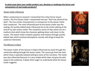
- 1. In what ways does your media product use, develop or challenge the forms and conventions of real media products? Teaser trailer influences When conducting my research I researched into a few horror teaser trailers. The first teaser trailer I researched into was “Don’t be afraid of the dark”. This has similar characteristics in comparison to the teaser trailer that I produced. The most influential part to the teaser trailer was the ending, the quickly edited shots influenced me to do similar editing at the end of my own teaser trailer. This involved a series of clips which are of a medium shot which show the character getting closer and closer to the screen. The teaser trailer created suspense and mystery through quickly edited clips which involved atmospheric sounds and stings to keep the audience interested. The Woman in black The teaser trailer of the woman in black influenced my work through the continuity editing through the teaser trailer. The scenes go from the start which show a typically isolated setting to story of the narrative. The trailer was also influential because it is very simple which does not give the plot away to the audience, it keeps them eager to understand what the teaser trailer suggests.
- 2. How does your media product represent particular social groups? Within my Teaser trailer I used the very stereotypical characters. For the victim I used a young girl, the reason behind this is that young girls are seen as vulnerable and a easy victim. To show the vulnerability of the young female I used various of long shots to show her isolation within setting. This is similar to the Don’t be afraid of the dark trailer, because a young female is also being victimised. The use of the young female makes the target audience have sympathy for the character because they know she is helpless. The other main character in my teaser trailer is a male teenager, this is very typical of the horror genre because teenagers are stereotyped as rogues who don’t follow the rules of society. In this case it would be an extreme rogue behaviour for a teenager to become a murderer. However, it has happened in the past. Males are stereotyped as powerful and authoritative people within the horror genre. I used this stereotype to suggest that this male has power and authority over the young female in my teaser trailer.
- 3. Who would be the audience for your teaser trailer? The target audience would be for male and female audiences of 15+, the reason for this is because the story contains scenes of stalking and terrorising of young females. Any one younger then 15 may find the scenes unsuitable and disturbing. To determine my the certificate of the film I used the BBFC guidelines which allowed me to research the acceptable guidelines of a horror film for the ages of 15+ . http://www.bbfc.co.uk/classification/guidelines/15-2/ These films are also rated 15+, they have similarities to my film.
- 4. How did you attract your audience? The opening shot is a long shot which shows the location and the isolation of the victim. This makes them edgy and uncomfortable for the victim I also used a tracking shot to the victim being followed by the murderer. This shot will make the audience have sympathy for the victim and also be frightened for her. This shot would attract the viewer to find out what is going to happen next. Another shot is the over shoulder shot which is showing the murderer watching over the victim. This will make the audience feel uncomfortable, however it will make them watch more to find out what is going to happen.
- 5. This shot shows the isolation of the murderer, the combination of the two long shots shows that the area is a residential estate, however no one else is around. The following shots show the murderer getting closer and closer using various jump and straight cuts which quickly show the intentions of the character because of the knife in his right hand The close up of the knife finalises the intentions of the character and the audience begin to feel sorry for the victim which is shown in the first half of the teaser trailer.
- 6. Near the ending of the teaser trailer there is another close up of the knife, however this time with blood on it. This shows the audience the inevitable that the murderer did use the knife. However, it creates some mystery because the audience does not know who the knife was used on. Typography is used throughout the teaser trailer, this is being used to entice the audience into watching the film. In this case the typography is stating the name of the film. However, I used some other typography to show the film is “coming soon” and that it is by a first time dierctor.
- 7. Free exclusive poster is available to attract The other cover customers in to lines are used to buying the magazine attract other target because they get an markets which may exclusive poster. not be as interested in the main article. Main image: A mid shot which shows the dominate main More cover lines character in the film, which could the use of the knife possible attract shows his authority and more customers power which he has into buying the within the film. magazine.
- 8. The main image is also very dark, this symbolises Dark colours are used darkness and evil of the throughout this main character. The use of poster, this connotes the knife shows his darkness and evil authority and power which is matched with creating a dominate figure the main character of the front of the poster. within the teaser trailer. The typography at the The title and tagline stand bottom is a typical out by being the only convention of a poster, bright colours on the this shows the target poster. This will attract the audience that this is a customers by the contrast film poster. in dark and bright colours.
- 9. How effective is the combination of your main media product and your two ancillary products? When creating my three products I tried to keep some similar aspects which would unit the products together and give a sense of branding. To do this I used the same images , text and themes throughout the teaser trailer, magazine and poster. The main character in the three products is wearing similar clothes and the same props, I have used this to prevent any confusion between characters. It also enables me to show the characters authority and power within the three products. In the poster and magazine I used the same image, this is because the image is dominate and has the same mise en scene in comparison with the teaser trailer.
- 10. Similarities between my three media products http://jsmith2293.blogspot.co.uk/
- 11. How effective is the combination of your main media product and your two ancillary products? I used similar typography throughout all the products, for the cover lines and title of the magazine I used 28 days later font. This font is mysterious but also is within the genre of horror which I was aiming for. I also used this font for the poster main title and the tag line, this enabled me to get a sense for branding between the different products which I have produced. The Birth of a killer You cannot trust anyone Above is the font which I used for the magazine and the poster.
- 12. What have you learnt from audience feedback? The first piece of primary research I conducted was a questionnaire which I used to identify my target audience. This allowed me to find out who I was going to target, this enabled me to use conventions which this target audience would like and want to appeal to them. Audience feedback is very important, it allowed me to find out changes I needed to do to construct my poster and magazine. To doe this I create a first draft of the poster and magazine, this gave me some feedback so I could change the final poster and magazine to appeal to my target audience. I also got feedback from my teaser trailer, I done this by uploading my first cut onto YouTube. This allowed me to get comments on changes which I needed to make for the final version of my teaser trailer. The teaser trailer first and final cut is on my BlogSpot. www.jsmith2293.blogpsot.com
- 13. What have you learnt from audience feedback? • The final piece of audience feedback I done was from my teaser trailer, this was very important because it considered camerawork, editing, mise en scene and sound. • I had to make several change to my teaser trailer to enable me to appeal to the correct target market. • I conducted audience feedback to also determine if I followed the correct conventions for all of my products which I have produced. Feedback from the audience and primary research was very useful, it allowed me to find out who my target audience is. Also, it allowed me to make crucial changes with the products which I create , the magazine, poster and teaser trailer.
- 14. How do you use new media technologies in the construction in the evaluation and planning? Throughout the entire project I used many pieces of software which has enabled me to create my main project the teaser trailer and the two ancillary projects. They have also helped me to construct and plan my projects. Blogger was the software which I used to plan my teaser trailer and ancillary products. Blogger is very useful in presenting all types of research, the website is basically a online folder which allows all my work to be posted onto one website. The advantages of using BlogSpot is that once uploaded, all the work and posts are safe and are accessible from almost any where with a internet connection. However, there are some disadvantages with using BlogSpot, one of the main disadvantage of using the website is that some internet sources are not viable and therefore will delay work from being uploaded. Paint.net is the software which I used to create my ancillary products the software is very useful when creating posters and magazine covers. The reasons for this is because it has the ability to use layers which enable the use of manipulation of text, images and the layout of objects. This enables these layers to manipulated into the layout of a typical poster or magazine. However, there are some disadvantages with this software is that it can be complicated when manipulating the layout. However, the website was the best possible software which I could use and overall it was very successful and easy to use when knowing how to use it. Adobe Premiere Pro was the software which I used to create the teaser trailer, i created the entire teaser trailer on this piece of software. It enable clips and sounds to be manipulated, the software is extremely good for manipulating the layout of clips and sounds to enable myself to create the teaser trailer. Overall the software was very useful but had some problems
- 15. YouTube is a video viewing website which allowed me to publish my video, by doing this I was able to publish my video onto my BlogSpot by using a embedded code. This is how I published my teaser trailer onto my BlogSpot profile. I also used YouTube to upload my teaser trailer first cut, this enabled me to get feedback on my first cut. www.cloudsound.com is a website which allowed me to publish the sound which I was going to use. First of all I download some sounds from www.freesound.org, once I downloaded the sounds which I needed I then published onto sound cloud which enabled me to store and share the sounds which I used for my teaser trailer. I also used Microsoft power point which is presentation device which helped me create the evaluation of this media a project. This is a very good piece of presentation software.
- 16. Evaluation Throughout the entire planning and construction of my media products I used new media technologies effectively to enable me to create successful products. Various new technologies have made it easier to plan and construct these products. One product which was very useful was BlogSpot, this enabled me to produce and online folder of the work which I was producing on a weekly basis. However, a very important part of BlogSpot was the phone application. This new phone application allowed me to do publish and edit work when I I didn’t have a computer available. I also used www.slideshare.net to publish this evaluation PowerPoint so it could easily be viewed.
- 17. Looking back at AS, what do you feel you have learnt in the progression to from coursework to construction of you’re A2? From my AS to A2 I have enjoyed the construction of my products more, one of the main reasons behind this that I was able to use paint.net. Paint.net is a very useful piece for software which has enabled me to create my poster and magazine more professionally. In AS I just used Microsoft publisher, which wasn’t the best software which could be used to edit my media products. The real advantages of paint.net was that I was able to add layers, this enabled me to layout my magazine easier and made the layout look better in comparison to my AS magazine. Also , I used paint.net to edit my images, the editing software on paint.net is limitless which allows you do almost anything with an image. Therefore the construction of my two ancillary products was a lot better in comparison with last year. I also learnt how to use a camera, to hold steady shots and put different camera shots into my teaser trailer. I experimented with a few different shots, such as the free hand tracking shot. I realised it was very difficult to stay straight but it was farily successful when I used it in my teaser trailer.
- 18. Possible improvements Teaser Trailer • Could have used more of a variation of shots, such as a close up of the victim. • Could have made the background lighting darker to add a sense of darkness to the setting. • I should have used the same font with the poster and magazine to enhance the branding of the products. Magazine • I should have used a different background instead of the white. • I could have added more cover lines to attract a larger target market. Poster • I could have used a different background • I could have added coming soon into cinemas to add more typography