

Recomendados
Recomendados
Mais conteúdo relacionado
Mais procurados
Mais procurados (18)
Destaque
Destaque (20)
Semelhante a Feedback for york press
Semelhante a Feedback for york press (20)
Mais de Jamie Kessel
Mais de Jamie Kessel (18)
Último
Último (20)
Feedback for york press
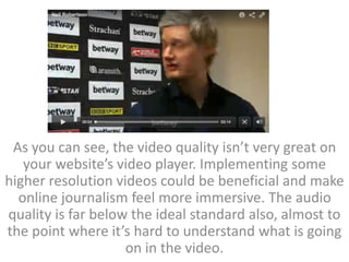
- 1. As you can see, the video quality isn’t very great on your website’s video player. Implementing some higher resolution videos could be beneficial and make online journalism feel more immersive. The audio quality is far below the ideal standard also, almost to the point where it’s hard to understand what is going on in the video.
- 2. • Many of the job offers presented via your website don’t specify the salary at all, or even indicate the company advertising the vacancy. Whilst this may not necessarily be the website’s fault, it would be beneficial to look into this to create a more fluid and user friendly job seekers experience. This is especially relevant when attempting to attract a younger audience to the website.
- 3. • There is lots of click bait on your website. Whether this is intentional or not, it can be very frustrating when clicking on an article only to find that the story is far from what the headline suggests it will be. An example of this is a title such as ‘boy cries for mum’s mercy’. This really makes me want to find out what’s happened, but then It’ll simply just be an article about a kid not wanting to get out of bed for school in the morning. While I understand that this is just a part of the media and what is needed to gain an audience, it is incredibly frustrating at this level, and makes me not want to use your website.
- 4. • The general layout of the website is fairly drab and blank looking. While I understand you are trying to maintain a clean professional aesthetic, I feel that it could do with a design overhaul. This would help to attract a younger audience, using more colours and exiting imagery rather than just stock images or images sent in by Smartphone users who’ve happened to be in the right place at the right time to capture some incident. I do however understand that it can be expensive to hire photographers and not always particularly cost effective. Other than this though, it all looks alright, and not too bad when compared to the websites of tabloids such as the sun.
- 5. • There are simply too many adverts on your website. While I understand that there needs to be sources for revenue, it completely deducts from the experience when there are just adverts all over the screen. What particularly gets to me about this is that you have adverts disguised as articles, that then redirect you to other media outlets who’ve paid you to display their articles on your site. This can be pretty annoying, especially with some very obscene looking articles being advertised, and I think it could harm your business having such tacky looking adverts on display for all your website’s users.