SlideShare uma empresa Scribd logo
1 de 1
Analysis of Professional Magazine Covers
-

-

-

-

-

-

-

-

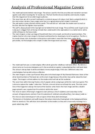
The masthead stands behind main image. The colours used for the title are white and red which contrast
against each other meaning the ‘Q’ stands out. The fact the title shows simplistic and maturity implies
that this magazine is for an older target audience.
The cover lines are all in san serif and kept to a minimal amount of colours (red, black, and gold) which is
the main colour scheme. Every single cover line is in capital letters which makes it stand out.
The pull quote is quite informal and the words “This will kill me” will make the reader want to read on
find out why the Foo Fighters have said this.
The puff is always placed in the top right corner behind the main image. The word they want to get across
is always in a bigger font at the top in black then underneath is the explanation in a smaller text in white
which all keeps to the house style.
The main image is a close up image of David Grohl then in his mouth are the other band members. This
implies that he is the main singer in the band and therefore he should get a lot of recognition. The fire in
his mouth draws a lot of attention to the picture and makes it seem like they have a quite feisty
personality. As the background is simple it makes the image stand out more.

The masthead font uses a smashed glass effect which gives the rebellious rock band effect. The title is a
clever name as it uses onomatopoeia as it’s the sound when a guitar is played giving that rock band style.
The colour is always kept to white and black in every single image, if this was a different colour the
smashed glass font would not be as effective.
The main image is a close up of Gerard Wray who is the lead singer of My Chemical Romance. None of the
other band members of the band are on this main image because the article may just be about the lead
singer. The image is a direct address to the reader which will attract the audience.
The cover lines within Kerrang! States a lot of popular artists and groups within the rock music genre. This
is done to capture the reader’s attention. The font, size and colour are all kept the same. The main cover
line of the magazine is always the name of the band or artist that is the main image and like a double
page spread it uses a quote from the article to add to the cover.
The mise-en-scene of Kerrang!’s magazine cover portrays a lot of rowdiness and crowd due to the
amount of large pictures and text. From the splashes of red black and yellow (fiery, hot colours) adds to
the mise-en-scene stereotype of rock as it gives it that feisty dark stereotype.
The banner at the bottom and puffs keep to the colour scheme but having back in the background helps
them to stand out. This will draw more attention to the readers as they see it more early meaning it is a
good advertising offer.

Mais conteúdo relacionado

Destaque

Olhos Sãos Pela Ginástica Ocular
Olhos Sãos Pela Ginástica OcularOlhos Sãos Pela Ginástica Ocular
Olhos Sãos Pela Ginástica OcularOSJ10
 
palestra slide Unidos para fazer a diferença
palestra slide Unidos para fazer a diferençapalestra slide Unidos para fazer a diferença
palestra slide Unidos para fazer a diferençaPr Ismael Carvalho
 
Pratica Forense Civil - Sucumbencia reciproca - Alberto Bezerra
Pratica Forense Civil - Sucumbencia reciproca - Alberto BezerraPratica Forense Civil - Sucumbencia reciproca - Alberto Bezerra
Pratica Forense Civil - Sucumbencia reciproca - Alberto BezerraAlberto Bezerra
 
Diseño instruccional mariela
Diseño instruccional marielaDiseño instruccional mariela
Diseño instruccional marielaunefamaestria
 

Destaque (6)

Olhos Sãos Pela Ginástica Ocular
Olhos Sãos Pela Ginástica OcularOlhos Sãos Pela Ginástica Ocular
Olhos Sãos Pela Ginástica Ocular
 
Kalender 2015
Kalender 2015Kalender 2015
Kalender 2015
 
palestra slide Unidos para fazer a diferença
palestra slide Unidos para fazer a diferençapalestra slide Unidos para fazer a diferença
palestra slide Unidos para fazer a diferença
 
Pratica Forense Civil - Sucumbencia reciproca - Alberto Bezerra
Pratica Forense Civil - Sucumbencia reciproca - Alberto BezerraPratica Forense Civil - Sucumbencia reciproca - Alberto Bezerra
Pratica Forense Civil - Sucumbencia reciproca - Alberto Bezerra
 
Spot oapi
Spot oapiSpot oapi
Spot oapi
 
Diseño instruccional mariela
Diseño instruccional marielaDiseño instruccional mariela
Diseño instruccional mariela
 

Mais de jademelvin

Documentary genre
Documentary genreDocumentary genre
Documentary genrejademelvin
 
Evaluation- Question 5
Evaluation- Question 5Evaluation- Question 5
Evaluation- Question 5jademelvin
 
Front cover, contents and double page spread process
Front cover, contents and double page spread processFront cover, contents and double page spread process
Front cover, contents and double page spread processjademelvin
 
Question 4 Evaluation
Question 4 EvaluationQuestion 4 Evaluation
Question 4 Evaluationjademelvin
 
Question 1 Evaluation
Question 1 EvaluationQuestion 1 Evaluation
Question 1 Evaluationjademelvin
 
Audience research results and conclusions
Audience research  results and conclusionsAudience research  results and conclusions
Audience research results and conclusionsjademelvin
 
Questionnaire
Questionnaire Questionnaire
Questionnaire jademelvin
 
Analysis of magazine contents page’s
Analysis of magazine contents page’sAnalysis of magazine contents page’s
Analysis of magazine contents page’sjademelvin
 

Mais de jademelvin (9)

Documentary genre
Documentary genreDocumentary genre
Documentary genre
 
Evaluation- Question 5
Evaluation- Question 5Evaluation- Question 5
Evaluation- Question 5
 
Front cover, contents and double page spread process
Front cover, contents and double page spread processFront cover, contents and double page spread process
Front cover, contents and double page spread process
 
Question 7
Question 7Question 7
Question 7
 
Question 4 Evaluation
Question 4 EvaluationQuestion 4 Evaluation
Question 4 Evaluation
 
Question 1 Evaluation
Question 1 EvaluationQuestion 1 Evaluation
Question 1 Evaluation
 
Audience research results and conclusions
Audience research  results and conclusionsAudience research  results and conclusions
Audience research results and conclusions
 
Questionnaire
Questionnaire Questionnaire
Questionnaire
 
Analysis of magazine contents page’s
Analysis of magazine contents page’sAnalysis of magazine contents page’s
Analysis of magazine contents page’s
 

Analysis of professional magazine covers

  • 1. Analysis of Professional Magazine Covers - - - - - - - - The masthead stands behind main image. The colours used for the title are white and red which contrast against each other meaning the ‘Q’ stands out. The fact the title shows simplistic and maturity implies that this magazine is for an older target audience. The cover lines are all in san serif and kept to a minimal amount of colours (red, black, and gold) which is the main colour scheme. Every single cover line is in capital letters which makes it stand out. The pull quote is quite informal and the words “This will kill me” will make the reader want to read on find out why the Foo Fighters have said this. The puff is always placed in the top right corner behind the main image. The word they want to get across is always in a bigger font at the top in black then underneath is the explanation in a smaller text in white which all keeps to the house style. The main image is a close up image of David Grohl then in his mouth are the other band members. This implies that he is the main singer in the band and therefore he should get a lot of recognition. The fire in his mouth draws a lot of attention to the picture and makes it seem like they have a quite feisty personality. As the background is simple it makes the image stand out more. The masthead font uses a smashed glass effect which gives the rebellious rock band effect. The title is a clever name as it uses onomatopoeia as it’s the sound when a guitar is played giving that rock band style. The colour is always kept to white and black in every single image, if this was a different colour the smashed glass font would not be as effective. The main image is a close up of Gerard Wray who is the lead singer of My Chemical Romance. None of the other band members of the band are on this main image because the article may just be about the lead singer. The image is a direct address to the reader which will attract the audience. The cover lines within Kerrang! States a lot of popular artists and groups within the rock music genre. This is done to capture the reader’s attention. The font, size and colour are all kept the same. The main cover line of the magazine is always the name of the band or artist that is the main image and like a double page spread it uses a quote from the article to add to the cover. The mise-en-scene of Kerrang!’s magazine cover portrays a lot of rowdiness and crowd due to the amount of large pictures and text. From the splashes of red black and yellow (fiery, hot colours) adds to the mise-en-scene stereotype of rock as it gives it that feisty dark stereotype. The banner at the bottom and puffs keep to the colour scheme but having back in the background helps them to stand out. This will draw more attention to the readers as they see it more early meaning it is a good advertising offer.