
Recomendados
Mais conteúdo relacionado
Mais procurados
Mais procurados (19)
Semelhante a Deconstruction of Horror Posters
Semelhante a Deconstruction of Horror Posters (20)
Último
Último (20)
Deconstruction of Horror Posters
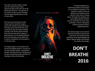
- 1. The colour scheme is black ,orange and red. I believe these colour capture the genre well and link to the whole idea of horror. The warmth of the colours create a sense of danger and evil appearing like there is a fire in front of her. The black background is commonly used for horror poster as it is relevant to the genre. The blackness creates a sense of darkness and isolation as the person on the cover is clearly alone. This helps the audience see how frightening this situation must be and helps her seem more venerable, in return making the audience question what is happening to her.. The whole design is very minimal with just one picture used for the main focus. The contrast of the white text on the black background helps it appear bolder even though it is small on the poster. The angle of gaze is not directly at the camera but slightly above it. The panic in her eyes intrigue viewers, making them wonder. She looks like she is being forced to watch something painful and that it is making her feel uncomfortable. She has hand covering her mouth shows how she could be trying to control her breathe and not be heard. This links to the title of the films and could be the way the makers wanted to make a link. By the way the hands look and how masculine it appears, I personally see it as her being captured by a man who plays as the villain and in return is telling her not to breathe in a torturous way. DON’T BREATHE 2016
- 2. ANNABELLE CREATION 2017 The red title on the brown/green background is eye-catching and bold as well as tying into the blood stain on her face . The fact that it is in capitals signifies importance. I find that they have placed this perfectly as it doesn’t take anything away from the picture. The image used is split into two parts. The first is what the camera is focused on. This may indicate how the doll is more powerful and deserve attention or just highlights the idea that the audience should be aware of its significance in the film. There is then a women screaming in the background . She looks tortured and in pain from her facial expression. I love the idea of how she is out of focus to convey a message for how unimportant she is, of how her pain doesn’t really matter. I find that this is a good picture to help draw an audience and make the question what is happening so they eventually go and watch the film. The facial expression on the doll is very sinister. It’s angle of gaze is just over the camera, not directly at us. This to me looks like she is watching some else in pain and is enjoying it thoroughly. Her mouth is forming a smile and she looks eerily happy. The use of a doll very much represents that this is a horror film. Dolls are commonly used to create fear as they have a supernatural element to them that people are frighten of. The colour scheme of the picture comes across as quite mysterious as there aren’t may colours.
- 3. THE PURGE: ELECTION YEAR 2016 The image conveys a message of destruction. The men are carrying weaponry and seem like they intend to hurt others or defend themselves. The costumes mirror historical attire and it looks like they are trying to make a joke about it and could also show that they are trying to appear more important. The fire in the background portrays a picture of fear. Fires represent danger and get out of control easily. This for me foreshadows what may come up in the film. It also has a figure of the liberty statue and had used the American flag. This reveals the story line in the sense that we understand this is some form of rebellion. The use of the masks creates a sense of ambiguity . We as the audience don’t know was is hiding behind them or who the people really are. The unknown naturally creates fear in humans and makes them question everything. The masks themselves are frightening. The smiles forced on them are very superficial and fake. The placement of the title doesn’t take too much away from the picture. It is big and bold and presented in a unique way. It has a slogan below it that helps the audience identify the synopsis. Overall, I do think it does link back to the genre horror. Element such as masks, guns and fire would be connoted to themes of this particular genre.