![[object Object]](data:image/gif;base64,R0lGODlhAQABAIAAAAAAAP///yH5BAEAAAAALAAAAAABAAEAAAIBRAA7)
Recomendados
Mais conteúdo relacionado
Mais procurados
Mais procurados (18)
Semelhante a Front cover
Semelhante a Front cover (20)
Front cover
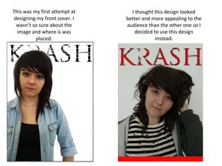
- 1. This was my first attempt at designing my front cover. I wasn’t so sure about the image and where is was placed. I thought this design looked better and more appealing to the audience than the other one so I decided to use this design instead.
- 3. I added the main article to the front cover. I put it on top of the image and I made the writing really big so the audience would know that it is the main story. I used different colours because red and purple contrasts and this links in with rock. I also used different fonts because I thought it gave the image an edge.
- 4. I added some text to my front cover to fill up the space and to show what my magazine would have in it. This is my final front cover until my audience research.