SlideShare uma empresa Scribd logo
1 de 4
Contents page NME (SEPT 2009) ANALYSIS Banner at the top shows clearly what you will get on the page, in capitals to make it clear and the white writing contrasts with the black background. Date included so the reader is able to know if they have missed an issue or if the magazine is up to date or not. Sub heading blocked out into black sub sections making the white writing stand out even more on the page, also shows the different types of things you can get within the magazine. Makes it clearer for the reader to find what they want as it separates pages under different subheadings. Brief heading and summary of content with page number in red, again running with the red and black theme throughout the front cover and contents, the summary also shows the reader exactly what they will be getting about the artists/bands etc.  The NME masthead is the same style and colour as on the front of the magazine showing the theme occurs throughout the magazine. Main image shows a woman that is wearing indie/ rock style clothing, and behind her is a tour bus. The image has been slightly tilted on the page showing no sign of organisation on the page, suggesting the magazine is a bit edgy and different. Bands are listed in red with page number in black. This goes with the theme colour of the magazine, is also easy to understand and stands out of the page. The band names also show the genre of the magazine before having to look through the whole magazine. Image is edited so it looks like a photograph. This is appropriate because it is showing that the magazine isn’t edited to look like photos are professional but instead show that people of the magazine are similar to the reader and do things the reader would be interested in doing, making the magazine more realistic. Editors introduction to contents of magazine, portraying the magazine as approachable and shows the editor them self also adding extra to the magazine. Chatty style of writing but also shows where the reader can find things the editor is talking about in the magazine. Previous/future editions of NME are shown with details of website/phone number etc. this is to attract the audience in buying more copies of the magazine or if they have missed an issue they are able to buy previous ones.
The banner at the top of the page states that this is what will be inside the magazine, girly font, white writing against a pink background going with the theme of bright colours on the front cover. Page numbers are in a big font with the pages that are featured on the front of the magazine which helps the audience find the page easier as something shown on the front of the magazine may have attracted them towards the magazine. The contents of the magazine are separated into different sections with different headings on different topics. Makes the magazine look like they cover a wide range of topics. Use image of the front cover in the contents to show where to find the things shown on the front and also to keep the image of the front cover in the readers head so it becomes more memorable. Uses various images around the page next to the topics it relates to, may attract the audience towards looking on the page more and by images being on the front it might make the audience more likely to read the writing around it. Certain things highlighted yellow which makes them seem more important than other things and also makes them stand out on the page. The text that is highlighted yellow means it is to do with boys, suggesting that the magazine is male orientated and may contain more about boy bands or artists than girls. Images are edited so they have no background around them but they have a white background so it fits into the background of the contents. The font of the subheadings is curly and feminine with swirls at the start of each letter, giving the idea that the magazine contains a particular type of music that is positive. The images of the people on the contents suggest that the magazine is an upbeat and cheerful magazine with the same type of music as the bands and artists shown produce that type of music. The contents page is a lot like the front cover in the way it is cluttered and full of things popping out on the page and doesn’t have much of a structure, suggesting the genre of the magazine. Contents page TOP OF THE POPS(SEPT 2009) ANALYSIS
The page is well structured on the page and has an order to it making it look sophisticated.  The type of artists and bands shown on the page further suggest the genre of the magazine and the page numbers are shown in white next to the images, making it clear that information on the band/artist is on that page. The masthead tells you what the page is and the font is simple, quite large and all in capitals, going straight to the point and not adding any fancy or unique fonts but instead using a font that is making a statement. The black writing contrasts with the white background and stands out as there is nothing around it. On the left hand side carrying under the title and down to the bottom of the magazine is straight blue lines which is giving the contents structure and also giving it a colour theme as it matches some of the colour writing in the contents. The main image is of a band that all look happy, relaxed and laid back suggesting that their attitude relates to their music. The background of the main image is a white brick wall, the white makes it clear for the text to come through on top but the background is not completely plain therefore makes it less boring. The band in the main image are all sitting on seats showing they are comfortable with each other and their surroundings and as if they belong there portraying that the magazine is welcoming. The contents of the magazine are separated under different sub headings such as ‘features’ and ‘upfront’ showing the magazines different range of topics. They are also in a different font to the rest of the magazine making it stand out and making it clear that they are sub headings.  Contents page BILLBOARD(SEPT 2009) ANALYSIS At the bottom of the page is gives the reader to go online and do other things besides reading the magazine, offering more information in different forms. In some of the contents underneath includes a summary of what will be on the page, but under ‘in every issue’ it does not do this which shows that as these things are in the magazine every issue the reader knows what will be on the pages. This could show that the magazine is already popular and doesn’t need to promote itself in all areas.
The contents page is not clustered but is set out in an organised way suggesting that the target audience may also be organised also.  Kesha is shown wearing a lot of make up and looking quite glamorous and attractive suggesting that the target audience may aspire to look similar to her if they are female and be attracted to her if they are male, showing the target audience is for both genders.  The artists and bands showed on the magazine are put there because they are the artists and bands that the target audience are interested in so their preferred artists being featured on the magazine will attract them to buy it.  The contents page is not clustered but is set out in an organised way suggesting that the target audience may also be organised also.

Mais conteúdo relacionado

Mais procurados

Preliminary task evaluation
Preliminary task evaluationPreliminary task evaluation
Preliminary task evaluationAlessia Teresko
 
Contents page analysis
Contents page analysisContents page analysis
Contents page analysisYenpopo
 
Q1. In what ways does your media product use, develop or challenge convention...
Q1. In what ways does your media product use, develop or challenge convention...Q1. In what ways does your media product use, develop or challenge convention...
Q1. In what ways does your media product use, develop or challenge convention...AliceCoulsonLove
 
Analysis of Music magazine front covers, contents pages and double page spreads.
Analysis of Music magazine front covers, contents pages and double page spreads.Analysis of Music magazine front covers, contents pages and double page spreads.
Analysis of Music magazine front covers, contents pages and double page spreads.Ceri Lewis
 
Research
ResearchResearch
Researchjoshfoo
 
Analysis of magazines (1)
Analysis of magazines (1)Analysis of magazines (1)
Analysis of magazines (1)sherieallen
 
Analysing a Contents Page
Analysing a Contents PageAnalysing a Contents Page
Analysing a Contents Pagejennagrieves
 
Magazine research On Existing Music Magazines
Magazine research On Existing Music MagazinesMagazine research On Existing Music Magazines
Magazine research On Existing Music Magazinesgiran_11
 
Research on existing music magazines
Research on existing music magazinesResearch on existing music magazines
Research on existing music magazinesGiran11
 
Guitar Magazine Evaluation
Guitar Magazine Evaluation Guitar Magazine Evaluation
Guitar Magazine Evaluation Amy Orme
 
music magazine analysis 2
music magazine analysis 2 music magazine analysis 2
music magazine analysis 2 media355
 
Contents page analysis
Contents page analysisContents page analysis
Contents page analysisMina Yaqin
 
Magazine resarch powerp 2 final
Magazine resarch powerp 2 finalMagazine resarch powerp 2 final
Magazine resarch powerp 2 finalJessica Smith
 
N:\Gsce Media\Analysis Of Magazines
N:\Gsce Media\Analysis Of MagazinesN:\Gsce Media\Analysis Of Magazines
N:\Gsce Media\Analysis Of Magazinesbenjichandra
 
Magazine resarch powerp 2
Magazine resarch powerp 2Magazine resarch powerp 2
Magazine resarch powerp 2Jessica Smith
 

Mais procurados (19)

Preliminary task evaluation
Preliminary task evaluationPreliminary task evaluation
Preliminary task evaluation
 
Contents page analysis
Contents page analysisContents page analysis
Contents page analysis
 
Magazine cover
Magazine coverMagazine cover
Magazine cover
 
Magazine resarch
Magazine resarch Magazine resarch
Magazine resarch
 
Q1. In what ways does your media product use, develop or challenge convention...
Q1. In what ways does your media product use, develop or challenge convention...Q1. In what ways does your media product use, develop or challenge convention...
Q1. In what ways does your media product use, develop or challenge convention...
 
Analysis of Music magazine front covers, contents pages and double page spreads.
Analysis of Music magazine front covers, contents pages and double page spreads.Analysis of Music magazine front covers, contents pages and double page spreads.
Analysis of Music magazine front covers, contents pages and double page spreads.
 
Research
ResearchResearch
Research
 
Analysis of magazines (1)
Analysis of magazines (1)Analysis of magazines (1)
Analysis of magazines (1)
 
Analysing a Contents Page
Analysing a Contents PageAnalysing a Contents Page
Analysing a Contents Page
 
Cover research
Cover researchCover research
Cover research
 
Magazine research On Existing Music Magazines
Magazine research On Existing Music MagazinesMagazine research On Existing Music Magazines
Magazine research On Existing Music Magazines
 
Research on existing music magazines
Research on existing music magazinesResearch on existing music magazines
Research on existing music magazines
 
Guitar Magazine Evaluation
Guitar Magazine Evaluation Guitar Magazine Evaluation
Guitar Magazine Evaluation
 
music magazine analysis 2
music magazine analysis 2 music magazine analysis 2
music magazine analysis 2
 
Contents page analysis
Contents page analysisContents page analysis
Contents page analysis
 
Magazine resarch powerp 2 final
Magazine resarch powerp 2 finalMagazine resarch powerp 2 final
Magazine resarch powerp 2 final
 
1b
1b1b
1b
 
N:\Gsce Media\Analysis Of Magazines
N:\Gsce Media\Analysis Of MagazinesN:\Gsce Media\Analysis Of Magazines
N:\Gsce Media\Analysis Of Magazines
 
Magazine resarch powerp 2
Magazine resarch powerp 2Magazine resarch powerp 2
Magazine resarch powerp 2
 

Semelhante a Billboard magazine contents analysis

Contents page analysis
Contents page analysisContents page analysis
Contents page analysisKirsty Allen
 
Contents pages
Contents pagesContents pages
Contents pages10lysharp
 
Music magazine analysis
Music magazine analysisMusic magazine analysis
Music magazine analysisDariusslide
 
Industry analysis
Industry analysisIndustry analysis
Industry analysisdammyalaka
 
Contents analysis
Contents analysisContents analysis
Contents analysiskimb0ot
 
Contents analysis
Contents analysisContents analysis
Contents analysiskimb0ot
 
Deconstruction practice
Deconstruction practiceDeconstruction practice
Deconstruction practicerobynneve
 
Music magazine anaylsis
Music magazine anaylsis Music magazine anaylsis
Music magazine anaylsis kirbiekay
 
Contents Page Research
Contents Page ResearchContents Page Research
Contents Page Researchbeckyjay26
 
Deconstruction of magazines
Deconstruction of magazinesDeconstruction of magazines
Deconstruction of magazinesLauren Holyoak
 
Content page analysis
Content page analysisContent page analysis
Content page analysisgrace_hawkins
 
Music Magazine Contents Page Analysis
Music Magazine Contents Page AnalysisMusic Magazine Contents Page Analysis
Music Magazine Contents Page AnalysisPieter Jollans
 
Mojo magazine analysis
Mojo magazine analysisMojo magazine analysis
Mojo magazine analysisLittlePainter
 
Magazine analysis: The Fly
Magazine analysis: The FlyMagazine analysis: The Fly
Magazine analysis: The Flytheresakuhn4
 
Mojo magazine analysis
Mojo magazine analysis Mojo magazine analysis
Mojo magazine analysis Najat Hachem
 
Task 3 research bmth
Task 3 research bmthTask 3 research bmth
Task 3 research bmthasmediae15
 
Music Magazine Analysis
Music Magazine AnalysisMusic Magazine Analysis
Music Magazine Analysislaurencowey
 

Semelhante a Billboard magazine contents analysis (20)

Contents page analysis
Contents page analysisContents page analysis
Contents page analysis
 
Contents pages
Contents pagesContents pages
Contents pages
 
Music magazine analysis
Music magazine analysisMusic magazine analysis
Music magazine analysis
 
Music magazine analysis
Music magazine analysisMusic magazine analysis
Music magazine analysis
 
MOJO
MOJOMOJO
MOJO
 
Industry analysis
Industry analysisIndustry analysis
Industry analysis
 
Contents analysis
Contents analysisContents analysis
Contents analysis
 
Contents analysis
Contents analysisContents analysis
Contents analysis
 
Deconstruction practice
Deconstruction practiceDeconstruction practice
Deconstruction practice
 
Music magazine anaylsis
Music magazine anaylsis Music magazine anaylsis
Music magazine anaylsis
 
Contents Page Research
Contents Page ResearchContents Page Research
Contents Page Research
 
Deconstruction of magazines
Deconstruction of magazinesDeconstruction of magazines
Deconstruction of magazines
 
Content page analysis
Content page analysisContent page analysis
Content page analysis
 
Textual analysis
Textual analysisTextual analysis
Textual analysis
 
Music Magazine Contents Page Analysis
Music Magazine Contents Page AnalysisMusic Magazine Contents Page Analysis
Music Magazine Contents Page Analysis
 
Mojo magazine analysis
Mojo magazine analysisMojo magazine analysis
Mojo magazine analysis
 
Magazine analysis: The Fly
Magazine analysis: The FlyMagazine analysis: The Fly
Magazine analysis: The Fly
 
Mojo magazine analysis
Mojo magazine analysis Mojo magazine analysis
Mojo magazine analysis
 
Task 3 research bmth
Task 3 research bmthTask 3 research bmth
Task 3 research bmth
 
Music Magazine Analysis
Music Magazine AnalysisMusic Magazine Analysis
Music Magazine Analysis
 

Billboard magazine contents analysis

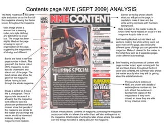
  • 1. Contents page NME (SEPT 2009) ANALYSIS Banner at the top shows clearly what you will get on the page, in capitals to make it clear and the white writing contrasts with the black background. Date included so the reader is able to know if they have missed an issue or if the magazine is up to date or not. Sub heading blocked out into black sub sections making the white writing stand out even more on the page, also shows the different types of things you can get within the magazine. Makes it clearer for the reader to find what they want as it separates pages under different subheadings. Brief heading and summary of content with page number in red, again running with the red and black theme throughout the front cover and contents, the summary also shows the reader exactly what they will be getting about the artists/bands etc. The NME masthead is the same style and colour as on the front of the magazine showing the theme occurs throughout the magazine. Main image shows a woman that is wearing indie/ rock style clothing, and behind her is a tour bus. The image has been slightly tilted on the page showing no sign of organisation on the page, suggesting the magazine is a bit edgy and different. Bands are listed in red with page number in black. This goes with the theme colour of the magazine, is also easy to understand and stands out of the page. The band names also show the genre of the magazine before having to look through the whole magazine. Image is edited so it looks like a photograph. This is appropriate because it is showing that the magazine isn’t edited to look like photos are professional but instead show that people of the magazine are similar to the reader and do things the reader would be interested in doing, making the magazine more realistic. Editors introduction to contents of magazine, portraying the magazine as approachable and shows the editor them self also adding extra to the magazine. Chatty style of writing but also shows where the reader can find things the editor is talking about in the magazine. Previous/future editions of NME are shown with details of website/phone number etc. this is to attract the audience in buying more copies of the magazine or if they have missed an issue they are able to buy previous ones.
  • 2. The banner at the top of the page states that this is what will be inside the magazine, girly font, white writing against a pink background going with the theme of bright colours on the front cover. Page numbers are in a big font with the pages that are featured on the front of the magazine which helps the audience find the page easier as something shown on the front of the magazine may have attracted them towards the magazine. The contents of the magazine are separated into different sections with different headings on different topics. Makes the magazine look like they cover a wide range of topics. Use image of the front cover in the contents to show where to find the things shown on the front and also to keep the image of the front cover in the readers head so it becomes more memorable. Uses various images around the page next to the topics it relates to, may attract the audience towards looking on the page more and by images being on the front it might make the audience more likely to read the writing around it. Certain things highlighted yellow which makes them seem more important than other things and also makes them stand out on the page. The text that is highlighted yellow means it is to do with boys, suggesting that the magazine is male orientated and may contain more about boy bands or artists than girls. Images are edited so they have no background around them but they have a white background so it fits into the background of the contents. The font of the subheadings is curly and feminine with swirls at the start of each letter, giving the idea that the magazine contains a particular type of music that is positive. The images of the people on the contents suggest that the magazine is an upbeat and cheerful magazine with the same type of music as the bands and artists shown produce that type of music. The contents page is a lot like the front cover in the way it is cluttered and full of things popping out on the page and doesn’t have much of a structure, suggesting the genre of the magazine. Contents page TOP OF THE POPS(SEPT 2009) ANALYSIS
  • 3. The page is well structured on the page and has an order to it making it look sophisticated. The type of artists and bands shown on the page further suggest the genre of the magazine and the page numbers are shown in white next to the images, making it clear that information on the band/artist is on that page. The masthead tells you what the page is and the font is simple, quite large and all in capitals, going straight to the point and not adding any fancy or unique fonts but instead using a font that is making a statement. The black writing contrasts with the white background and stands out as there is nothing around it. On the left hand side carrying under the title and down to the bottom of the magazine is straight blue lines which is giving the contents structure and also giving it a colour theme as it matches some of the colour writing in the contents. The main image is of a band that all look happy, relaxed and laid back suggesting that their attitude relates to their music. The background of the main image is a white brick wall, the white makes it clear for the text to come through on top but the background is not completely plain therefore makes it less boring. The band in the main image are all sitting on seats showing they are comfortable with each other and their surroundings and as if they belong there portraying that the magazine is welcoming. The contents of the magazine are separated under different sub headings such as ‘features’ and ‘upfront’ showing the magazines different range of topics. They are also in a different font to the rest of the magazine making it stand out and making it clear that they are sub headings. Contents page BILLBOARD(SEPT 2009) ANALYSIS At the bottom of the page is gives the reader to go online and do other things besides reading the magazine, offering more information in different forms. In some of the contents underneath includes a summary of what will be on the page, but under ‘in every issue’ it does not do this which shows that as these things are in the magazine every issue the reader knows what will be on the pages. This could show that the magazine is already popular and doesn’t need to promote itself in all areas.
  • 4. The contents page is not clustered but is set out in an organised way suggesting that the target audience may also be organised also. Kesha is shown wearing a lot of make up and looking quite glamorous and attractive suggesting that the target audience may aspire to look similar to her if they are female and be attracted to her if they are male, showing the target audience is for both genders. The artists and bands showed on the magazine are put there because they are the artists and bands that the target audience are interested in so their preferred artists being featured on the magazine will attract them to buy it. The contents page is not clustered but is set out in an organised way suggesting that the target audience may also be organised also.