26 terms must know by graphic designer | hmftj | GAD
•
0 gostou•174 visualizações

26 terms for graphic designer | hmftj | Tara Technologies

Recomendados
Mais conteúdo relacionado
Mais procurados
Mais procurados (19)
Semelhante a 26 terms must know by graphic designer | hmftj | GAD
Semelhante a 26 terms must know by graphic designer | hmftj | GAD (20)
Mais de LGS, GBHS&IC, University Of South-Asia, TARA-Technologies
Mais de LGS, GBHS&IC, University Of South-Asia, TARA-Technologies (20)
Último
Último (20)
26 terms must know by graphic designer | hmftj | GAD
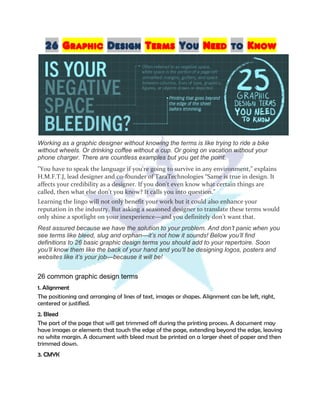
- 1. 26 Graphic Design Terms You Need to Know Working as a graphic designer without knowing the terms is like trying to ride a bike without wheels. Or drinking coffee without a cup. Or going on vacation without your phone charger. There are countless examples but you get the point. "You have to speak the language if you're going to survive in any environment,” explains H.M.F.T.J, lead designer and co-founder of TaraTechnologies “Same is true in design. It affects your credibility as a designer. If you don't even know what certain things are called, then what else don't you know? It calls you into question." Learning the lingo will not only benefit your work but it could also enhance your reputation in the industry. But asking a seasoned designer to translate these terms would only shine a spotlight on your inexperience—and you definitely don’t want that. Rest assured because we have the solution to your problem. And don’t panic when you see terms like bleed, slug and orphan—it’s not how it sounds! Below you’ll find definitions to 26 basic graphic design terms you should add to your repertoire. Soon you’ll know them like the back of your hand and you’ll be designing logos, posters and websites like it’s your job—because it will be! 26 common graphic design terms 1. Alignment The positioning and arranging of lines of text, images or shapes. Alignment can be left, right, centered or justified. 2. Bleed The part of the page that will get trimmed off during the printing process. A document may have images or elements that touch the edge of the page, extending beyond the edge, leaving no white margin. A document with bleed must be printed on a larger sheet of paper and then trimmed down. 3. CMYK
- 2. Also known as four-color process, this abbreviation stands for cyan, magenta, yellow and key, which refers to black. This is a color model that refers to the four inks used in some color printing. 4. Concept The end result of the creative process or a time brainstorming and experimenting with ideas. Clients and companies will often ask designers for a few concepts when creating a new logo or new design scheme. 5. Crop marks The marks on the outside of the printed piece, used as guides for cutting the piece down to the final size. 6. Camera ready A term for a document that is ready for reproduction or ready to “go to press.” 7. Die cut A metal ruler that cuts shapes or holes in various types of materials. If you’re looking to print a document in an unconventional shape, you’ll likely need to use a die cut at the printer. 8. Export To save a file in a format that is usable by most other computers and/or programs. Not everyone has design software so once a document is complete, you’ll have to export it to a PDF or other universal format. 9. Grid A two-dimensional tool in design programs that features a set of horizontal and vertical lines to assist in structuring content. 10. Gutter The space created by the binding of a book or magazine. A gutter is the inside margins or blank space between two facing pages. 11. Layers A tool within design software that allows you to gather, organize and re-edit your work by providing access to the different tiers of information, photos and shapes within a document. 12. Margins The space surrounding the content on your page. Margins are generally on the edges of the page and in between columns of copy and images. 13. Negative space This is the space around the words and shapes in your designed piece. This space can be creatively integrated into the design of the overall work. 14. Orphan Also known as a widow, this term refers to the words or short lines at the beginning or end of a paragraph. These words are isolated from the rest of the content, often causing an unwanted focal point. 15. Pantone system
- 3. A printing industry color matching system which utilizes the Pantone company’s number system for identifying colors. 16. Pica A typesetting unit of measurement equaling one-sixteenth of an inch. InDesign and other design software use picas as a way to measure size and space. 17. Pixel The smallest element of an image. Images are comprised of many minuscule pixels, providing a clear, high-quality image to the viewer. 18. Proof A copy of what your materials will look like. This is also known as a mockup and may be printed for review or emailed to your client for review prior to printing. 19. Raster image An image made up of individual pixels. Altering the dimensions of a raster image may result in a blurry image since you’re simply shrinking or stretching the pixels themselves. Raster image file extensions include .JPEG, .GIF and .BMP. 20. Resolution A measure of dots per inch (DPI) for printed works and pixels per inch (PPI) for digital work. It’s best practice to use at least 300 DPI for printed work and at least 72 PPI for digital pieces. 21. RGB This abbreviation stands for red, green, blue. It’s a color mode for all images shown through an electronic display, such as a computer or television. 22. Sans serif A style of typeface in which there are no small lines at the end of each character. Common sans serif typefaces include Arial, Helvetica, AvantGarde and Verdana. 23. Slug Optional space a designer can display within a document that is not part of the final product. This space may include helpful notes, copyright or suggestions during the proofing process. 24. Typography The art of using typefaces to communicate. This skill encompasses both the typefaces and the negative space surrounding them. 25. Vector graphic An image made up of paths and curves (vectors) rather than a grid of pixels. Unlike raster images, these are able to be enlarged without losing image quality. Vector graphic file extensions include .EPS, .AI, .SVG and .DRW. 26. Static Image different Formats supported Color range An 8 bit file allows 256 shades of grey per channel. That’s 2^8 for each channel (R,G and B) which means 2^24. That’s 16 777 216 colours in total.
- 4. A 16 bit file allows 65 536 shades of grey per channel (2^16). That equals to 2 ^ 48 for an RGB image which is a staggering amount of colour variation (you can work it out!). The real difference is that in a smoothly gradated sky (for example) having only 256 shades of grey per channel to work with can result in banding instead of a smooth colour transition. Working in 16 bit will improve the smoothness of all subtle colour gradations and allow a program such as Photoshop a lot more information to work with. Although JPEG (for example) may only support 8-bit it is still best to work in 16 bit while editing (this allows your photo editor to have access to the maximum amount of information - assuming that your file was 16 bit to begin with of course). When you save to jpeg, bmp, gif or png-8 the bit depth is automatically reduced to 8. These file formats support a maximum of 8 bits per channel : .bmp .jpg .png-8 .gif These file formats support both 8 and 16 bits per channel : .psd .png-24 (with transparency) .tif There are other file formats of course - but I assume you are specifically focussing on those for web use. The main difference is JPEG is "Joint Photograph Expert Group" suitable for mainly photographs. PNG is "Portable Network Graphic" suitable for GRAPHICS not really photos as such. So a digital camera image in JPEG would be fine to use in print and on the Web. But if you take a RAW image and want to use it on the Web it's better to save it as PNG file rather than a JPEG. Saving an image from JPEG to PNG won't increase the quality - as the artifacts are already within the JPEG file, they are embedded the damage is already done. However, if you get a JPEG file that you want to use on the web and you make some alterations in photoshop it would be BEST to in practice to save it as PNG so that no further degradation of the image occurs. It's best not to use PNG in print, but if you have PNG it's best to save it as a TIFF or PSD file, rather than a JPEG, saving as a JPEG will introduce jpeg artifacts to the image. If you have colour charts that aren't complex like solid colours or gradients, then it might be best to consider PNG for the WEB. If you need animations you would require GIFs but they are limited to a colour range of 256 (216) colour range, so best to use this format on smaller images that are solid blocks and NOT on photographs etc.