
Recomendados
Mais conteúdo relacionado
Mais procurados
Mais procurados (20)
Destaque
Destaque (20)
Semelhante a analysis of album covers
Semelhante a analysis of album covers (20)
Último
Último (20)
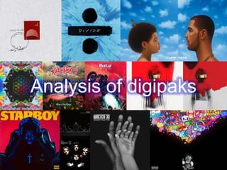
analysis of album covers
- 2. Drake – Nothing Was The SameDrake states: “It’s a child version of myself starring at myself now. When I try to think back through this journey, it’s so hard to pinpoint all these moments and it gets foggy. Even on past albums when I been trying to tell this story, I’ve got there, but maybe not got there all the way. What that album art is to me is that this is my most clear, concise thoughts from now and my best recollection of then.” When buying a physical copy of the album, consumers will notice it is a real oil painting made by Kadir Nelson, who also produced Michael Jackson’s 2010 album cover for ‘Michael’. This is to show that the album is not just music, but a work of art. This therefore makes the album more acclaimed, and may make audiences pay more attention to the artwork and lyrics in the songs than they might have done with a ‘normal’ album cover. Both images serve as the front and back of the album, and were places in stores as they are below. This further shows Drakes intention to display that this album is merely about his journey, which he wants to share with his audience. The title of the album along with the artist’ name is placed on the bottom right and left corners, acting as a real mirror, displaying that the two people on the covers are the same people but at different times, furthermore displaying showing Drakes journey. The font does not seem to be bold or standout and blends in with the background. This may show Drakes attitude to fame and him wanting to keep a low profile but make a name for himself in music. It also illustrates that he wanted consumers to buy the album because of the artwork and not because it is a ‘Drake album.’ The color white and blue have connotations of purity, wisdom, faith, intellect and honesty, which are what all the songs on the album display. The different shades of blue makes the album more eye-catching to the consumer. This is the deluxe version of the album. The older version of him was used for the deluxe version of Nothing Was The Same, to display how there is more to him now and illustrates that he is more knowledgeable in life than he once was. He is also looking to the left which shows that the rapper feels nostalgic and reflective of his past. The child's facial expression seems to be optimistic and inspired at what he sees. The album encourages his audience to dream big as you never know what you can become and in this case the little boy did not know the mega-star he would become. The back of the album has kept the color scheme of blue- keeping the theme of his journey throughout. The artists brand logo is presented at the back showing that this is Drake’s own work. The background of the sky the message that possibilities are endless as the sky is never ending.
- 3. The weeknd- starboyThis is the seventh studio album from the Weeknd, and the most different from the rest of the other album artworks he has created. Previous artwork contained very minimal amounts of color, and kept to a black and white theme. I think that the artist did this to show that the album is different from any other album he has produced, and immediately displays this through his artwork, therefore initially showing the consumer that they should unexpected something different from this album. The colors used are bright, bold and eye catching. The bright yellow has connotations of happiness, joy, energy and is a color that produces a natural warming effect and cheerfulness. This is contrasting with the color of red, which has connotations of war, passion anger, danger and strength. Red is a very intense color creating very natural passionate emotions. These are two contrasting colors showing that the music in the album is a variation of emotions, taking listeners through every emotion possible. Dark blue and black are also prominent colors on the artwork, and have connotations of trust, loyalty, intelligence and mystery. All colors have share an equal amount of space on the front cover displaying that they are equally important. However, The Weeknd is in the dark colors of navy and black, displaying that he is the dark, mysterious character that affects his life, and everything else is joyous and passionate but he is the danger. The placement of the title of the album is in bold, sans serif font, and is written in uppercase. This diverts the attention of the consumer directly to the title first because of its bold font and coloring. The title of ‘starboy’ has connotations of someone who is important and mesmerizing. It is also above the artists’ head which displays that he is the ‘starboy’, that he is the focal aspect of the album. The track list has kept to the color scheme of red and yellow, however, there is no indication of the navy and black as there was on the front cover. This further shows that he is the dark being of the album. The titles ‘starboy’ and ‘The Weeknd’ are placed opposite each other, almost mirroring on another, displaying that he is the ‘starboy’ of the album. The production companies are written in small, almost unreadable to the consumer, illustrating that it is an unimportant factor to the consumer. The song titles are also written in bold and who features on the album are written in a small font, displaying that he wants his audience to focus on the music rather than who is in the song. The weeknd’s body language on the front cover shows someone who is distressed, troubled and displeased. His direct stare into the camera makes the audience feel as if they have the same troubles as him and therefore listening to the songs on the album will let his audiences in on what is causing him the distress that he is presenting on the front of his album cover. Another, prominent aspect of the front cover is that he is wearing a large crucifix necklace, which suggests that the album has a theme of religion in it. Nevertheless, the fact that he is wearing all black and a leather jacket, displays that he is rebelling religion and what religion says you must do and is being sinful. This relates back to the idea that he is wearing all black which shows that he is a dark character. The parental advisory sign is also in yellow, keeping the the albums color scheme
- 4. Stormzy- Gang Signs & Prayer This is grime artist, Stormzy’s first debut album which released on February 23rd, 2017. The album was the first ever grime album to have all its songs in the charts at the same time, and the only grime album to sell so many physical copies. The artwork is supposed to be a depiction of the last supper, where Stormzy is Jesus Christ, which is why he is not wearing a mask as it shows his purity and individualism. However, this is a darker, more cynical version of the last supper, which Is shown through the prominent color of black. Also, all the figures on the front cover are wearing masks, so we are unable to tell the identities of each character and therefore unaware of whom is there to out of good or bad intentions. This gives the consumer an insight on the kind of theme that may occur through the songs; betrayal, hurt and religion. The title of the album, ‘gang signs and prayer’ gives the consumer an insight on what the album is about, it paints very contradicting themes throughout the album but also shows that Stormzy is reviewing every aspect of his life throughout this album. It is a contrasting album title as people who are associated with gangs usually commit high levels of crime, which is sinful in many religions. The title also suggests that the individuals sat on the table are all part of a gang but have deep beliefs about their religion. The artists’ name is written in small lettering on the top right hand corner, along with the title of the album. Stormzy did this to show that the image on the from cover is more important than his name and the title of the album. It is also written in white so it cant stand out from the image but also to show purity and intelligence. The color scheme of the album is mainly black with white lettering. The image on the front contains only black objects and the faces of the individuals are only shown because of some off stage lighting. This shows that the content of the album is very dark, and truthful. The white lettering is chosen because it is the only color that can be used with black and will still keep the album neat, without looking too busy. The white lettering also symbolizes purity, honesty, intelligence and strength. Which is how the artist wants to come across to his audiences. Each individual on the front cover, are staring directly into the camera, which is slightly intimidating, where ever you move their eyes are always focusing on you. This may make consumers more obliged to buy copies as they may feel the album is directly aimed for them. Stormzy is positioned in the middle, making him the focal point of the front cover, he is also the only figure not wearing a mask which may make audiences feel more comfortable as it is more personal to see his face. There is also a greater amount of artificial light on him, furthermore making him the center of attention. The parental advisory sign is largest of all the signs on the back of the album displaying that it is a very raw, emotional album, which younger audiences may not understand. The album is very plain in terms of color, however, the story it presents through the color of black and the image on the front cover is very powerful and displays the content of the music immediately. The production credits are written in small, which once again focuses on the content of the album.