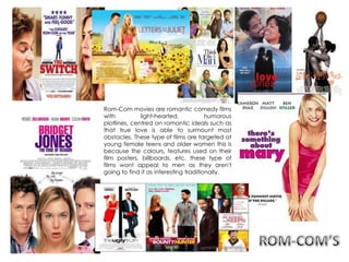
1. Rom-Com movies are romantic comedy films
with light-hearted, humorous
plotlines, centred on romantic ideals such as
that true love is able to surmount most
obstacles. These type of films are targeted at
young female teens and older women this is
because the colours, features used on their
film posters, billboards, etc. these type of
films wont appeal to men as they aren't
going to find it as interesting traditionally.
2. The point of a tagline is to
give the audience a slight
hint as to what the film is
going to be about. The
vocabulary used for this
tagline is casual and
informal, as well as it being
quite amusing.
The use of ‘Friggin’ makes
the target audience realise
that the film will be a
comedy, aimed at 16-25
year old teen girls and
women, as this is the type
of language they mostly
likely will use.
The main image within
the poster is of a male
and female, assuming to
be the main characters
in the movie. the women
has a shocked and
frightened facial
expression, who is sitting
up straight looking tense.
The male character
sitting next to her, is quite
the opposite. He is much
more relaxed, sitting
casually with legs
crossed. He is glaring at
the women which
suggests that he is quite
fond of her which the
audience will able to
identify, if it’s as a friend
or more. The background
is of a beach, which
shows that the film is set
somewhere romantic
and relaxing. This makes
the audience assume
more than they are more
just friend's.
The use of colour of text is
consistent throughout (Red
text) and its set to bold. The
text at the bottom is eye-
catching as it’s a reminder
to ‘remember the date’ in
bold and the size is
bigger, this makes the
audience aware of when it
comes out.
3. The audience for iron man 3 has been targeted to its specific
audience by the producer by having the trailer for the movie
in cinemas while other films of the same genre are being
played. The actors in the film are well known for being in these
types of films, which the audience will be able to relate to and
recognise as of their other films they have stared in, therefore
the audience might want to watch it. they also use a lot of
special effects on the film to make it appeal more to the
audience as it enhances more enjoyment to the film. The
colours used for the poster are very bold, earthy colours which
catches the audiences attentions.
The male characters in the poster are shown to be more
dominant which is the opposite for Rom-Com film
posters, which makes the film more appealing to men as men
are more likely to watch action films especially if they involve
fights, fast paced scenes , films with a lot of tension involved
etc. In this poster the male character is exposed as a ‘hero’ as
he in in front and looks bigger from all the other male
characters and ,also he is holding onto a women which makes
him more controlling and the audience will be able to
recognise that his character will be a hero.
The women in the poster looks worried and alert, this makes the
audience know that she is the one in the middle of what the
situation is in the film, also the background graphics lets the
viewers know that the film will be a sci-fi action film , as it has
robots, fire and rocks.
The institution is shown clearly ‘Marvel’ , this film company is
well known to a lot of people as of the other films produced
within the company such as ; Spiderman, green lantern
etc., this is why some young male teens will be attracted to
this.
4. War films target specific audiences such as males , by the posters. On the
covers, the colours used in most war films are mostly dark, and dull colours.
War films usually consist of male soldiers and sometimes with the rest of the
army. For the props, they show a lot of guns and other war weapons which
attract the target audience , which does. This also lets the viewers know that
the film that they will be watching will be a war film, intriguing the male
audience. The setting of war film posters would be deserted places, to
replicate exactly how and war was like.