Representations through magazines.
•Transferir como DOCX, PDF•
0 gostou•247 visualizações

The document summarizes key elements of magazine design across a front cover, contents page, and double page spread. On the front cover, the masthead is partially covered by the main image to emphasize the cover model over the brand. A pull quote stands out in large, colored text to attract readers. On the contents page, continuity is shown through the same masthead and cover model image. The layout neutralizes the background to focus attention. The double page spread features a large pull quote as a masthead and divides the text into two columns for easy reading.

Recomendados
Mais conteúdo relacionado
Mais procurados
Mais procurados (18)
Semelhante a Representations through magazines.
Semelhante a Representations through magazines. (20)
Mais de Hanna Occiano
Mais de Hanna Occiano (17)
Representations through magazines.
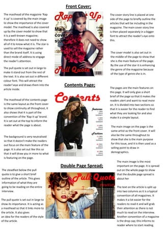
- 1. Front Cover; The masthead of the magazine ‘Rap it up’ is covered by the main image to show the importance of the cover model. The masthead is also covered up by the cover model to show that it is a well-known magazine; therefore it does not need to show all of it to know what it is. The star is used to sell the magazine rather than the brand itself. It is using direct mode of address to engage the reader’s attention. The pull quote is set out in large to make it stand out from the rest of the text. It is also set out in different colour font. This will attract the reader’seye and draws them into the article inside. The cover story line is placed at one side of the page to briefly outline the articles that will be including in the magazine. The main cover story line is then placed separately in a bigger font to attract the reader’s eye onto this. The cover model is also set out in the middle of the page to show that she is the main feature of the page. By the use of the star it is enhancing the genre of the magazine because of the type of genre she is in. Contents Page; The masthead of the contents page is the same layout as the front cover to show continuity all throughout, it also shows that it is part of the convention of the ‘Rap it up’ brand. It is set out at the top to inform the reader what the page is about. The main image on the page is the same artist as the front cover. It will also be the same throughout to show that she is the main purpose for this issue, and it is then used as a selling point to draw in demographics. The background is very neutralised so that it doesn’t make the readers out focus on the main feature of the page. It is also set out like this so that it will draw you in more to what is featuring on the page. Double Page Spread; The steadfast below the pull quote is to give a short brief outline of the article. This gives information of what they are going to be reading on the entire interview. The pull quote is set out in large to show its importance. It is acting as a masthead so that it links more to the article. It also gives an idea for the readers of the style of the article. The pages are the main features on this page. It will only give a short brief of the page so that it makes the readers alert and want to read more on. It is divided into two sections so that it is easier for the reader to find what they are looking for and also make it a simple layout. The main image is the most important on the page. It is spread out on the whole page to show that the double page spread is about her The text on the article is split up into two columns as it is a typical convention of all magazines. It makes it a lot easier for the readers to read it and will grab their attention as there is not much to read on the interview. Another convention of a magazine is the drop cap; this informs to reader where to start reading.