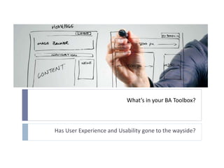
What’s in your BA Toolbox – Has User experience and Usability gone to the wayside?
•Transferir como PPTX, PDF•
1 gostou•966 visualizações

Susan Bernstein, CGI Glenn Teneycke, Rogers Large companies generally have a user experience (UX) department where these designers are mostly utilized for building public facing applications. User Experience designers complement a business systems analyst and vice versa. But, when the UX designers are not available for non-public facing internal applications, the company’s department then relies upon the BSA for user design. Too many times, these applications lack in user design and usability. Even the simplest changes can be implemented incorrectly. How does a BSA gain expertise in this area? This presentation offers pitfalls discovered in applications and how to avoid them.

Recomendados
Recomendados
Mais conteúdo relacionado
Mais procurados
Mais procurados (20)
Semelhante a What’s in your BA Toolbox – Has User experience and Usability gone to the wayside?
Semelhante a What’s in your BA Toolbox – Has User experience and Usability gone to the wayside? (20)
Último
Último (20)
What’s in your BA Toolbox – Has User experience and Usability gone to the wayside?
- 1. What’s in your BA Toolbox? Has User Experience and Usability gone to the wayside?
- 2. Objectives Learn about usability and why it is important Learn the basics of user interface design Where to go to learn more information when building applications
- 3. Presenters Susan Bernstein, Senior BA Consultant / Lead Over 20 years as a BA designing and enhancing applications Glenn Teneycke, User Experience Designer Over 15 years UX experience
- 4. BA Skills Requirements Management Processes (BPM) Interfaces Usability Testing Better Workflows Leverage technology and improve interfaces Improved User Experience Improved reliability and functionality
- 6. BA Skills “This is a great opportunity for business analysts, but it requires a shift in the way they define requirements. UX skills are often absent from business analysts' (BAs') tool kits, because BAs have been trained to engage "the business" to learn about requirements but not to do true user research that will deepen their understanding. By gaining key skills, performing user research, and actually "becoming" their application's end users while defining requirements, BAs can improve the user experience — and organizational outcomes — by helping create apps that are useful, usable, and desirable.” Credit: https://www.forrester.com/Business+Analysts+Seize+The+Opportunity+To+Deliver+Compelling+User+Experiences/fulltext/-/E-RES56758
- 7. What is User Experience Design (UXD)? The process of enhancing user satisfaction by improving the usability, ease of use, and pleasure provided in the interaction between the user and the product. Credit: Donald Norman “The Design of Everyday Things” ”, www.jnd.org
- 8. User Experience Design Credit: http://usabilitylab.walkme.com/awesome-dilbert-cartoon-usability/
- 9. User Experience Design - Not Just UI
- 10. User Experience Design - Experts Large companies have UI/UX departments Public facing applications Added cost for any project Leverage these experts depending on cost: Low cost – Access company UI guidelines Medium cost - Use to review solution and provide best practices High - Work as UI experts on your project team
- 11. User Experience Design - Key Elements User research Interface Design Usability Visual Design
- 12. Requirement Life Cycle High Level Business Requirements • User Research Detailed Business Requirements • Interface Design • Usability System Requirements • Visual Design
- 13. User Research User Research focuses on understanding user behaviours, needs, and motivations Credit: http://lerablog.org/business/the-role-of-moderator-in-conducting-focus-groups/
- 14. User Research Techniques User Observation User Interviews Focus Groups Surveys
- 15. User Research Techniques – User Observation Observe the users do their own work tasks Discuss in person any issues Encourage user to share past stories relevant to the project Most effective Most expensive
- 16. User Research Techniques – User Interview Researcher meets with the user and asks questions Not as effective as User Observation What they say they do may not be what they actually do.
- 17. User Research Techniques – Focus Groups Groups of 3 -12 participants are asked a series of questions on a set of topics Avoid leading participants Good for quick feedback Danger of 1 or 2 participants dominating
- 18. User Research Techniques - Surveys Intercept Surveys Surveying website users while they are using the website Email surveys Select a group of users Benefits Capturing trends Large amount of feedback at a low cost Drawbacks Feedback can be flawed Never gets the same level of detail found in user observation
- 19. ROI of User Research Meet the user and build relationships Gain confidence with stakeholder and sponsor May surface additional requirements earlier rather than later
- 20. Requirement Life Cycle High Level Business Requirements • User Research Detailed Business Requirements • Interface Design • Usability System Requirements • Visual Design
- 21. Interface Design A user interface is like a joke. If you have to explain it, it’s not that good Credits: http://comedycentral.mtvnimages.com/images/ccsu/ccsu_azizansari/ccsu_ansari_delicious/ccsu_ansari_delicious_preview2.jpg? http://www.artversion.com/ui-ux/
- 22. Interface Design Principles - Visibility Credit::http://www.givegoodux.com/visibility-5-principles-interaction-design-supercharge-ui-2-5/ Guide them through a series of tasks
- 23. Interface Design Principles - Visibility Lead the user through an interaction
- 24. Interface Design Principles - Visibility Indicate what actions are available to them
- 25. Interface Design Principles - Visibility Communicate the context of the situation
- 26. Interface Design Principles - Navigation
- 27. Interface Design Principles - Navigation Navigation is intuitive
- 28. Credit: http://blog.teamtreehouse.com/10-user-interface-design-fundamentals Interface Design Principles Pay attention to patterns and stay consistent Use visual hierarchy Navigation and tasks are clear to the user what is next or what can be done Buttons show available actions Speak their language Keep it simple Keep moving forward
- 29. Interface Design Deliverables -Site Maps Credit: http://www.artofanderson.com/website-site-map-example/
- 30. Interface Design Deliverables – Screen Flow
- 31. Interface Design Deliverables -Wireframes Credits: http://graphicdesign.stackexchange.com/questions/30860/what-is-the-difference-between-wireframes-and-mockups http://speckyboy.com/2011/05/29/20-effective-examples-of-web-and-mobile-wireframe-sketches/
- 32. Interface Design Deliverables - Mockups Credit: http://speckyboy.com/2011/05/29/20-effective-examples-of-web-and-mobile-wireframe-sketches/
- 33. ROI of Improved Interface Design Buy in from the business/users Validation of requirements prior to documenting Tangibility as users are visual Reduces Drop off rate
- 35. Usability - Testing Early stages Helps guide the design Assess the overall experience from user Helpful Ideas Comments Techniques Use paper prototyping, screen flows, site maps, mockups Comparative testing on multiple designs (A/B testing) Simulations Card Sorting
- 36. ROI of Usability Increase user productivity Decrease user errors Decrease training and customer support costs Decrease user support Increase user satisfaction and loyalty Increase sales Lower abandon rates Credit: http://www.amanda.com/joomla_uploads/whitepapers/AM+A_ROIWhitePaper_20Apr0%201.pdf
- 37. Requirement Life Cycle High Level Business Requirements • User Research Detailed Business Requirements • Interface Design • Usability System Requirements • Visual Design
- 39. Visual Design - Branding
- 40. Visual Design – Colours and Contrast Credit: http://www.webstyleguide.com/wsg3/7-page-design/3-visual-design.html
- 41. Visual Design - Style Guide
- 42. Visual Design - Style Guide Documents basic rules and features Ensures best practices Provides uniformity and consistency Standards vs. Guidelines Logo / fonts are standards Guidelines are best practices
- 43. Visual Design - Style Guide Layout Typography Forms Tables Navigation Wizards Right mouse Dialogs and Messages
- 44. Visual Design - Style Guide: Layout Create a Template for the pages in the application Define each section Credit: http://webstyleguide.com/wsg3/6-page-structure/3-site-design.html
- 45. Visual Design - Style Guide: Typography Define standard font, font sizes, colors, background color Headings (H1, H2, H3) Labels Menu names Text Hyperlinks Define consistent spacing and alignment Headings Form controls (Text boxes, radio buttons, check boxes, etc.) Buttons Dialogs
- 46. Visual Design - Style Guide: Typography Credit: http://alistapart.com/article/creating-style-guides
- 47. Visual Design - Style Guide: Typography Credit: http://static.bbci.co.uk/gel/0.2.16/downloads/GEL_web_styleguide.pdf
- 48. Visual Design - Style Guide: Typography Credit: https://ui.netbeans.org/docs/nbui_styleguide/style_guide.html
- 49. Visual Design - Style Guide: Forms Primary goal for every form is completion Provide a clear path Prevent users from making mistakes Provide defaults Focus on first enterable field Disabled fields vs. Visibility Only show what is needed
- 50. Visual Design - Style Guide: Forms Use the right control to help with selection(s) Mandatory fields (*) visibility Prevent continuing until all mandatory fields are entered Use icons, labels and images Consistent use of controls, navigation, alignment, etc. throughout application
- 51. Visual Design - Style Guide: Forms Label alignment Top Aligned Data required is familiar Right Aligned Fast Completion time Left Aligned Data required can be unfamiliar
- 52. Visual Design - Style Guide: Forms Mandatory Clearly highlight required fields If most fields are required: indicate optional fields Asterisk (*) or Text Credits: http://sixrevisions.com/user-interface/10-tips-for-optimizing-web-form-submission-usability/ http://uxmovement.com/forms/always-mark-optional-form-fields-not-required-ones/
- 53. Visual Design - Style Guide: Forms Don’t use placeholders to replace labels Placeholder is gone once user starts typing Use placeholder for added helpful information Credits: http://sixrevisions.com/user-interface/10-tips-for-optimizing-web-form-submission-usability/ http://uxmovement.com/forms/always-mark-optional-form-fields-not-required-ones/
- 54. Visual Design - Style Guide: Forms Field length should provide enough room for input Credits: http://static.lukew.com/webforms_lukew.pdf http://www.uie.com/articles/web_forms/
- 55. Visual Design - Style Guide: Forms Group like information Credit: http://www.nngroup.com/articles/form-design-white-space/
- 56. Visual Design - Style Guide: Forms Buttons Execute a single action or range of actions Text should use verbs No more than five buttons on a page Multilingual considerations
- 57. Visual Design - Style Guide: Forms Buttons Label of button should be intuitive Instead of OK, be more descriptive
- 58. Visual Design - Style Guide: Forms Buttons Button State Left, Middle, Right, Split? Credit Top Image: https://mockupstogo.mybalsamiq.com/projects/controls/story
- 59. Visual Design - Style Guide: Forms Text Free form data entry Use Textarea for long entries and allow for scrolling
- 60. Visual Design - Style Guide: Forms Checkbox Yes/No selection Multiple Yes/No’s
- 61. Visual Design - Style Guide: Forms Radio buttons Select only of one of maximum 4-6 selections
- 62. Visual Design - Style Guide: Forms Drop down lists Select only one of many Autocomplete – completes entry based on existing values or prediction Combo box – allows input
- 63. Visual Design - Style Guide: Forms Credit: https://mockupstogo.mybalsamiq.com/projects/controls/story
- 64. Visual Design - Style Guide: Forms Selection lists – one of many or many to many Credit: Left: Microsoft Word, Right: https://mockupstogo.mybalsamiq.com/projects/controls/story
- 65. Visual Design - Style Guide: Forms Table CRUD (Create, Retrieve, Update, Delete) Credit: https://mockupstogo.mybalsamiq.com/projects/controls/story
- 66. Visual Design - Style Guide: Forms Pagination Credit: https://mockupstogo.mybalsamiq.com/projects/controls/story
- 67. Visual Design - Style Guide: Feedback Errors - Explain why the information was not valid and what needs to be fixed Credit: http://uxmovement.com/forms/how-to-make-your-form-error-messages-more-reassuring/
- 68. Visual Design - Style Guide: Feedback Errors – Avoid Negative words Credit: http://uxmovement.com/forms/how-to-make-your-form-error-messages-more-reassuring/
- 69. Visual Design - Style Guide: Feedback Bad Feedback examples
- 70. Visual Design – Bad Examples Green background Labels – not intuitive, drop shadow Buttons – inconsistent Credit: http://stackoverflow.com/questions/15293782/how-to-design-a-forms-in-wpf-application-without-missmatches-in-design-and-runti
- 71. Visual Design – Bad Examples Too much going on Credit: http://www.codeproject.com/KB/cs/AAL-5A/screenshot.jpg
- 72. ROI of Visual Design Skills Ease of use by customer / user Enhances user engagement Builds trust and interest in brand Overall Reduction in future costs of development and support Higher Customer Satisfaction
- 73. Resources - Internal UX Team Style Guides Developer Helps determine any technology constraints Challenge the developers for better solutions You Learn what is available for your technology Google similar web applications
- 74. Resources - External Our picks - Websites Jakob Nielson – http://www.nngroup.com Luke Wroblewski – http://www.lukew.com/ Web Style Guide - http://webstyleguide.com/wsg3/index.html Alan Cooper - http://www.cooper.com/ Controls Sample - https://mockupstogo.mybalsamiq.com/projects/controls/ story Kendo UI – http://demos.telerik.com/kendo-ui/ Jquery UI –http://jqueryui.com/demos/
- 75. Objectives Learn about usability and why it is important Learn the basics of user interface design Where to go to learn more information when building applications
- 76. Final note Navigation and simplicity are key
Notas do Editor
- The following points above are the objectives we want you to get out of this presentation. Target Audience BA’s that have no exposure to User experience and Usability and want to expand their skills as well as learn where to look for information
- BA skills generally have been focussed on Requirements management. But to be able to be better BSA these added skills should be in your toolbox for the best solution for the client. Why have these skills are in the boxes and review each one BAs are responsible for ensuring business solutions are met not only from Requirements but from a Process, Functionality and Usability perspective
- The BA and UI expert working together provide the balance naturally for user needs and goals which on the most part are also the business. If No UX person than the BA must internalize that balance Learn to additionally focusing on the user interaction when creating requirements. BABOK 2.0 has Little or no information. Just references to prototyping and interface analysis without much information.
- Talk about the quote in the sense that BAs can build better solutions by doing some user research and/or user requirements
- Review this quote with the audience. Donald Norman is cofounder of Nielson Norman Group, a leader in user interface design. So what is User Experience and Usability? Let’s start with User Experience.
- "User experience" encompasses all aspects of the end-user's interaction with the company, its services, and its products. Broader concept of Usability Even this diagram does not depict the full spectrum of UX
- Large companies have UX departments to cater to the public facing applications– e.g. those applications on the WWW and Mobile. Other projects may or may not use UX departments but this will be an added cost to that department. This will then fall on the BSA to pick up and incorporate user experience in their requirements. Many times this has failed as the BSA does not have this expertise. Departments can leverage these experts depending on how much they want to spend. At a low cost, the Department/BSA can reach out to the UX department and get their UI guidelines or Style guides. This should give the BSA an idea of standards to follow. This is the first thing a new BSA to a company should do. At a medium cost, a UX department can be used as a consultant and review the solution and provide input For a higher cost, they can be a team member on your project, especially if the solution is UI intensive. NN Group: http://www.nngroup.com/articles/return-on-investment-for-usability/ To assess the total cost of usability (as opposed to the price of a single test), we collected data from 863 design projects that included usability activities. Depending on how we estimated it, usability costs were between 8% and 13% of the projects' budget. Based on this finding and findings from other surveys, we conclude that current best practices call for devoting about 10% of a project's budget to usability. Our full survey data reveals a slightly complicated mathematical model that relates project size to recommended usability spending. In essence, the cost of usability doesn't increase linearly with project size, since many usability activities cost about the same, regardless of how big the project is. A project that's ten times bigger, for example, typically requires only four times more usability spending.
- UX design can be loosely grouped in 4 areas and we will look at each one more closely
- In Summary, if we look at a Requirement Life Cycle, during each of these Requirement Gathering types is when the UX key elements are also executed. Above is generally for waterfall. If agile, then all could come into play at the same time.
- User Research focuses on understanding user behaviors, needs, and motivations through observation techniques, task analysis, and other feedback methodologies.
- Speakers notes There are a range of user research techniques that can help the BA build requirements. I’ve listed 4 main ones to consider . The one you choose will depend largely on how much time and money the project has to support the various methods Sources: http://www.nngroup.com/articles/which-ux-research-methods/
- Most effective of the user research methods and also most expensive
- The goal of user interface design is to make the user experience and interaction with your system as simple and efficient as possible.
- With applications, this is useful with workflows and wizards. In an application, if the task is create account, this could take more than one page and the system can lead the user through the steps.
- The examples here guides the user through a series of steps.
- From an application perspective, these can be the menus, top or left navigation and also the buttons. This Rogers example clear illustrates the actions the client can make on the screen.
- Context of the situation with applications can also be shown using breadcrumbs. In this example the Turbo Tax site shows the user where they are in the process and allows the user to easily move from section to section
- Does anyone remember Netscape Navigator? One of the creators said he wished that he had never invented the back button on the browser as allowed designers to not build proper navigation. When visiting a screen the user wants to know the following” Where am I? How did I get here? What can I do here? Where can I go from here?
- This CIBC site provides a good example of Navigation visibility
- A few points in what a BA can do.
- Explain Site Map vs. Screen Flow
- Wireframes Is all about functionality (where text goes, buttons etc) Ranges from a simple sketch to a higher fidelity Similar to the blueprint of a house, it shows you where the rooms are but not how they are decorated A good practice is to keep details sketchy in the first part of the research process to keep the focus away from the smaller parts of the design that come later BAs should create wireframes to help the visualize the requirements
- Mockups Higher fidelity then wireframes Done later in the requirement gathering process to verify requirements Attention to detail is required as can be used to develop the look and feel of the site
- A reduction in drop-off rates during the checkout process on e-commerce sites can increase the ROI for usability.
- Usability is the ease of use and learnability of a human-made object. A BA should ask each of these questions with respect to the UI changes to the application. Learnability: How easy is it for users to accomplish basic tasks the first time they encounter the design? Efficiency: Once users have learned the design, how quickly can they perform tasks? Memorability: When users return to the design after a period of not using it, how easily can they reestablish proficiency? Errors: How many errors do users make, how severe are these errors, and how easily can they recover from the errors? Satisfaction: How pleasant is it to use the design? Visibility: Keep the most commonly used options for a task visible (and the other options easily accessible). Does it do what the users need?
- Best done in the early stages of the project which helps guide the design Focus is on whose goal is not primarily to find usability problems that need to be fixed, but to assess the overall user experience and understand users’ reactions to different ideas. This can include comparative testing—that is, soliciting feedback on multiple solutions to a design problem A BA should be using Paper prototyping, screen flows, site maps and mockups to confirm that the requirements solution is correct. GLENN add add notes for how a BA could use theseh
- In Summary, if we look at a Requirement Life Cycle, during each of these Requirement Gathering types is when the UX key elements are also executed
- Visual Design refers to the Aesthetics – Images, colors, font, layout, controls, etc.
- Consistency, branding across all platforms BA should be consistent as this enhances customer’s user experience Devices should not be in competition with each other
- What is a style guide? – it is best practices for the application Why do you need it? – it provides visual blueprint, standards, branding etc to the application and for the developers. All applications should have a style guide for the visual aspect of the application. This provides a standard to follow as well as provides consistency to the application if there is turnover
- The core pieces of a style guide: layout, navigation, fonts, colours, usability and accessibility requirements Design deliverable consisting of fonts, colours and interface elements that communicate the essence of a visual brand for the web. Style Tiles are similar to the paint chips and fabric swatches an interior designer gets approval on before designing a room. They help form a common visual language between the designers and the stakeholders and provide a catalyst for discussions around the preferences and goals of the client.” Style tiles are more of a graphic design deliverable than a UX document. However a UX designer would certainly input into a set of style tiles and may well create a set if they have graphic design expertise.
- Living breathing document
- Each page in the application should be consistent. If there is no style guide then create one. Start with a template of the page and define each component and it’s attributes. This is just an example and there could be many variations for dialogs, overlays, messages, etc. Your application may only have a few of these sections
- Form Controls are the data entry field types
- When you look at the style guide created by Yelp, you can see how it starts with the basics: typography, grid, and colors, adding more patterns as it goes along.
- Whether new technology or old, the standards still apply for all forms, dialogs, pages, etc.
- A form is a page with fields.
- Summary of points to note for the audience.
- No fast rule as long as your application is consistent, although right aligned labels provided form completion times cut in half. If vertical screen is not an issue then top aligned also provides reduced completion time.
- For a lot of fields, make it look neat and clean and ordered how the user would work
- Grouping related fields together helps users make sense of the information that they must fill
- Use a button when the user is required to execute a single action. Use a set of buttons when a range of actions is available to a user. Do not use buttons for navigation between screens. Hyperlinks should be used instead. Do not use buttons to indicate a change of state (e.g. leave button pushed in). Consider using checkboxes or radio buttons instead. Do not use more than seven action buttons on a screen. Five is the preferred limit.
- Order of buttons normally is left or right. There is no right answer but again as long as the application is consistent. Middle can be used for alerts.
- Add slides for each one
- Add slides for each one
- Note alignment of labels and that this is just a summary of what we just reviewed. Comment on alignment of labels to control, date picker
- One of many – use when too many for a drop down list
- Just an example of a table and for the application to be consistent with all tables. Point out Add/Edit/Delete.
- Interface should provide feedback Error messages indicate what the user needs to fix Be explicit, human readable, polite, precise and give constructive advice on how to fix problem Be visible, preserve as much of the user’s work, reduce the work (http://www.nngroup.com/articles/error-message-guidelines/)
- Green background Shading in the text Excess border around the controls Inconsistent spacing of buttons
- Tabs and tabs Buttons in different case Radio buttons when check boxes could be used (depends on the business)
- Here are some things you can also do. Talk to your developer and find out any technology constraints. Keep asking for better solutions if you are not sure of what they suggest. Google sites that have what is available for your technology. So if you are using .Net, then google .Net UI and see what comes up. Also if you are building an accounting application, then google that and see what the similar applications are doing.
- Our handout will have a summary of key concepts and more links
- The following points above are the objectives we want you to get out of this presentation. Target Audience BA’s that have no exposure to User experience and Usability and want to expand their skills as well as learn where to look for information