

Recomendados
Mais conteúdo relacionado
Mais procurados
Mais procurados (20)
Semelhante a Question 3
Semelhante a Question 3 (20)
Último
Último (20)
Question 3
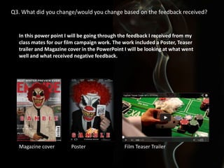
- 1. Q3. What did you change/would you change based on the feedback received? In this power point I will be going through the feedback I received from my class mates for our film campaign work. The work included a Poster, Teaser trailer and Magazine cover in the PowerPoint I will be looking at what went well and what received negative feedback. Magazine cover Poster Film Teaser Trailer
- 2. Teaser Strengths These are some of the strengths we where told our teaser had when conducting feedback with our class mates: • • • • • Impressive use of mise-en-scene, titles, sound and overall presentation. Amazing use of props and lighting. Amazing sound and pace. The shots and camerawork follows conventions of a teaser. Good camera angles, props and sound track. The mise en scene fitted well and there was a good use of props/ signifiers. Amazing sound track, good close ups and clever camera shots. Good use of colour and strong titles. By finding out our teasers strengths it helped make clear what we were doing well, this intern helped to enforce what we should keep the same and what we needed to improve. Based on this feedback we decided to keep our soundtrack similar to how it was at the point this feedback was given as we were told it was an “Amazing sound track”. Some things we did change even though we received positive feedback on them were the titles as although we were told they were “strong titles” we believed they could be improved upon and we also received feedback that said they could be approved upon.
- 3. Teaser Trailer Areas for Improvement These are some of the areas for improvement we where told our teaser had when conducting feedback with our class mates: • • • • No distribution icon, maybe consider using a different font for titles. Title styles. Improvements - none The titles are a bit too simple. The font isn't professional unlike the rest of the editing and sound From this feedback we decided to add a distribution icon and change the font of our titles to a bolder more interesting font.
- 4. Sound track feedback Strengths: • Great soundtrack - fits in perfectly with the teaser. • Good cuts and a variety of shots fitting with the sound. • Good use of Diegetic and non diagetic sound in the trailer. This is the feedback we received on our teaser trailers soundtrack, although we did not receive any negative feedback for this we picked out things in the soundtrack that we thought needed improving such as adding sound to the idents at the beginning of the trailer.
- 5. Magazine Cover Strengths Feedback: • • • • • • • • • • • Figure placement Looks good so far The main picture is good and well placed The effects so far are good. Appropriately placed within the frame as a convention, the photograph is clear and high quality with good positioning of main image Good use of the title font. Good use of the gun as mise en scene and a signifier. Informative text on the magazine cover. I like the use of the props for example the gun adds an intimidating feel. Very good, good layout and composition. Good constant branding of the clown. We chose to keep a lot of the things on the magazine cover the same after receiving feedback on it as there was a lot of positive feedback and therefore we didn’t want to change aspects of the magazine cover that people thought were good already.
- 6. Magazine Areas of improvement Feedback: • • • • • Green Empire title and smokey background have connotations of a horror film when associated with the clown mask opposed to a thriller. Title needs to be bigger - look at the conventions of the empire magazine. More of a faded edge around the character with more writing and the empire logo changed to red. Looks too fake. Not a fan of the background colour as it doesn't go together with the rest. Due to this feedback we decided to change the colour of the Empire title. Initially we thought the green would help to make the title stand out and would go with the poker theme as poker tables are green, but after receiving the feedback saying it gave connotations of a horror film we decided to make the title red which looked better as it went with the other colours on the poster and helped to sustain our brand image and keep the classic red Empire title which made the magazine colour look more realistic. After receiving this feedback we also decided to add a lot more text and pictures to the magazine cover to make it look more interesting and realistic. We did not decide to change our background as every other background we looked at took to much attention away from the pictures and text on the cover. We also thought that smoke was a good idea for a background as it gives a dramatic effect and is commonly used by action thriller films, the background also looked a lot better once we had added more pictures and text to the magazine cover.
- 7. Poster feedback •Nice close up of clown mask. •Good use of the card in the mise en scene. •Good use of lighting. •The close up looks brilliant the read hair is great. •Really good colours and layout and good titles. Poster Inspiration This is all of the feedback we received for our poster as it is all positive feedback we did not change any of the aspects of our poster due to this. After this feedback was given we did decide to add things to the poster judged on our own criticism such as the picture of the cards and fire at the bottom of the poster and we also added more text to the poster to make it more realistic and similar to the poster that inspired us.
- 8. Conclusion When reflecting on how we conducted our feedback results if I had another chance to re do the feedback I would have chose to ask more students on their opinion of our campaign pieces and encouraged them to give more constructive criticism so that we could have been more aware of what to improve upon. By doing this it would have helped us as we wouldn’t have had to work out as much what to improve our selves and it would have given us a wider rang of opinion from our target audience.