The document analyzes the layout, design elements, and techniques used on a magazine front cover. It discusses the header, masthead, cover lines, image of the artist, and other components. It provides advantages and disadvantages of how each element is designed and positioned. The analysis aims to understand how the cover attempts to attract and persuade potential buyers to purchase the magazine.
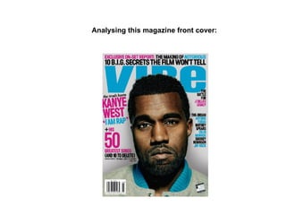
2. Header:
The header is the text located at the top of the page and is in capitals, the reason why all the text is in capitals is because
conventional nearly all magazines uses capital letters in text to make the audience be aware of its presence so that they may be
persuaded to buy it.
The colour scheme used for the header is interesting because the publisher uses a different variety of colours to make certain parts of
the text stand out from the page, for example: ‘Exclusive on-set report:’ is bright pink which is done because the lay out editor what
to get the message across to the audience that the contents is only available in this magazine which tempts the target audience to buy
it.
As mentioned the header’s text differs in colour as part of it is black, this technique of changing colours allows the text as a whole to
draw the audience’s eye towards it, which may then lure the target audience to buy it.
The header also features the word ‘Notorious’ which is a film and offers the reader to learn the secrets of the film. The word itself
is set between black text and is bright blue which I believe was done in to attract the audiences’ eye to this specific piece of text so
that it may persuade the target audience to buy the magazine.
In addition, by the header mentioning the name of the film ‘Notorious’ and the famous rapper ‘B.I.G’ it attracts a wider audience not
only people who are interested in the artist Kanye West and his music, but people who are fans of ‘B.I.G’ and the film, therefore
leading to more music magazines being sold and to a different variety of people.
Header
3. Masthead:
The masthead for this music magazine has a large and clear font making it easy for the audience to read and
because it is much larger than the surrounding text and because it is in a different font than the other text and is
therefore immediately eye catching, plus it has a sans-serif style.
Furthermore addressing the colours used, it is bright blue which distances itself from the rest of the page making
it stand out which I believe was done deliberately by the lay out editor so that it would become noticeable and
attract the audience.
The rule of thirds is important when looking at this magazine because each of the letters are within the rule of
thirds lines, so from this it is clear that the masthead is one of the many elements within this magazine that lures
the eye to look at it.
Moreover, the positioning of the artist is important when linking it to the masthead because although he takes up
some of the letters, the size is that big and because it is a well known and recognised music magazine the
audience already know what the name of the publication is without having to see the whole text.
Masthead
4. Cover line:
One of the cover lines I found interesting was the name of the artist ‘KANYE WEST’ and it’s positioning on the
page. The name of the artist is important as along with the picture as it makes clear to the audience who the
magazine is revolving around which could lead to his fans wanting to the buy the magazine in order to get
information on him. In addition, because the artist is well known to be in the hip hop genre it makes clear that his
magazine as a whole is about hip hop.
Moreover, I believe the use of the colour pink is important not only because it makes the text stand out but it also
widens the magazines target audience as stereotypically women do not like hip hop music so by using a famine
colours it invites women to buy it which enlarging its target audience therefore more magazines will be bought.
Cover line
5. Positioning of the model/ and the artist himself:
The positioning of the artist is very important because a first glance of this magazine shows that he is the main
image as he is taking up most of the page, also because there is no other image on the front cover it further adds
to your eye being drawing towards him.
Moreover, the rule of thirds is important when examining this front cover because he when we spilt up the
sections of this page as specified, all of the intersections are of a segment of the model. This shows that the artist
main part of on the front cover that the audiences eye would be drawn to.
In addition the background colour of the magazine is critical when linking it to the artist as the background
colour is light grey however, the outline of the model is light black and even though there is only a light outline
because it is a complete contrast to the background colour it instantly emphasises his dominance on the page
and is inevitable for the audiences eye not to be drawn to. It is clear that the lay out editor has put an effect on
the image so that you see the artist and are then persuaded to buy the magazine.
Furthermore the colour of the artist’s clothes are important because it differs from the background making it the
dominate colour and therefore makes it stand out from backdrop. Moreover, the colour of the artist’s collar is
the same colour as the masthead which blends them together well, reinforcing the colour scheme for the front
cover.
The artist
6. Pull quote:
One thing I found interesting about this pull quote was the colour and placement of it. I say this because it is
positioned where the surrounding colours are pink and as it is a light blue it immediately causes to stand out
from the page which will therefore attract the attention of the audience. In addition the pull quotes colour is
identical to the masthead, header and cover lines therefore it blends well with the surrounding text colours and
strengthens the colour scheme.
However, I have noticed that this pull quote differs from other music front covers I have analysed firstly
because of its size as conventionally they would be one of the largest on the page with the exception of the
masthead. So for it to be this size is very usual and could be a disadvantage of the front cover.
Pull quote
8. Pull quote:
This pull quote is important in this front cover as it creates a sense of mystery and leaves the audience questioning what
this text about and could lead to the target audience buying the magazine so that they can understand what is being
discussed in the interview.
The pull quote is black which is set on a white background which gives it a effect that makes it stand out from the
surrounding text and the background of the front cover. However I did notice that there were some drawback to this
pull quote which was the size, it is a very small which the audience may not be able to see particularly from a distance,
and conventionally they are a big size. So by not using the traditional size it makes the magazine appear unusual and
could damage the effect it is supposed to have which is to persuade the audience to buy the magazine.
Furthermore another negative aspect of the pull quote is it’s positioning on the page and it is crammed between two
other text which is a disadvantage overall because it leads to the text having to be reduced in size and portrays the
magazine as a whole to appear unprofessional and rushed which could then lead to the audience wanting a buy another
magazine that has more quality and value
Pull quote
9. Layout:
I believe there are some advantages and disadvantages as regarding the layout of this front cover. Firstly,
one positive thing I found about this front cover was that it clearly identifies who it’s target audience’s is
through the use of the image of the artist. He takes up most of the page which will clearly lure the audience
eye towards the magazine and seeing that he is the only image on the page it makes him the most dominant
and eye catching element to look at one the page.
Furthermore the use of the cover lines particularly the artist’s name ‘EMINEM’ is positioned right next to
the artist which I believe was done to make sure that audience are completely aware of who he is so they
will then be lured to purchasing this magazine. However, one disadvantage of the layout is that some of the
cover lines are too closely positioned together which makes the text small therefore diminishing the
appearance of the front cover which would put the audience off from purchasing the magazine.
Layout
10. Image:
The artist position of the page is interesting on the front cover and there are many media techniques that are
used that told only attracts but is also persuades the target audience to buy it. This is the only image of the page
and is the first thing that your eye is drawn to, my evidence of this is by using the rule of thirds and as a result
each section when split up contains a piece of him, therefore it which clear that he is the main attraction on the
page.
The facial expression and body stance of the artist is interesting because it creates a serious and intense mood
which could reflect the theme of the magazine and the music genre which in this case is rap. The artist himself is
wearing only a vest which shows his tattoos which is done to attract the target audience which are mainly
teenagers, the artist is portrayed as a rebellious figure which may appeal to teenagers as there are stereotypical
seen to be rebellious and will therefore persuade them to buy it.
Furthermore, the vest’s colour is important because it is the darkest colour on the front cover and is set on a
light grey background which immediately causes the audience’s eye to be drawn to the artist which will then
persuade them to buy the magazine seeing as a famous and well known person is appearing on it.
Image
11. Masthead:
This publication uses a very large, visible, sans-serif masthead which takes up the upper section of this front
cover. I believe this has been done to make sure the audience can easily see the title so that they will then be
persuaded into buying it as it is a well known, recognised music magazine. The masthead that attracts is large
in size and font also it is in capital letters which makes it stick out from the surrounding text as it is the biggest
on the page. The masthead uses two colours that have been blended together and I think these two colours have
been chosen because it matches the rest of the texts colours and reinforces the colour scheme.
Masthead
12. Cover lines:
There are numerous cover lines in this front cover but one that I am choosing to discuss is “EMINEM
COMES CLEAN” because I believe I how found some interesting points to make. Firstly, the size of this
cover line, in my opinion the large bright font makes it clear and easy for the audience to read which could
lure the target audience to buy the magazine as it is of a well known and very famous artist an offers personal
information of the him.
Another cover line is “Who is the best rapper ever? You decide” This offers the audience to give their opinion
to the magazine making them feel that they are appreciated which may encourage them to buy the magazine.
In addition the cover line adds to the colour scheme and it is a interesting how it is being used as the text is
placed on a grey background and both colours cause the audiences eye to immediately spot them, but the
colour red stands out more than any other text which I believe was done because the layout editor wants to get
the message of the red text across to the target audience so that they maybe influenced them buy it.
Cover line
Cover line
13. Header:
The header in this magazine lists other music artists appearing in in, this may be useful because it will attract a
larger audience of people as the magazine has a wide range of artist and is sure to attract the target audience .
However, I have found some disadvantages as regarding the header, to begin with the size, it is the smallest
text on the front cover and it should not be as the header plays an important role in persuading the target
audience to buy the magazine. So for it to be this size is irregular and I believe that it does not serve it’s
purpose as it should. In addition the colour is not good although some of the text is in a black which makes it
stand out, the size on the other hand is extremely difficult to reader so he colour is irrelevant. The larger text
of the header is a similar colour to the background which makes it difficult to notice and read plus, it does not
have the effect that other elements of the front cover, the other elements which use dark and engaging colours
to appeal the audience to the magazine.
Header
15. Masthead:
This front cover uses a clear masthead in order for the audience to read it without difficulty and the serif style
not only draws the attention of the audience because it is different to other magazines but it also lead the
audience to believing that because of the elegance and sophistication of the masthead this amount of quality
will appear within the magazine, encouraging the target audience to buy it. The colour used are bright and clear
because it is set on a white background causing the masthead to stand out from the page and draw the eye of
the audience. An additional factor about the colours used in that it gives out a warm and welcoming feeling
which could appeal the target audience to buy the magazine as it is inviting and friendly.
Masthead
16. Header:
The header of this magazine promises to give the audience television and radio listings for all of the music that
is within this genre and the latest news, so the audience will believe they will be receiving the most up to date
new regarding this genre of music and therefore be persuaded to buy this magazine. The header also boasts that
it’s ‘the world’s best selling classical magazine’ leading the audience to believe it must be of good contents for
so many people to buy it and will therefore be convinced to buy it. However a disadvantage regarding this
header is the size, it is very small and closely positioned together which makes it hard for the audience to read
and therefore will not influence them to buy the magazine.
Header
17. Cover lines:
The cover line used ‘Sarah Chang’ is the name of the artist which I believe was used to make the audience
aware of who she is which may lead to them buying the magazine as she is a famous musician in the classic
music genre. Furthermore the colour of this particular cover line is identical to the masthead which adds to the
colour scheme of the magazine and makes it stand out from the plain background.
However a disadvantage with another cover line located in the middle of the front cover is particularly the size
as it is very small making it hard for the audience to read and as a result they will be unable to be persuaded to
buy the publication.
Cover lines
Cover lines
18. Image:
The image of the artist in this front cover is large and positioned well which because it uses the rule of
thirds which means that the first thing that draws your eye on this front cover and because it is of the a
well known music artist it may persuade the target audience to buy the magazine. In addition because of
the white background it makes any image stand out from the page and as it is the only image on the
front cover, it further lures the audience eye towards the image which could then persuade the target
audience to buy the magazine. Moreover, the clothes the artist is wearing could reflect the target
audience as it is a feminine colour and because of the artist being female it reinforces the idea that this
magazine is targeting women. In addition adding onto the clothing of the artist it is looks stylish which
may lead the audience to be believe they that will be receiving that same amount of quality within the
magazine.
Image
19. Layout:
The layout of the front cover has some advantages firstly; the image is positioned in a way that audience a
clear view of the audience and as it is in the centre of the page immediately attracting the eye on the audience.
Another advantage of the layout is the masthead as it is large and takes up the upper part of the magazine
which I believe is done to make sure that the audience is aware of the publications name so that they will
know of it’s reputation and therefore be expect to receive that amount of quality within the magazine and as a
result will be persuaded to buy it.
However, I have a disadvantage which is the cover lines as there is only one cover line positioned correctly
and the others are not plus, they are closely placed together which reflects the magazine as a whole to appear
amateurish and unprofessional portraying the magazine in a negative way and as a result audiences will not
want to buy it.
Layout
20. Prop:
The prop used in this front cover is the violin which can be seen being held by the artist, the reason why I
think the use of the prop is important is because it offers extra information about the genre of the music which
could then lead to them buying the magazine as they may like that particular instrument and the music it plays.
The placement and size of the prop is important because it is the nearly the same height as the image of the
artist herself and is positioned next to the artist because I believe the layout editor wants to make sure that the
audience are clearly aware of what type genre the magazine is so that the target audience will then purchase it.
Prop