
Recomendados
Mais conteúdo relacionado
Semelhante a HOMEWORK.pdf
Semelhante a HOMEWORK.pdf (19)
Último
Último (20)
HOMEWORK.pdf
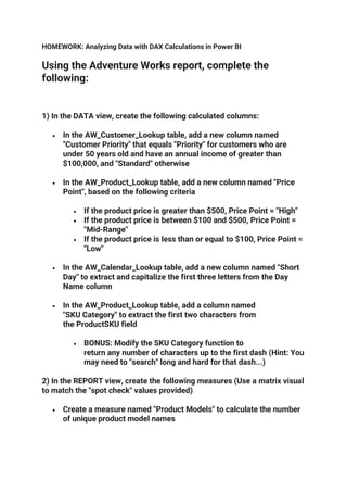
- 1. HOMEWORK: Analyzing Data with DAX Calculations in Power BI Using the Adventure Works report, complete the following: 1) In the DATA view, create the following calculated columns: • In the AW_Customer_Lookup table, add a new column named "Customer Priority" that equals "Priority" for customers who are under 50 years old and have an annual income of greater than $100,000, and "Standard" otherwise • In the AW_Product_Lookup table, add a new column named "Price Point", based on the following criteria • If the product price is greater than $500, Price Point = "High" • If the product price is between $100 and $500, Price Point = "Mid-Range" • If the product price is less than or equal to $100, Price Point = "Low" • In the AW_Calendar_Lookup table, add a new column named "Short Day" to extract and capitalize the first three letters from the Day Name column • In the AW_Product_Lookup table, add a column named "SKU Category" to extract the first two characters from the ProductSKU field • BONUS: Modify the SKU Category function to return any number of characters up to the first dash (Hint: You may need to "search" long and hard for that dash...) 2) In the REPORT view, create the following measures (Use a matrix visual to match the "spot check" values provided) • Create a measure named "Product Models" to calculate the number of unique product model names
- 2. • Spot check: You should see a total of 119 unique product models • Create a measure named "ALL Returns" to calculate the grand total number of returns (not the number of items returned), regardless of the filter context • Spot check: You should see a total of 1,809 returns • Create a measure to calculate "% of All Returns" • Spot check: You should see a value of 61.64% for the Accessories product category • Create a measure named "Bike Returns" to calculate total returns for bikes specifically • Spot check: You should see a total of 427 bike returns • Create a measure named "Total Cost", by multiplying order quantities by product costs at the row-level • Spot check: You should see a total cost of $14,456,986.32 • Once you've calculated Total Cost, create a new measure for "Total Profit", defined as the total revenue minus the total cost • Spot check: You should see a total profit of $10,457,580.86 • Create a measure to calculate Total Orders for the previous month (named "Prev Month Orders") • Spot check: Create a matrix with "Start of Month" on rows to confirm accuracy • • Create a measure named "Order Target", calculated as a 10% lift over the previous month • Spot check: Create a matrix with "Start of Month" on rows to confirm accuracy • Total Returns for the previous month (named "Prev Month Returns")
- 3. • Spot check: Create a matrix with "Start of Month" on rows to confirm accuracy • 90-Day Rolling Profit (named "90-day Rolling Profit") (13:33 mark) • Spot check: You should see a 90-day rolling profit of $2,142,623.27 3) Save a separate backup copy of the .pbix file (i.e. "AdventureWorks_Report_Backup")
- 4. HOMEWORK: Creating Table Relationships & Data Models in Power BI Using your Adventure Works report file, complete the following: 1) Navigate to the RELATIONSHIPS view, and perform the following actions: • Right-click to delete each relationship between AW_Sales, AW_Customer_Lookup and A W_Calendar_Lookup (including both date fields) • Use the Manage Relationships tool to delete all remaining relationships between all tables 2) Recreate all table relationships (using any method you prefer), and confirm the following: • Cardinality is 1-to-Many for all relationships • Filters are all One-Way (no two-way filters) • Filter direction correctly flows "downstream" to data tables • Data tables are not connected directly to one another • Both data tables are connected to all valid lookup tables • Product-related tables follow a snowflake schema 3) Return to the REPORT view, and complete the following: • Edit (or insert) the matrix visual to show ReturnQuantity (values) by CategoryName (rows) from the AW_Product_Category_Lookup table • Which category saw the highest volume of returns? How many? • Replace CategoryName with Year from the AW_Calendar_Lookup table • How many returns do you see in 2015 vs. 2016? • Replace Year with FullName from the AW_Customer_Lookup table
- 5. • What do you see, and why? • Update the matrix to show both OrderQuantity and ReturnQuantity (values) by ProductKey (row s) from the AW_Product_Lookup table • What was the total OrderQuantity for Product #338? 4) Unhide the ProductKey field from the AW_Returns tables (using either the DATA or RELATIONSHIPS view): • In the matrix, replace ProductKey from AW_Product_Lookup with ProductKey fro m the AW_Returns table • Why do we see the same repeating values for OrderQuantity? • Edit the relationship between AW_Returns and AW_Product_Lookup to change the cross filter direction from Single to Both • Why does the visual now show OrderQuantity values by product, even though we are using ProductKey from AW_Returns? • How many orders do we see now for Product #338? What's going on here? 5) Complete the following : • Change the cross filter direction between AW_Returns and AW_Product_Lookup back to single (One- Way) • Hide the ProductKey field in the AW_Returns table from report view (and any other foreign keys, if necessary) • Update the matrix to show ProductKey from the AW_Product_Lookup, rather than AW_Returns • Recommendation: Save a separate backup copy of the .pbix file (i.e. "AdventureWorks_Report_Backup") HOMEWORK: Visualizing Data with Power BI Reports
- 6. Using your Adventure Works report file, complete the following: 1) Add a new report page named "Customer Detail", and complete the following steps (Note: Screenshot provided for reference below): • Add a matrix visual to show Total Orders and Total Revenue by customer full name for the top 100 customers by revenue • What happens when you try to pull in Total Returns as well? Why? • Sort the matrix by Total Revenue (descending) to show the top revenue- generating customers • Spot check: You should Mr. Maurice Shan as the top customer, with $12,407.96 in Total Revenue • Add conditional formatting to show data bars on the Total Orders column and a background color scale on the Total Revenue column, and customize the style however you'd like 2) Add a Donut Chart to show Total Orders by Gender (on the Legend) • Title the chart "Orders by Gender", and adjust formatting to match the gauge charts on the Customer Detail tab (centered, gray background, light gray font) • Copy the chart and paste two more versions: one to visualize orders by IncomeLevel, and a second to visualize orders by Occupation (remember to update the chart titles!) • Update the report interactions so that each donut chart (as well as the matrix) filters the other two donuts, instead of highlighting (2:10 mark) • Spot check: If you select "Mr. Maurice Shan" form the matrix visual, you should see the charts filter to only show Gender = M, Income Level = Average, and Occupation = Professional • Hold CTRL to select all three donuts, and use the formatting tools to align the top of each chart and distribute horizontally 3) Add a Line & Clustered Column chart to show Total Orders (as columns) and Total Revenue (as a line), with Start of Month on the shared X-axis
- 7. Update the chart title to "Orders & Revenue by Month", and format the chart style however you choose • Spot check: You should see that "Mr. Marco Lopez" drove the most orders (3) in June 2017 • Select the matrix, and update the report interaction mode to filter the combo chart (vs. highlighting) • Spot check: You should see that "Mr. Marco Lopez" placed orders in June 2016, August 2016, March 2017 and June 2017 4) Add a Treemap visual to show Total Orders (values) grouped by Current Age Update the chart title to "Orders by Age", and format the chart style however you choose • Select the matrix, and update the report interaction mode to filter the treemap (vs. highlighting) • Spot check: Ages will change over time since they based on the TODAY() function, but you should see the most orders for age 50 and 49 5) Add a card to show FullName, and make the following updates: • Turn off the Category Label, update the card title to "Top Customer", and adjust formatting to match the donut charts • Format with a light yellow background fill (to match the product cards on the exec summary page) • Add a Top N visual-level filter to show the #1 customer based on Total Revenue • Spot check: You should see "Mr Maurice Shan" when the view is unfiltered, and "Mrs. Janet Munoz" when filtering on Female customers only • Copy and paste to create two new cards: one showing Total Orders, and the other showing Total Revenue, and update card titles to "Customer Orders" and "Customer Revenue", respectively
- 8. • Spot check: Among high income customers, you should see "Mrs. Lisa Cai" as the top customer, with 7 orders and $11.33K in revenue 6) Add a text box that says "Executive Summary", and insert an arrow button next to it Return to the "Exec Summary" page, activate the bookmark tab, and add a bookmark named "Exec Summary" • Return to the "Customer Detail" page, and link the arrow button to the bookmark you just created using the object "Action" properties • Spot check: CTRL-click the arrow to confirm that the link works as expected 7) Make any formatting tweaks that you see fit (alignment, chart styles, separation lines, etc.), and save a (completed!) copy of the report Report screenshot (for reference):