
Recomendados
Mais conteúdo relacionado
Mais procurados
Mais procurados (15)
Destaque
Destaque (12)
Semelhante a Product research, analysis 1
Semelhante a Product research, analysis 1 (20)
Mais de danobrien93
Último
Último (20)
Product research, analysis 1
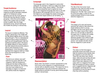
- 1. Title/Masthead The title of this front cover music magazine is big, bold and white so that it stands out on the vibrant pink background. The title ‘Vibe’ covers up a lot of the front page in order for the audience/target market to know exactly what the magazine is. Image The image is of a man and woman standing half naked to help attract the target audience which is young teenagers into the music genre of hip-hop. The image is big so that it helps stand out a lot and also to help fill out the page more. In addition the models used on the front page are young attractive people/ music artists to help show that the magazine is up to date and for ‘cool’ people and also shows that the magazine is quite sexual. Font The font is an ordinary ‘san serif’ bold font but works well with in the magazine. With the background being pink the black writing suits it well so that it stands out. The writing here are music artists and is basically an insight in to what and who will be inside the magazine. Colour The colour on this front page is extremely vibrant and bright; this is to help the audience know exactly what the magazine is and who they are. There are only three main colours, black, white and pink but they all work well together and help it stand out which is the main objective of the colour with in a magazine front cover. With the background being a vibrant pink it suggests that the magazine will be energetic and lively and has connotations of how the type of music (Hip-Hop) will be pulsating. Layout The layout is simple but effective. The image is placed big in the middle with the title placed slightly above it but also going through it. This is a stereotypical magazine layout where everything is kept nice and straightforward. Also the typeface/coverlines used in the layout are slightly different to others where it has been placed all around the sides to add an extra dimension to the design/layout. I think that all this helps represent the magazine itself as it helps show that hip-hop/grime is a new beginning. Language The language used in this magazine is some what colloquial. An example is ‘what you really know about the dirty south, drugs, drama, destiny’. This shows that they are doing their best to signify the music genre. The magazines language also tries to use real life situations with language such as ‘crazy in love’; this helps to try and engage the reader to show they know how their target audience can be feeling. Target Audience I believe the target audience for this magazine would be teenagers between ages of 13-18 (Burton’s social grouping) and into the music genre of Grime and Hip-Hop (Burton’s media grouping). I think this as the typeface used is very modern and up to date, similar to graffiti. Also the image represents young, sexual meaning as the models are posing in a sexual way. Representation Music artist ‘The Dream’ is shown/ represented on the front cover of this magazine in a seductive/sexual manner with an attractive woman. The reason for him to be represented in this way is because it attracts the target audience perfectly of young, good looking people posing in sexual ways.
- 2. Masthead The masthead is in a san serif font to make it clear. It has been produced in a bright yellow as the mise-en-scene of the front cover is black/dark. Also with the title being so bold it helps anchor the music genre clearly as it has been put in almost block capitals to try and connotate power. Colour The colouring in this magazine is a basic but bold selection that all represent the music genre of grime. The font colour is mixed from blue, yellow and white; this helps make it clear as the background is dark so straight away gives an advantage as the information is easily read. I believe the balance of colours are good as the bright font colours signify that the magazine will be interesting and lively but then with the background being black helps show that the magazine will tackle serious, interesting subjects with in the music genre of grime. Layout This is an unusual layout but none the less a good/successful one. The coverlines on this front page have been placed all around which has left some open space to the magazine which has then been cleverly filled in with a image, an example is where the man is DJ’ing. The masthead like all magazine has been placed in the middle at the top on the pure basis so that the target audience/viewers can see it. Finally the image represents the grime music scene as music grime artist ‘Lil Wayne’ is posing with his thumb pointing at him to try and portray himself as ‘the man’ which shows some sort of arrogance which is often represented in grime. Font The font on this front cover is san serif and bold. The reason for this is that the producers want to show that this magazine is serious and not all posh by having serif typeface which is often linked with posh magazines. The font is in bright colours so that all text is seen and easily read. Target Audience The target audience for this particular magazine would be teenagers between the ages of 13-18 and possibly of black ethnicity (Burton’s social grouping). It would also be targeted at people who are into the music genre of grime (Burton’s media grouping). This is shown clearly as the font and image represent swag-eristic style Image The denotation of this image is simply a music artist (Lil Wayne) posing with a certain swagger about him whilst holding a microphone next to a man who is posing to be a DJ. The connotation of this image is that there is a serious side to grime music by showing the expression on the bigger images face but also enjoyable fun with there being a DJ in the background. Language The language used is very persuading to try and get the audience to buy this magazine. An example is ‘the blueprint of Hip-Hop’. This shows persuasion as they are trying to inform the audience that their magazine is the best in their particular music genre. Representation The music artist shown here is represented as a man with a certain swagger about him in the way he is posing. This automatically attracts the readers as they immediately want to have the same characteristics as him. Also the pose that he is illustrating is often compared to people from ‘the ghetto’ and this suits the music genre of grime perfectly.
- 3. Title/Masthead This masthead is in a san serif font so that it stands out nice and clear. The boldness and brightness from the colour red make it easily visible to the audience. The title is similar to the masthead except the fact that it has been put in the middle. It has also been purposely put at an angle to show that it is crazy and messy which is often a connotation of the music genre ‘rock’ which this magazine seems to be aimed at. Image The image has been set out big in the middle with two other little side images shown to give the reader a clue what else will be in the magazine. The bigger image has been well edited by using a light tool to brighten up the music artist. The denotation of the main image is simply a man with a guitar singing into a microphone. The connotation is with his mouth being so far open it shows that he is shouting which is often referred to in ‘rock’ music and is therefore rocking/raving. Colour The colouring in this magazine links to the music genre of ‘rock’ perfectly. The reason for this is the colours black and red are often thought upon when rock is involved due to the thought of death and life. The white in the font and slightly in the background just brings some reality/normality to the front cover and also brightens up things. Font The font is very much san serif as everything is in block capitals and bold. The colours are bright on a black/dark background in order for it to stand out. Also the colour of the font being red suggests passion and this is often a connotation of rock music. Language The language on this front cover encodes their target audience perfectly as it gives non-fiction stories about ‘rock stars’ which would appeal to the target audience. It also gives brief examples of what will be with in the magazine, e.g. ‘How Pete's coping behind bars’. Layout The layout of this magazine front cover is quite squashed as there are a few empty bits which is unusual. The masthead has been labelled in the top left hand corner and the coverlines have been placed underneath them down the left hand column. This leaves a fair amount of space on the right side but is cleverly filled with a big image which helps show/tell the audience exactly what genre of music this magazine is for. Target Audience The target audience is rather clear due to the image and colours used. It would be people who are into the music genre of ‘rock’ (Burton’s media grouping) and of ages between 15-25 of perhaps white ethnicity (Burtons social grouping). Representation Leader of music band ‘The Enemy’ is shown in the centre of the front cover singing. The way there is light gleaming off him shows that he is centre of attention and is therefore leader of the band. The way he seems to be singing and the emotions in his face seem to represent effort/shouting which is often seen in music such as rock.
- 4. Conventions of Front Pages The conventions of a front page of a magazine and in this case a music magazine are simple. A masthead which shows the audience who the distributers/ company are. Also images which are key to grab the audiences attention; they are often distributed as one big one spread across the whole page. A title is also always there so that the target audience have some idea what will be within the magazine itself. Colour is also a convention and perhaps the most important one. The reason for this is because its all about catching the audiences eye and with bright, vibrant colours you can do this. Text is also shown on a front page but only little bits informing the reader what will occur in the magazine, this could include competitions and advertisements as well as artists that will be publicized. Finally something that is always guaranteed to be on a front page and usually in the top right hand corner is the date and sometimes the distribute number of the magazine; this is simply so that the audience know exactly when and what the magazine is.