
Recomendados
Mais conteúdo relacionado
Destaque
Semelhante a Evaluation
Semelhante a Evaluation (20)
Mais de daniellaeverett
Mais de daniellaeverett (20)
Último
Último (20)
Evaluation
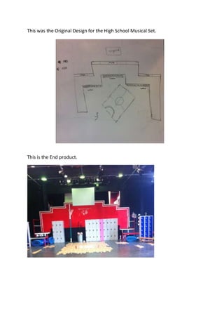
- 1. This was the Original Design for the High School Musical Set. This is the End product.
- 2. The prop I chosen was the Noticeboard, which was used in the performance. I feel the Noticeboard fit perfectly with the set. Straight away it linked with the colour scheme with the red and white being team colours. It also linked to my partner’s posters for the big game and Science Decathlon, so if the students in the performance seen them round the school and wanted more information they’d come to the noticeboard. Another positive is that it was actually used in the performance as not everyone else’s was and a character actually wrote on it. I had enough Justification for why I did each thing on my Noticeboard, It either linked to the set idea or the script. It was prominent on stage it stood out the audience as they walked in it was right there for audience to notice, so if the audience noticed it then in the performance the students can notice it. It was aesthetically correct with the set and the costumes of the performers. A negative about the noticeboard was that two of the notices had to be changed so last minute as they were on coloured paper and hand drawn to make it look like they were drawn by the students themselves and they’ve stuck it on. But Teachers disagreed with the design and wanted it all printed off and red but I personally felt like it was too much red and harder for the audience to read because it just blended in with the set. With a noticeboard I feel you have to have bold writing and bright colours to grab the student’s
- 3. attention but with the new changes I thought it didn’t do that but on the other hand it did fit with the set and colour scheme. On each dress rehearsal and night of the performance I did have to keep changing the signup sheet for the ‘Juliet and Romeo’ Auditions as Sharpay wrote on it. My original idea was to write Sharpay’s signature herself in bright pink to link to her locker being pink and her being so girly and she could mime writing on it so then it’s easier for the audience to read and it’s neater, because when she did write on it because the noticeboard had a fleece texture and not a hard background she had poked a hole through the paper on the first night and on another night it wouldn’t write. She wouldn’t have had that problem if I already wrote it on. A student gave me her noticeboard to use but there weren’t enough small pins that came with the board which isn’t her fault. I had to use pins that you would use if you were sewing and they were a lot longer than the ones that came with it. So they did keep bending when I was trying to push them in and they went through the noticeboard itself and at points some things fell off because they weren’t pinned on secure enough. If I was to do it differently I would get some coloured paper that I could actually put in the printer and print stuff on it, so then it would be the best of both words for my design of bright colours on the noticeboard and the teacher’s idea of having everything printed off. My noticeboard fit with the rest of the set with the colour scheme and with the wildcats logo and paw to link to the team spirit. The placing of the noticeboard was in a good position as it was there as soon as the audience walked in. Overall I think it was a good prop that fit with everything from colour scheme to context to the script. I would only change the colours and add other colours but just leave the red for the wildcat’s notices.