Frequency Tables, Frequency Distributions, and Graphic Presentation
•
4 gostaram•7,989 visualizações

Statistics Topics: Frequency Tables, Frequency Distributions, and Graphic Presentation

Recomendados
Mais conteúdo relacionado
Mais procurados
Mais procurados (20)
Destaque
Semelhante a Frequency Tables, Frequency Distributions, and Graphic Presentation
Semelhante a Frequency Tables, Frequency Distributions, and Graphic Presentation (20)
Mais de ConflagratioNal Jahid
Mais de ConflagratioNal Jahid (9)
Último
Último (20)
Frequency Tables, Frequency Distributions, and Graphic Presentation
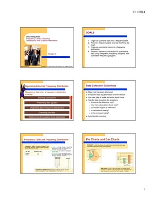
- 1. 2/11/2014 1 Chapter 2 Describing Data: Frequency Tables, Frequency Distributions, and Graphic Presentation McGraw-Hill/Irwin Copyright © 2010 by The McGraw-Hill Companies, Inc. All rights reserved. 2-2 GOALS 1. Organize qualitative data into a frequency table. 2. Present a frequency table as a bar chart or a pie chart. 3. Organize quantitative data into a frequency distribution. 4. Present a frequency distribution for quantitative data using histograms, frequency polygons, and cumulative frequency polygons. 2-3 Determining the question to be addressed Collecting raw data Organizing data (frequency distribution) Presenting data (graph) Drawing conclusions Organizing data into a frequency distribution involves: Organizing Data into Frequency Distribution 2-4 Data Collection Guidelines Data must represent all groups Find some data by observation or from records Use past data to make decisions about future Test the data by asking the questions: o Where did the data come from? o How many observations do we have? o Do the data support or contradict? o Is the evidence missing? o Is the conclusion logical? Avoid double counting 2-5 Frequency Table and Frequency Distribution FREQUENCY TABLE A grouping of qualitative data into mutually exclusive classes showing the number of observations in each class. FREQUENCY DISTRIBUTION A grouping of data into mutually exclusive classes showing the number of observations in each class. Class interval: The class interval is obtained by subtracting the lower limit of a class from the lower limit of the next class. Class frequency: The number of observations in each class. **Class midpoint: A point that divides a class into two equal parts. This is the average of the upper and lower class limits. 2-6 Pie Charts and Bar Charts PIE CHART A chart that shows the proportionor percent that each class represents of the total number of frequencies. BAR CHART A graph in which the classes are reported on the horizontal axis and the class frequencies on the vertical axis. The class frequencies are proportional to the heights of the bars.
- 2. 2/11/2014 2 2-7 Relative Class Frequencies Class frequencies can be converted to relative class frequencies to show the fraction of the total number of observations in each class. A relative frequency captures the relationship between a class total and the total number of observations. 2-8 EXAMPLE – Creating a Frequency Distribution Table Ms. Kathryn Ball of AutoUSA wants to develop tables, charts, and graphs to show the typical selling price on various dealer lots. The table on the right reports only the price of the 80 vehicles sold last month at Whitner Autoplex. 2-9 Constructing a Frequency Table - Example Step 1: Decide on the number of classes. A useful recipe to determine the number of classes (k) is the “2 to the k rule.” such that 2k > n. There were 80 vehicles sold. So n = 80. If we try k = 6, which means we would use 6 classes, then 26 = 64, somewhat less than 80. Hence, 6 is not enough classes. If we let k = 7, then 27 128, which is greater than 80. So the recommended number of classes is 7. Step 2: Determine the class interval or width. The formula is: i (H-L)/k where i is the class interval, H is the highest observed value, L is the lowest observed value, and k is the number of classes. ($35,925 - $15,546)/7 = $2,911 Round up to some convenient number, such as a multiple of 10 or 100. Use a class width of $3,000 2-10 Step 3: Set the individual class limits Step 4: Tally the vehicle selling prices into the classes. Step 5: Count the number of items in each class. Constructing a Frequency Table - Example 2-11 Relative Frequency Distribution To convert a frequency distribution to a relative frequency distribution, each of the class frequencies is divided by the total number of observations. 2-12 Graphic Presentation of a Frequency Distribution The three commonly used graphic forms are: Histograms Frequency polygons Cumulative frequency distributions
- 3. 2/11/2014 3 2-13 Histogram HISTOGRAM A graph in which the classes are marked on the horizontal axis and the class frequencies on the vertical axis. The class frequencies are represented by the heights of the bars and the bars are drawn adjacent to each other. 2-14 Frequency Polygon A frequency polygon also shows the shape of a distribution and is similar to a histogram. It consists of line segments connecting the points formed by the intersections of the class midpoints and the class frequencies. 2-15 Histogram Versus Frequency Polygon Both provide a quick picture of the main characteristics of the data (highs, lows, points of concentration, etc.) The histogram has the advantage of depicting each class as a rectangle, with the height of the rectangular bar representing the number in each class. The frequency polygon has an advantage over the histogram. It allows us to compare directly two or more frequency distributions. 2-16 Cumulative Frequency Distribution Selling Prices ($ 000) Frequency Less than Class Cumulative Frequency 15 up to 18 8 Less than 15 0 Less than 18 8 18 up to 21 23 Less than 21 31 21 up to 24 17 Less than 24 48 24 up to 27 18 Less than 27 66 27 up to 30 8 Less than 30 74 30 up to 33 4 Less than 33 78 33 up to 36 2 Less than 36 80 Total 80 2-17 Cumulative Frequency Distribution 2-18 Cumulative Frequency Distribution More than Class Cum. Freq. More than 14 80 [80] More than 17 72 [80-8] More than 20 49 [72-23] More than 23 32 [49-17] More than 26 14 [32-18] More than 29 06 [14-8] More than 32 02 [6-4] More than 35 00 [2-2]
- 4. 2/11/2014 4 2-19 Cumulative Frequency Distribution 14 17 20 23 26 29 32 35 80 70 60 50 40 30 20 10 ● ● ● ● ● ● ● ● 2-20 From the following data set prepare: (a) a data array of ascending order, (b) a frequency distribution with six classes under exclusive and inclusive method, and (c) a cumulative as well as a relative frequency distributions 4.9, 3.4, 4.7,3.4, 5.5, 3.8, 4.0, 5.5, 4.1, 5.5, 4.1, 4.2, 4.3, 2.0, 4.7, 4.8, 4.9, 5.5, 3.8, 4.1 Example -1 2-21 Data array in ascending order: 2.0, 3.4, 3.4, 3.8, 3.8, 4.0, 4.1, 4.1, 4.1, 4.2, 4.3, 4.7, 4.7, 4.8, 4.9, 4.9, 5.5, 5.5, 5.5, 5.5 Solution: Example -1 2-22 Solution- Exclusive Method Classes Tally Marks Frequency Cumulative Frequency Relative Frequency 2.0-2.6 | 1 1 0.05 2.6-3.2 - 0 1+0=1 0.00 3.2-3.8 || 2 1+2=3 0.10 3.8-4.4 ||||| ||| 8 3+8=11 0.40 4.4-5.0 ||||| 5 11+5=16 0.25 5.0-5.6 |||| 4 16+4=20 0.20 Total 20 20 1.0000 2k > n, 26 = 64 > 20 i= (H─L)/k= (5.5-2.0)/6=0.58. Round up the 10th decimal to 0.6 2-23 Solution- Inclusive Method Classes Tally Marks Frequency Cumulative Frequency Relative Frequency 2.0-2.5 | 1 1 0.05 2.6-3.1 - 0 1+0=1 0.00 3.2-3.7 || 2 1+2=3 0.10 3.8-4.3 ||||| ||| 8 3+8=11 0.40 4.4-4.9 ||||| 5 11+5=16 0.25 5.0-5.5 |||| 4 16+4=20 0.20 Total 20 20 1.0000 2k > n, 26 = 64 > 20 i= (H─L)/k= (5.5-2.0)/6=0.58. Round up the 10th decimal to 0.6 2-24 The Orange County Transportation Commission is concerned about the speed motorists are driving on a section of the main highway. Here are the speeds of 45 motorists: (See the table in the next page.) Use these data to construct relative frequency distribution using 5 equal intervals and 11 equal intervals. The US Transport Department (TD) reports that, nationally, no more than 10 percent motorists exceed 55 mph. a) Do Orange County motorists follow the TD’s report about national driving patterns? b) Which distribution did you use to answer part (a)? c) The US TD has determined that the safest speed for this highway is more than 36 but less than 59 mph. What distribution helped you answer this question? Exercise Problem-2 (Levin and Rubin)
- 5. 2/11/2014 5 2-25 Table: Exercise Problem-2 (Levin and Rubin) 2-26 Solution: Inclusive Method Classes Tally Marks Freq. Relative Frequency 15-25 ||| 3 0.067 26-36 |||| 4 0.089 37-48 ||||| ||||| || 12 0.267 48-58 ||||| ||||| ||||| ||| 18 0.400 59-69 ||||| ||| 8 0.177 Total 45 1.0000 2k > n, 25 = 32 > 20 ??? i= (H─L)/k= (69-15)/5=10.8. Now round up to 11 2-27 Solution: Inclusive Method Classes Tally Marks Frequency R. Frequency 15-19 ||| 3 .0667 20-24 - 0 .0000 25-29 || 2 .0444 30-34 || 2 .0444 35-39 ||||| 5 .1111 40-44 ||| 3 .0667 45-49 ||||| ||||| | 11 .2444 50-54 ||| 3 .0667 55-59 ||||| ||| 8 .1778 60-64 ||||| 5 .1111 65-69 ||| 3 .0667 Total 45 1.0000 2k > n, 211 = 2048 > 20; OK i= (H─L)/k= (69-15)/11=4.91. Now round up to 5 2-28 a) No, we can see from either distribution that more than 10% of the motorists drive at 55 mph or more. 5 intervals: over 17.77%; 11 intervals: 35.56%) b) Either can be used; the 11-interval distribution gives a more precise answer c) The five-interval distribution shows that 66.67% of the motorists drive between 37 and 58 mph, inclusive.