Frukostseminarium: Design och copy som ger effektiva calls-to-action
•
0 gostou•328 visualizações

David Aler, webbstrateg och Patrik Åkerman von Knorring, interaktionsdesigner på Cloud Nine berättar om hur Interaktionsdesign och onlineinnehåll samspelar och vikten av att det finns en tanke bakom så att pusselbitarna hänger ihop.

Recomendados
Recomendados
Mais conteúdo relacionado
Semelhante a Frukostseminarium: Design och copy som ger effektiva calls-to-action
Semelhante a Frukostseminarium: Design och copy som ger effektiva calls-to-action (20)
Mais de cloudnine
Mais de cloudnine (20)
Frukostseminarium: Design och copy som ger effektiva calls-to-action
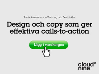
- 1. Patrik Åkerman von Knorring och David Aler Design och copy som ger effektiva calls-to-action
- 3. Var?
- 5. Världen är större än din sajt...
- 6. Flera CTA på samma sida
- 7. Anpassa efter enhet och sammanhang
- 8. Design
- 10. the less connected they are,” writes Jacob gube in smashingmagazine. “therefore, if you Omgivningen spelar roll have other elements that can help convince users to take action, reduce the white space in warm background colors, such as red and orange, which appear larger than colors suggesting coldness, blue and green. warm colors appear closer to the viewer. Share This Ebook! www.Hubspot.com
- 11. ”Above the fold”
- 12. Tänk på kontrasten Klicka här Klicka här Klicka här
- 13. even more irresistible call-to-action. other design styles that you can apply to your call-to-action Interaktiva effekter include drop shadow, text and button bevels and gradient colors. All these options are available through Hubspot’s call-to-Action builder. Share This Ebook! www.Hubspot.com
- 15. Skapa en riktning Share This Ebook! www.Hubspot.com
- 16. Användartesta
- 17. while you should focus on your call-to-action text, don’t forget that graphics can help convey meaning and strengthen your message. they are especially useful in explaining a concept that is Fokusera på texten... hard to explain with words alone. Share This Ebook! www.Hubspot.com
- 18. Vad du säger
- 19. Tänk på VAD och FÖR VEM Har du koll på vad som lockar just dina kunder? (Dvs högst kvalitet för kunden) Högst värde för dig? Kommande kampanjer Personligt anpassad? Vad förstår kunden?
- 20. Tänk på satsdelarna (!) Glöm inte verbet - (genererar t ex mest delningar på Twitter) Undvik onödiga adverb (nu, snabbt) - använd bara om de förtydligar Gör det angeläget
- 21. Ta fram fördelarna 90 - 150 tecken totalt Betona fördelarna och hur besökaren blir belönad eller smartare eller mer framgångsrik etc (insikter, expertråd, testresultat) 2-3 meningar med USPar som kortas ned Undvik tekniska termer Undvik standard ”klicka här”
- 22. Fördelen för kunden i centrum
- 24. Siffror, siffror Internet är fullt av vaga otydliga 31 MASTERING THE DESIGN & COPY OF CALLS-TO-ACTION påståenden example of an A CALL-TO-ACTION TEST: Vad får jag - hur många, hur länge, hur The screenshot below is of a call-to-action A/B test that sought to compare two offer types. The image actually illustrates what HubSpot’s homepage used to look like in 2010! många sidor, hur många intervjuade i Originally, HubSpot’s homepage offered our community a seven-day free trial. However, we were rapporten, hur många har redan köpt curious to see if offering a longer trial period would entice more visitors to sign up. Would it have free trial and the treatment offered a 30-day free trial. Extra bra som rubriker på pressreleaser, epost etc CONTROL
- 25. which is meant to engage the reader Var stolt immediately and create some urgency. The image also creates a clear Kundcitat om hur bra du är connection to the idea of who the CTA is targeting. Lastly, the description is very Frågor som bara du kan svaren på detailed and includes a number. This call-to- happy cust technique m the compan verbiage in of urgency Share This Ebook!
- 26. Sammanfattningsvis Tänk på kundens behov och förförståelse Tänk på sammanhanget Många ställen i flera digitala kanaler passar bra för effektiva CTA Designen stödjer copy Verb + siffror Placera ALDRIG en CTA på landningssidan för en annan CTA!
- 28. Punkt 1 Punkt 2 Dax för Punkt 3 övning! Osv....
- 29. VAR: i köpcykeln t Uppm enhe är åt ks Bel a m he t ns Levera Intresse Köp Be Köp gä r
- 30. HUR: Röda korset
- 31. Just nu: Cloud Nine bjuder på mikroanalys av konvertering på er sajt Boka analys nu (Endast 10 kvar)