Label placement on forms, STC Seattle 2010
•Transferir como PPT, PDF•
1 gostou•291 visualizações

A presentation on Label placement in forms, at the Technical Communication Summit, Seattle, US, April 2010. Amongst the time-consuming controversies we look at are left and right alignment, labels above and below fields, how to handle required fields, colons, and sentence case.

Recomendados
Recomendados
Mais conteúdo relacionado
Mais procurados
Mais procurados (17)
Semelhante a Label placement on forms, STC Seattle 2010
Semelhante a Label placement on forms, STC Seattle 2010 (20)
Mais de Caroline Jarrett
Mais de Caroline Jarrett (20)
Último
Último (20)
Label placement on forms, STC Seattle 2010
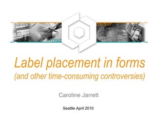
- 1. Label placement in forms (and other time-consuming controversies) Caroline Jarrett FORMS CONTENT Seattle April 2010
- 2. A bit about me: Caroline Jarrett Consultancy: www.effortmark.co.uk Training: www.usabilitythatworks.com Forms advice: www.formsthatwork.com Editing tips: www.editingthatworks.com Jarrett and Gaffney (2008) Forms that work: Designing web forms for usability Morgan Kaufmann Stone, Jarrett, Woodroffe and Minocha (2005) User interface design and evaluation Morgan Kaufmann 2
- 3. 3 Agenda Label placement on forms • Where people look on forms • How this influences placing of labels Let’s stress about details • Colons in front of labels • Sentence or title case for labels • Required field indicators Two ways to trip up your users • It’s not OK and I don’t want to cancel • ‘False ends’ If it looks good, it’s easy to use: • Keep the logo in proportion • Calm your creative impulses • Design to a grid • Use rules with a light touch
- 4. 4 Where people look on forms Reading forms is different from using them The ‘face and vase’ effect – and why your logo goes in the top left The ‘narrow focus’ effect – and what it means for placing labels
- 5. 5 Reading forms is different from using them
- 6. 6 Reading forms is different from using them
- 7. 7 Are my observations confirmed by eye-tracking? A look at some heat maps Examples thanks to permission from Ian Roddis, Head of Online Services, The Open University
- 8. Ordering a prospectus • User has chosen a prospectus • Postcode lookup for the address 8
- 9. 9 One person’s heat map • Small green dots show narrow focus on labels and left end of fields • Red crosses show clicks
- 10. 10 An aggregate • Narrow focus on the easy questions at the top • Gets messy further down: harder questions, more answers to consider
- 11. 11 The ‘face and vase’ effect – task can drive where you look • If you want to, you can decide to look at the faces (black) or the vase (white) • Change of task, change of vision: the same thing works on the web image from Eye Site, part of the University of Illinois Eye Center http://www.uic.edu/com/eye/LearningAboutVision/EyeSite/OpticalIllustions/FaceVase.shtml
- 12. 12 Now try it for yourself • Pick ONE of these two tasks: – “Look for something to help you plan your assignment” – “Find out how to contact the Open University”
- 13. 13 Face and vase / figure and ground on the web
- 14. 14 User never glances at the header until the task requires header-type information Looking for ‘contact us’Looking for ‘planning’
- 15. 15 If the form is going well, no need to look elsewhere
- 16. 16 Make sure ‘page furniture’ is there for users when they need it • Page furniture is the stuff on the page that isn't the form • When users swap tasks, they look in the page furniture – “Who are you?” – “I want to contact you” – “I want help” – “How do I save the form?” • It helps users if the items they need are in familiar places: – “Contact us” header or footer – “Search” top right (next best: top of left margin) – “Help” top right of page – Your logo top left corner
- 17. 17 Back to labels. The ‘narrow focus’ means big jumps for the users’ eyes.
- 18. 18 Mario Penzo’s recommendation: “Place labels above or right-align them” Penzo, M (2006) Label Placement in Forms http://www.uxmatters.com/MT/archives/000107.php
- 19. 19 Are all these questions equivalent? Where do the answers come from? • Your address • Your city • Company you work for • Number of colleagues • Your address • Your city • Company you work for • no of colleagues • Name • Surname • Age • City
- 20. 20 Easy questions and hard questions prompt different patterns of reading • Users glance at populated answers • Users look mostly at the left end of the answer space for easy questions • Users read complex instructions quite carefully... • ... provided they are on the way to their goal
- 21. Update: Labels above the fields may be no faster than right aligned labels • Das, McEwan and Douglas investigated label placement • Chose a simple form with simple questions • Found no difference between labels above the fields and right-aligned labels Das, McEwan and Douglas (2008) Using eye-tracking to evaluate label alignment in online forms, NordiCHI '08: Proceedings of the 5th Nordic conference on Human- computer interaction: building bridges 21
- 22. A section of a form where I think left-aligned labels really are necessary 22
- 23. Users can survive a lot 23
- 24. Method 1 (more effort): Decide where to put your labels according to your users, their goals, and the questions Your users and their goals .... Your questions ... Put the labels ... Willing to reveal the answers; filling in the form helps them to achieve a goal Simple, only a few of them Above Simple but lots of them Right-justified Complex Left-justified Unwilling to reveal answers or reluctant to fill in the form Simple or complex Left-justified (you’ll need more explanation) 24
- 25. 25
- 27. 27
- 28. 28 Interlude by kind permission of Steve Krug, author of “Don’t Make Me Think” and “Rocket Surgery”
- 29. 29
- 30. 30
- 31. 31 As you’d expect, Steve goes on to recommend usability testing • Usability testing gets you away from ‘religious wars’ • Even one test with one (possibly unrepresentative) is better than nothing
- 33. Method 2 for labels (guaranteed success): Choose anything harmonious then test and test • Any reasonably harmonious arrangement of labels and boxes is likely to be OK • The only guaranteed way of achieving a good form is: – Test YOUR form with YOUR users – Make changes based on what you find – Test again with (different) users – Make more changes – Repeat until the form works 33
- 34. 34 Let’s stress about details Colons at the end of labels? Sentence or title case? Required field indicator?
- 35. 35 Colons at the ends of labels are a matter of considerable debate Pick one style. Stick with it. It’s not worth arguing about. http://www.usabilitynews.com/news/article3200.asp and http://www.usabilitynews.com/news/article3112.asp
- 36. 36 Sentence or title case? Sentence case wins. (But only just). • This is sentence case • This is Title Case • This Is Capitalisation Of Each Initial Letter • ISO-9241 part 17 says • "Initial upper-case (capital) letter for field labels: To facilitate readability, the text field labels begin with an upper-case letter. The rest of the label should contain lower case (small) letters except for cases where the label is a logo, an acronym or language convention that requires each word in the label to begin with a capital letter.“ • Sentence case is slightly more legible due to familiarity • It’s not worth changing a big suite of forms to fix this http://www.usabilitynews.com/news/article2594.asp
- 37. 37 Required field indicator? (There’s a theme developing here...) • Miriam Frost Jungwirth: • “I was once charged with testing that. Seriously. $10,000 of manhours testing asterisk placement. There was no difference in user performance. At all.“ • I’m a little more interested in this discussion: – Indicators placed to the right are likely to be invisible – Put the text describing the indicator at the top of the fields (that is, not at the end of the form and not in the instructions) – Use the same indicator in both places (text and next to required field) – Use the alt-text ‘required’ (not ‘asterisk’) – Always indicate required; don’t switch to indicating ‘optional’ – If you feel the urge to indicate ‘optional’, use the word ‘optional’ – Do not use colour on its own as an indicator Miriam Frost Jungwirth, posting on CHI-WEB, 19 April 2007
- 38. 38 A few examples of required field indicators
- 39. 39 A few examples of required field indicators
- 40. 40 A few examples of required field indicators
- 41. 41 A few examples of required field indicators
- 42. Which is the most important problem • Examine the Michigan Department of Transport form • Find as many usability problems as you can • Decide which ONE problem is the most important 42
- 43. Three details that do affect users 1. It’s not OK and I don’t want to Cancel 2. Shorter preambles 3. ‘False ends’ 43
- 44. Buttons really do matter to users. 44
- 45. 1. Label the button with what it does. 2. If the user doesn't want to do it, don't have a button for it. • “OK” works – if it makes sense to say “OK” at that point • “Reset” probably doesn’t work • Reset Button: INPUT TYPE=RESET An INPUT element with `TYPE=RESET' represents an input option, typically a button, that instructs the user agent to reset the form's fields to their initial states. The VALUE attribute, if present, indicates a label for the input (button). When you are finished, you may submit this request: <input type=submit><br> You may clear the form and start over at any time: <input type=reset> http://www.w3.org/MarkUp/html-spec/html-spec_8.html#SEC8.1.2.8 45
- 46. Three details that do affect users 1. It’s not OK and I don’t want to Cancel 2. Shorter preambles 3. ‘False ends’ 46
- 47. A/B testing Varied: • photo • background • colours • shading • buttons • preamble 47
- 48. In our 2004 study, we found that only a better preamble made any real difference • We tested a wide selection of visual variants of a form • Variants improved conversion rates • The only variation that achieved statistical significance was the improved preamble: – Shorter – Clearer – Better layout Jarrett, C. and Minott, C. (2004) Making a better web form Proceedings of the Usability Professionals' Association Conference, Minneapolis, Minnesota, USA. http://www.formsthatwork.com/files/Articles/BetterForm.pdf 48
- 49. 66 words 49
- 50. 28 words 50
- 51. Three details that do affect users 1. It’s not OK and I don’t want to Cancel 2. Shorter preambles 3. ‘False ends’ 51
- 52. ‘False ends’: if it feels like the end of the conversation, users will stop 52
- 53. ‘False ends’: if it feels like the end of the conversation, users will stop 53
- 54. Avoid screens in the middle of forms that have no fields for user entries • Option 1: save a ‘false end’ screen for the true end of the conversation • Option 2: include a question that guides users around the ‘false end’ screen 54
- 55. 55 Now try it for yourself • Design a solution to the ‘false end’ in the tax form
- 56. 56 If it looks good, it’s easy to use Keep the logo in proportion Calm your creative impulses Design to a grid Use rules with a light touch
- 57. 57 Some branding reinforces your form’s credibility.
- 59. 59 Where is the form? Too much branding
- 60. 60 Another, more recent, look at the Marvel site
- 61. 61 Another, more recent, look at the Marvel site
- 62. 62 Is this just right? Or too much?
- 63. 63 If it looks good, it’s easy to use Keep the logo in proportion Calm your creative impulses Design to a grid Use rules with a light touch
- 64. 64 Calm your creative impulses.
- 65. 65 More conventional: easier to use, still offers opportunities for improvement
- 66. 66 If it looks good, it’s easy to use Keep the logo in proportion Calm your creative impulses Design to a grid Use rules with a light touch
- 67. 67 Design to a grid: work with the graphics in the shape of the page
- 68. 68 Keeping to a grid: starts well
- 69. 69 Example: chipping at the grid
- 70. 70 Design to a grid: if you give up entirely, it looks a bit inept
- 71. 71 Design to a grid: if you give up entirely, it looks a bit inept
- 72. 72 A before- and after- example. First of all, the old one. Plenty of grid problems.
- 73. 73 Currently: tidied up, and with page furniture
- 74. 74 Design to a grid: think about the whole page as well as the fields
- 75. 75 Design to a grid: now it has a grid – but also invisible instructions
- 76. 76 Now try it for yourself • Design a solution for ‘invisible instructions’ on the ACT form
- 77. 77 If it looks good, it’s easy to use Keep the logo in proportion Calm your creative impulses Design to a grid Use rules with a light touch
- 78. 78 Taking out some lines can help • This is a USA tax form • I thought it looked disorganised
- 79. 79 Drawing the grid shows problems • This shows just a few lines on the grid • I could easily draw five times as many
- 80. 80 Back to the form
- 81. 81 Try lining it up and lightening up • In this version: – removed some lines – lined up as many as possible – replaced some with grey lines
- 82. 82 1040X before and after (maybe?)
- 83. 83 Another rules experiment: better or worse?
- 84. 84 Another rules experiment: better or worse?
- 85. 85 Another rules experiment: better or worse?
- 86. 86 A final thought on rules: the famous ‘Butterfly’ ballot
- 87. 87 Most statistical analyses claim that the Buchanan vote was anomalous; some do not Dillman, D. (2007) Mail and Internet Surveys: The Tailored Design Guide; Wiley
- 88. 88 The final words A cautionary tale What really matters to users
- 89. 89 A cautionary tale: actual user behaviour on your real form beat all guidelines • Background – A new form for a UK government department – Followed all my own guidelines and ideas • Tested with 5 participants • The results – Five out of five filled in the whole form, even though the guidance should have directed them elsewhere – Four out of five never found out what they were applying for – They still considered it was pretty easy on the whole
- 90. It’s what you ask and why that really matters • Users rarely abandon forms because of: – Label placement – Use of colons – Required field indicators – Sentence or title case • Users often abandon forms or lie on them because of: – Questions that they don’t understand – Questions that they have no answer for – Intrusive questions that are inappropriate to the task – Validations that refuse their preferred or correct answer 90
- 91. 91 Question time Caroline Jarrett carolinej@effortmark.co.uk +44 1525 370379 I’m a consultant, hire me: Consultancy: www.effortmark.co.uk Training: www.usabilitythatworks.com Free stuff: Forms advice: www.formsthatwork.com Editing: www.editingthatworks.com Columns: www.usabilitynews.com “Caroline’s Corner”