
Recomendados
Mais conteúdo relacionado
Mais procurados
Mais procurados (19)
Semelhante a Contents Production
Semelhante a Contents Production (20)
Mais de chrispatonmedia
Contents Production
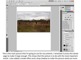
- 1. This is the main picture that I’m going to use for my contents. I stretched it across the whole page to make it large enough. This shows that this picture is to do with the most important article. I also added a stroke effect and a drop shadow to make the picture stand out more.
- 2. Here, I have added some information with the picture – the page number, the band’s name, and a short description of what the article is about.
- 3. This is the title I will use for the page. The large yellow font conforms to the colour scheme of the front cover.
- 4. I added a second image which is of a person against a grey background. To make the image more interesting I created the effect of his head overlapping the edge of the square.
- 5. Here I have added the articles that are found inside the magazine. It is laid out in two sections, features, and regulars. This follows conventions of magazines. I added black boxes as a background to the text which sticks with the page’s colour scheme.
- 6. I added two extra parts which you can usually find on contents pages – an editors letter and information on how to subscribe. This also filled in the empty space I had on my cover.
- 7. I changed the fonts to some custom ones downloaded of dafont.com. I have used the same fonts as on the front cover: Alegre Sans, Steelfish and SF Movie Poster. I also added a gradient background which also sticks to the scheme of the front cover.
- 8. This the contents page that I will ask for audience feedback on.