SlideShare uma empresa Scribd logo
1 de 3
Overview of Front Covers
Front Covers


These front covers are from the magazines ‘XXL’ and ‘Vibe’ and both magazines use key conventions
of the genre to attract the fans of the Hip-Hop and Rap music genre to their magazine. Through
comparing these two magazines it is possible to find similarities that are both used in the magazines
and the genre in general.

These magazines follow key general and layout conventions of their music genre with the main
image that fills the frame, sell lines surrounding the main image, a masthead that is designed
appropriately for the genre and popular artist’s names on the side on the right side of the front
cover.
More conventions include a solo artist looking directly into the camera, giving direct address and a
sell line next to the main image relating to the artist on the front cover. Some times two or more
artists feature on the front cover but typically a solo artist features. This is to show that Hip-
Hop/Rap bands/duets are not as popular as solo artists in the genre. This is because of the self-
centred lyrics that are typically used within the genre. The artists are positioned close to the
camera, except for Jay-Z in XXL, to help fill the frame more and to make them look bigger, stronger
and more powerful. This is a conventional look for artists in this genre and makes the front cover
very eye-catching to the reader. Interestingly, no feature article photographs appear which is then
replaced with the featured artist’s name in a larger and bolder font than the rest of the front cover
except from the masthead.

There are many specific mise-en-scene elements that feature within the Hip-Hop/Rap genre that are
shown in these front covers. Artists mainly wear a lot of or all black clothes but this is not
conventional, as some artists like Chris Brown and Kanye West who feature in ‘Vibe’ magazine’ wear
different coloured outfits including, red white and blue. The actual clothes vary somewhat. Jay-Z
and Dr. Dre are wearing long, black leather jackets while 50 Cent wears a black vest and Nas wears a
black hoody. In longer shots of the artists (medium shots or long shots) they are seen either wearing
black trousers or black jeans. The colour black is conventional to some degree but does not have to
be used and artists can where whatever they like to help their star image.

Artists normally have their hair short and sometimes wear hats called Snapbacks. These are a
popular style of hat that followers of the Hip-Hop/Rap genre would usually wear. Another specific
mise-en-scene element of the Hip-Hop/Rap genre is the use of chains worn by the artists. They are
usually silver or gold which gives off the impression that they are very rich and can afford large
amounts of gold and silver.

The featured artists all have snarly and angry expressions on their face. This is conventional of Hip-
Hop/Rap magazines as this gives a look of intimidation and that they do not care about anything.

Both ‘XXL’ and ‘Vibe’ have large and bold mastheads that are in a display font. This is a conventional
look for Hip-Hop/Rap magazines. The reason why the masthead is in a large, bold display font is to
attract the reader to the magazine. These fonts can be very eye-catching, especially ‘XXL’’s
masthead as it normally has a white background, with a red masthead background with white text.
These mastheads are also slightly overlapped by the featured artist. This is to make the artist as eye-
catching as possible and to make them look more powerful.

The sell lines also follow a key layout convention by having only two sell lines. One sell line features
the main artist’s name in a bigger font than anything on the front cover apart from the masthead
and under it the name is accompanied by further text e.g. “NAS. You can hate the move to Def Jam
but Esco says he’s still the man”. The second sell line features a list of popular artists that also
feature within the magazine, often on the right side of the front cover. This will attract the reader to
the magazine as their favourite artists may be featured in the list. ‘Vibe’ features straplines but ‘XXL’
doesn’t. It is clear that straplines are not very conventional but can add more information to the
front cover, promoting a featured article within the magazine e.g. “Exclusive on-set report: The
making of Notorious. 10 B.I.G secrets the film won’t tell”. One reason for only two sell lines may be
due to the fact that the main image needs to fill the frame and to be as eye-catching as possible.
There are no feature article photographs which gives the magazines a more serious and masculine
feel.

The bar code is usually placed in the bottom left or the bottom right of the page and is rotated so
that it is hard to see for the reader. This layout technique is used to keep attention to the main
artist featured on the front cover and the sell lines surrounding it. The reason why the bar code is
placed at the bottom of the page is because it is the last place that the readers will look.

‘Vibe’ and ‘XXL’ both use certain colours like black, white and red. Even though these colours are
conventional it is okay to use other colours such as blue and yellow. The use of these colours can
make it more eye-catching for the reader. The use of black, white and red is used a lot because they
are contrasting colours which makes the pages of the magazine easy to read. These colours are all
primary colours so it appeals to a masculine, male audience.

By investigating both ‘Vibe’ and ‘XXL’, it is clear that these magazines have their own brand identity
but follow many conventions of the Hip-Hop/Rap magazines. This can make these magazines very
recognizable to their target audience. The layout and overall look of the magazines are repeated to
keep a brand identity and this allows these magazines to sell a lot of copies.

Mais conteúdo relacionado

Mais de Chris Donnellan (8)

Filming Schedule
Filming ScheduleFilming Schedule
Filming Schedule
 
Call Sheet 5
Call Sheet 5Call Sheet 5
Call Sheet 5
 
Call Sheet 4
Call Sheet 4Call Sheet 4
Call Sheet 4
 
Call Sheet 3
Call Sheet 3Call Sheet 3
Call Sheet 3
 
Call Sheet 2
Call Sheet 2Call Sheet 2
Call Sheet 2
 
Call Sheet 1
Call Sheet 1Call Sheet 1
Call Sheet 1
 
Call Sheet 6
Call Sheet 6Call Sheet 6
Call Sheet 6
 
Overview of contents pages
Overview of contents pagesOverview of contents pages
Overview of contents pages
 

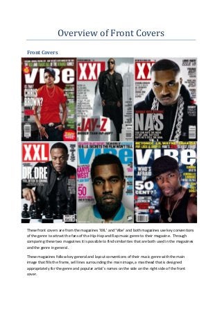
Overview of front covers

  • 1. Overview of Front Covers Front Covers These front covers are from the magazines ‘XXL’ and ‘Vibe’ and both magazines use key conventions of the genre to attract the fans of the Hip-Hop and Rap music genre to their magazine. Through comparing these two magazines it is possible to find similarities that are both used in the magazines and the genre in general. These magazines follow key general and layout conventions of their music genre with the main image that fills the frame, sell lines surrounding the main image, a masthead that is designed appropriately for the genre and popular artist’s names on the side on the right side of the front cover.
  • 2. More conventions include a solo artist looking directly into the camera, giving direct address and a sell line next to the main image relating to the artist on the front cover. Some times two or more artists feature on the front cover but typically a solo artist features. This is to show that Hip- Hop/Rap bands/duets are not as popular as solo artists in the genre. This is because of the self- centred lyrics that are typically used within the genre. The artists are positioned close to the camera, except for Jay-Z in XXL, to help fill the frame more and to make them look bigger, stronger and more powerful. This is a conventional look for artists in this genre and makes the front cover very eye-catching to the reader. Interestingly, no feature article photographs appear which is then replaced with the featured artist’s name in a larger and bolder font than the rest of the front cover except from the masthead. There are many specific mise-en-scene elements that feature within the Hip-Hop/Rap genre that are shown in these front covers. Artists mainly wear a lot of or all black clothes but this is not conventional, as some artists like Chris Brown and Kanye West who feature in ‘Vibe’ magazine’ wear different coloured outfits including, red white and blue. The actual clothes vary somewhat. Jay-Z and Dr. Dre are wearing long, black leather jackets while 50 Cent wears a black vest and Nas wears a black hoody. In longer shots of the artists (medium shots or long shots) they are seen either wearing black trousers or black jeans. The colour black is conventional to some degree but does not have to be used and artists can where whatever they like to help their star image. Artists normally have their hair short and sometimes wear hats called Snapbacks. These are a popular style of hat that followers of the Hip-Hop/Rap genre would usually wear. Another specific mise-en-scene element of the Hip-Hop/Rap genre is the use of chains worn by the artists. They are usually silver or gold which gives off the impression that they are very rich and can afford large amounts of gold and silver. The featured artists all have snarly and angry expressions on their face. This is conventional of Hip- Hop/Rap magazines as this gives a look of intimidation and that they do not care about anything. Both ‘XXL’ and ‘Vibe’ have large and bold mastheads that are in a display font. This is a conventional look for Hip-Hop/Rap magazines. The reason why the masthead is in a large, bold display font is to attract the reader to the magazine. These fonts can be very eye-catching, especially ‘XXL’’s masthead as it normally has a white background, with a red masthead background with white text. These mastheads are also slightly overlapped by the featured artist. This is to make the artist as eye- catching as possible and to make them look more powerful. The sell lines also follow a key layout convention by having only two sell lines. One sell line features the main artist’s name in a bigger font than anything on the front cover apart from the masthead and under it the name is accompanied by further text e.g. “NAS. You can hate the move to Def Jam but Esco says he’s still the man”. The second sell line features a list of popular artists that also feature within the magazine, often on the right side of the front cover. This will attract the reader to the magazine as their favourite artists may be featured in the list. ‘Vibe’ features straplines but ‘XXL’ doesn’t. It is clear that straplines are not very conventional but can add more information to the front cover, promoting a featured article within the magazine e.g. “Exclusive on-set report: The making of Notorious. 10 B.I.G secrets the film won’t tell”. One reason for only two sell lines may be due to the fact that the main image needs to fill the frame and to be as eye-catching as possible.
  • 3. There are no feature article photographs which gives the magazines a more serious and masculine feel. The bar code is usually placed in the bottom left or the bottom right of the page and is rotated so that it is hard to see for the reader. This layout technique is used to keep attention to the main artist featured on the front cover and the sell lines surrounding it. The reason why the bar code is placed at the bottom of the page is because it is the last place that the readers will look. ‘Vibe’ and ‘XXL’ both use certain colours like black, white and red. Even though these colours are conventional it is okay to use other colours such as blue and yellow. The use of these colours can make it more eye-catching for the reader. The use of black, white and red is used a lot because they are contrasting colours which makes the pages of the magazine easy to read. These colours are all primary colours so it appeals to a masculine, male audience. By investigating both ‘Vibe’ and ‘XXL’, it is clear that these magazines have their own brand identity but follow many conventions of the Hip-Hop/Rap magazines. This can make these magazines very recognizable to their target audience. The layout and overall look of the magazines are repeated to keep a brand identity and this allows these magazines to sell a lot of copies.