Boost PC performance: How more available memory can improve productivity
Contents
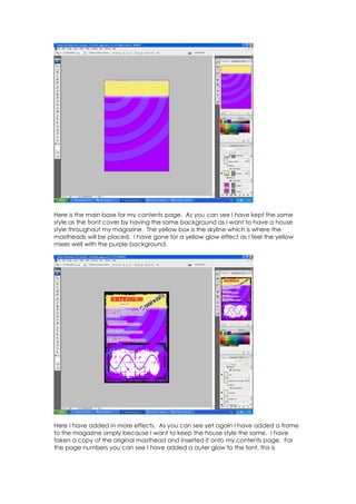
1. Here is the main base for my contents page. As you can see I have kept the same
style as the front cover by having the same background as I want to have a house
style throughout my magazine. The yellow box is the skyline which is where the
mastheads will be placed. I have gone for a yellow glow effect as I feel the yellow
mixes well with the purple background.
Here I have added in more effects. As you can see yet again I have added a frame
to the magazine simply because I want to keep the house style the same. I have
taken a copy of the original masthead and inserted it onto my contents page. For
the page numbers you can see I have added a outer glow to the font, this is
2. because I want to make the writing stand out so I simply added a slight glow to do
that.
Here is my completed contents page, I wanted to try and stay original so I put in an
editors column which is what most music magazines have with a paragraph of what
to expect in the magazine. And you can see I have inserted an image from one of
the double page spreads because it gives the readers an idea of the main article
featured in this magazine.