![Conforming With Conventions ,[object Object],[object Object],[object Object],[object Object],[object Object],[object Object],Image: her face is looking towards the reader, more interactive One person in the image looks neater and doesn’t look to crowded Reboard font Agency FB font Justfist font](data:image/gif;base64,R0lGODlhAQABAIAAAAAAAP///yH5BAEAAAAALAAAAAABAAEAAAIBRAA7)
Recomendados
Mais conteúdo relacionado
Mais procurados
Mais procurados (20)
Destaque
Destaque (13)
Semelhante a Evaluation
Semelhante a Evaluation (20)
Último
Último (20)
Evaluation
- 1. Evaluation
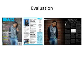
- 3. Eye flow is a C shape first thing the reader looks at is the title then what's inside, then the picture and down do the subscription. Cover stories and editorial pillars are included in a neat way so its easy for the reader to navigate around and read them , cover stories are in bold to attract the readers attention and explanatory text is short and brief doesn’t reveal too much about the story but enough to attract the reader Date and issue number at the top of the page, subscription option to the magazine at the bottom in a big font so that it attracts readers attention Image: Both images conform with the colour scheme of blue and the page numbers on the pictures are yellow In the photos the models are looking towards the reader which attracts the reader because makes them feel more interacted with the magazine Includes a page number at the bottom Caviar dreams font Static buzz font Agency FB font
- 4. Slug Drop Cap Title Pull quote By line Conforms with conventions, includes all of the aspects of a double page spread Eye flow start from the picture them to the title and down in the text, very neat layout so the reader can easily navigate around the page good orientation for the reader Image: The model is looking directly to the reader which again makes the reader feel more interacted, the sides of the image fades into black which I thought was a good effect because it gives the effect of darkness which goes with the actual story as it talks about her hard life Page number
- 5. How does your media product represent particular social groups? The social groups represented in my magazine are urban groups because it is an urban grime magazine which relates to more of the underground music scene, some of the artists aren't known as the music hasn’t gone mainstream The stereotypes of the social group is a street wise youth who probably has a troubled background because most of the artists sing or rap about their life and what they have been through so these youths can relate to it The models costumes represent this - baggy jeans, hoodies, sportswear, bandanas, also the location is on the street which represents the “streetness” of these social groups - this is shows in these pictures: The language in the double page spread is very informal and the interviewee uses slang words which represent the social group
- 7. Audience The audience would be 13-24 year olds men and women of the socio economic groups C2, D and E and would be people trying to get into the rap industry. The audience may be students and teenagers who have quit school, also young adults who are known as “chavs” How did you attract/address your audience? The language-register used in the whole magazine is very informal and so I would say its casual register. Slang, vulgarities and colloquialisms are normal in the groups and therefore slang is used in some language to engage more with the reader The choice of articles used I thought would attract the reader because they are all to do with the genre of music and gossip within that genre, the main bands and rap artists were mentioned to attract the reader also such as K Koke and Drake and Giggs Lastly the models used would attract and address the audience because I used street looking models who like the genre of music so the readers can relate to them