
Recomendados
Mais conteúdo relacionado
Mais procurados
Mais procurados (20)
Destaque
Semelhante a Digipak Design Analysis of Taylor Swift and Ariana Grande Album Covers
Semelhante a Digipak Design Analysis of Taylor Swift and Ariana Grande Album Covers (20)
Mais de charheap2244
Último
Último (20)
Digipak Design Analysis of Taylor Swift and Ariana Grande Album Covers
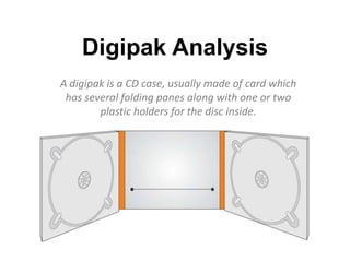
- 1. Digipak Analysis A digipak is a CD case, usually made of card which has several folding panes along with one or two plastic holders for the disc inside.
- 2. Taylor Swift- Speak Now Colour Scheme: The colours used on this album cover are a combination of purple, white and gold, by using these three colours it gives off a magical feeling for this album which could even give us a hint towards her style of songs. As well as this the sparkly dust which is surrounding the words also represents the magical theme. The font used on the front cover of this digipak is quite girly and unique as well as it being in italic style. This helps represent the magical side to this album and also gives us a taster that she is happy etc. This mid shot of Taylor swift in a purple dress tells us that she is confident by her facial expressions shown. This also emphasizes the title of the album “Speak Now” as her facial expression shows she isn’t afraid of anything Because of Taylor’s album we are able to identify that her target audience is teenage girls. This is because of the colour scheme, her own style and the font represents who she is. This makes it easier for the audience to be able to relate to her.
- 3. The background shows us an art piece, which could also tell us that her songs within this album are also an art piece and are something she can relate too. The CD itself emphasizes more of the album as there is eight hands shown which all have a different later which spell out ‘speak now’. I think this image shows you that people should never feel alone and can always have someone to speak. However it could also show that Taylor is uniting with her fans and that they are not alone and her music will show that she is there for them. This side of the digipak for Taylor Swift comes across with a vintage style. This could show that her album may also have a unique/vintage theme to it as well as its magical theme
- 4. The font on this back cover of the album is quite similar to the front with the curls in the lettering and the italic style. The colours used within the side of the album are also very bright and obvious which help support her magical theme. As well as this they have used a corner of a frame in the bottom left corner this also supports the magical/fairytale theme. Similarly to the front cover, Taylor is wearing a sparkly vibrant dress and is looking away from the camera. She is also doing a very similar pose to the famous Marilyn Monroe pose of her dress flaring up in the air. This could also support the fairytale/magical idea. The production company is shown to inform everyone who will be distributing the album. Overall I think the design layout of this digipak is a simple design. However it is also very effective as it has given us a strong idea of what the theme of the album is based around and the way Taylor Swift represents herself.
- 5. Ariana Grande- My Everything The pose Ariana Grande is sat is makes her look quite innocent, despite her legs on show. Through this shot and the title together is it clear that is it feminine and ‘girly’ album which the music within it is going to be about love. The font used on this front cover of the digipak is shown in white so it stands out from the background. Both the title of her name is printed in as small font however her name is easier for the audience to read than the title of the album, implying that her name is more important that the album itself which creates her a brand image. Ariana is shown in a black and white image which makes her stand out from the purple background which allows the audience to draw attention to her more easily. The use of herself instead of any type of album artwork is a typical convection of a pop artist digipak as with other genres the artist give them something to follow where as with pop artist it is mainly about themselves and their image.
- 6. The photo use on the CD itself it from a shot within one of her music videos. In the video she is seen with the projected shadows on her face so it allows the audience to know that the person within her video is the same. As well as this the photo itself it quite illuminating which grabs the audiences attention onto her. Further more the pattern also reinforces the vintage idea as it appears like an old film footage and camera on her face. The CD also has a similar colour scheme to the front cover of this digipak. This creates a familiarity to her audience and makes them relate to Ariana to girly colours such as purple. The close up of her face can relate to Andrew Goodwin’s theory and the fact that institutions want a lot of close ups in the music video and therefore the CD design as well.
- 7. The track list on the back of the digipak does not include any artwork. This ties in with the simple cover and image throughout the whole of the digipak. The black font makes it easier for the audience to read what songs are featured and follow it through on the CD. The style of typography used on this back cover is also very simple in relation to the rest of the font. It is stereotypically gender neutral as it isn't rounded and typically girly but also not squared off and aggressive as you would expect for a male target audience. At the bottom of the back cover the songs have been squared off from the barcode etc. the reason for why this has been done it because it is important that the audience read the song list first due to a large amount of simplicity. Overall the digipak itself is shown in a simple way through both layout of design of it all giving the audience a calm feeling towards this album.