
Recomendados
Mais conteúdo relacionado
Mais procurados
Mais procurados (19)
Destaque
Destaque (16)
Semelhante a Eval for mag
Semelhante a Eval for mag (20)
Mais de chappleaaron00
Mais de chappleaaron00 (20)
Eval for mag
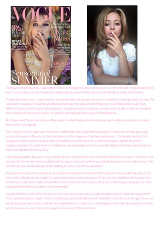
- 1. . InDesign and photo shop. I used photo shop to change the colour of my nail to white and add more blonde to the hair. I used colour contrast and photo brightness to enhance the colour as the photo as it was dark before. To look like Kate moss I made my hair the same style and I posed the same. I could find a background that was the same but to improve I could have edited something that looked something like it on Photoshop.I used Text, different types of font and on photoshopfor cropping tool for cropping my own photo. I also used the smudging tool to make my face look clearer. I used the spot healing tool to get rid of blemishes. No I have used the same tools as other projects which helped me finish my project editing quicker as I already knew what I was doing. The strengths of my cover are the colour match that I did using Photoshop tools to help me and the pose and colour of my skin in the photo. Also the layout of the magazine I feel was quite exact. The weaknesses of this magazine I felt the photo quality and the background of the picture. I could have gone outside to get the background and this could have also helped to my advantage as there would be lighter including natural light to help intensify the photos quality. I am pleased with it because they are both similar and I tried my best to make them look the same. The fonts and colours of the text are well matched and the layout of each headline and side heading are in the right places. The only thing that I would change is the setting of where my photo was taken. The photo was easy to re-create as all I needed was white nail varnish thick eyeliner and a pretty top and as my hair isn’t as blonde as the models I used photo shop to take the colour of her hair and highlighted my own hair.I could have used other tools to make the colour of my skin the same as hers and something to elongate my arms and make then thinner as she is a skinny model. I would choose a more difficult cover as this one was pretty easy to copy because all you had to do was get the font, colour and photo right. I think the lighting need to be lighter and I needed it more focus of the person as not all the back ground is unfocused like the original photo. It wasn’t as challenging as I thought it would be but I like what I have done and I chose this magazine because It fitted me best.