The document analyzes the front cover of the September 2009 issue of NME magazine, which features British rapper Dizzee Rascal. It discusses various design elements of the cover including the use of a flasher, large bold masthead, header, cover lines, Dizzee Rascal's image, colors, fonts, and placement of additional information like the barcode. It also provides details on NME's target demographics as mainly men aged 17-30 who are interested in music and new bands.
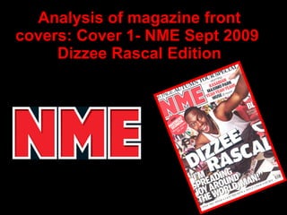
2. FRONT COVER ANALYSIS USE OF A FLASHER- The flasher shows that the magazine offers extra things and seems more special which attracts the audience THE MASTHEAD- The masthead is at the top of the page and is large, bold and uses strong colour- red which makes it stand out and creates an identity for the magazine THE HEADER- The header summarises what the magazine is about and attracts the reader THE SELL LINES/COVER LINES- The sell lines gives the reader a brief idea of what and who is featured in the magazine. There is not a lot of cover lines and offers on this cover which suggests that it is a very popular magazine and sells it self THE MAIN IMAGE- The main image is a long shot of the famous rapper Dizzee Rascal (which is clearly shown by the large caption placed on the middle of the image) who is crouching down and dominates the page. He is looking straight at the camera with a happy expression which makes cover friendly. In the background there is graffiti which relates to rappers genre of music. Also on the cover there is use of mostly red, white and black which are colours that usually targets the older audience as it is more sophisticated THE MAIN COVER LINE- The main cover line is situated in the middle of the page, it anchors the main image down, it shows the reader who the man is, and that he is the main feature. The font used is large, bold and has a drop shadow effect which makes it stand out. The same font has been used for some of the other cover lines BARCODE-DATE/ISSUE/PRICE- These are important when selling magazines and tend to be quite small in the corner so it is out of the way of the copy THE FOOTER- Other artists featured in magazine. The plus sign suggests there is lots more going on in the magazine USE OF A PULL QUOTE- This pull quote is in a large bold font same as the main cover line and it shows something that Dizzee Rascal has said and gives a good impression of him RULE OF THIRDS- This has not been used properly as the image dominates the page which suggests rebellion like Rap
3.
4. These are the type of imagery, layout, and text that the target audience look for in a NME magazine (large images of popular rock artists/bands, extras/exclusives, mostly music orientated, etc