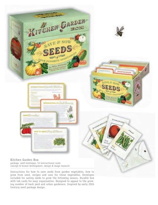
1. Kitchen Garden Box
package, seed envelopes, 52 instructional cards
concept & format development, design & image research
Instructions for how to save seeds from garden vegetables, how to
grow from seed, recipes and uses for those vegetables. Envelopes
included for saving seeds to grow the following season. Durable box
with tab cards for easy organization. Designed to appeal to the grow-
ing number of back yard and urban gardeners. Inspired by early 20th
Century seed package design.
2. The Amazing Magical Wonderdeck
package, booklet, card deck & box, trick cards & envelopes
development & design of all elements
A trick card deck with a fun and instructive illustrated
booklet. Designed to appeal to adults and children
interested in learning and performing a variety of
card tricks and slights of hand.
The design, illustration & typographic style were
inspired by the posters and promotions created for
early 20th century magicians and illusionists.
Package illustration by Jeff Foster. Booklet interior illustrations
by Kevin Sprouls.
3. The Sustainable Business Network Members Directory
2005–2009: covers, interior design sample on request
This directory is designed for consumers who are interested in
shopping sustainably in the Philadelphia area. It lists a wide
variety of businesses and services that are independent and locally
owned such as architects and designers, farmers, green product
suppliers, restaurants and breweries, etc.
4. Buy Fresh Buy Local
Guide cover & interior, postcard & flyer
Guide and advertisements for the nonprofit
group’s yearly campaign to make consumers
aware of markets, restaurants, and stores that
are vendors of locally produced food products.
5. Fair Food & Fair Food Farmstand
trifold & advertisement
Marketing pieces for a nonprofit group that brings farm-
ers and their products in touch consumers via farmers
markets and outreach programs all over the Philadelphia
area. The trifold was a mailer sent to farmers advertising
Fair Food’s services and free workshop program. At right,
one of several advertisements and flyers done to intro-
duce consumers to the Fair Food Farmstand at the Reading
Terminal Market in Philadelphia.
6. Quirk Notes: Owner’s Manual Series
stationery folio with magnetic closure, cards and envelopes
series logo, format development, cover & interior design
Stationery line established to expand the popular
Owner’s Manual series of books and journals. The
Owner’s Manuals are a humorous and informative techy
take on caring for your most prized possessions. The
stationery follows this course and is cute, entertaining
and informative.
Illustrations by Headcase Design.
7. It’s Slinky!
Hardcover book packaged with Slinky
package, hardcover jacket & interior design
A celebration of the classic walking spring; history,
trivia, pop culture. The original 1940’s logo was incor-
porated into a bright retro design for the jacket cover
which functions economically as the main visual for the
clear plastic package.
8. NOW IN HOW MAGAZINE
INTERNATIONAL DESIGN ANNUAL
The Anti-War Quote Book
greyboard cover & interior design
A book of quotes from prominent philosophers, educa-
tors, politicians, scientists, artists, clergy, and soldiers
from antiquity to today.
Left: Experimented with silkscreen on uncoated card-
board to give this cover the look and tactile feel of a
hand made poster.
Below: Interior spreads. Quotes were sometimes illus-
trated and sometimes paired with historical and con-
temporary posters and images of protest.
9. NOW IN HOW MAGAZINE
INTERNATIONAL DESIGN ANNUAL
The Rock Bible
cover & interior design
Written by Henry Owings of Chunklet magazine. Humorous
guidelines for living an authentic rock ‘n roll lifestyle.
Left: This faux leatherette flexibind cover is gold stamped
and has a black ribbon place marker. The bible-like treat-
ment is meant to appeal to an irreverent market; genera-
tions of rock fans.
Below: Interior chapter opener: “The Gospel According to
the Drummer” & interior page.
Interior illustrations by Jonathan Williams.