
Recomendados
Mais conteúdo relacionado
Mais procurados
Mais procurados (20)
Destaque
Destaque (20)
Semelhante a How my media product both uses and challenges magazine conventions
Semelhante a How my media product both uses and challenges magazine conventions (20)
Último
Último (20)
How my media product both uses and challenges magazine conventions
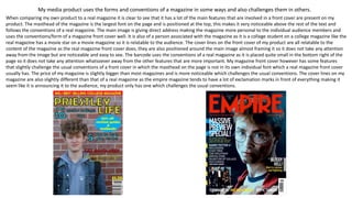
- 1. My media product uses the forms and conventions of a magazine in some ways and also challenges them in others. When comparing my own product to a real magazine it is clear to see that it has a lot of the main features that are involved in a front cover are present on my product. The masthead of the magazine is the largest font on the page and is positioned at the top, this makes it very noticeable above the rest of the text and follows the conventions of a real magazine. The main image is giving direct address making the magazine more personal to the individual audience members and uses the conventions/form of a magazine front cover well. It is also of a person associated with the magazine as it is a college student on a college magazine like the real magazine has a movie star on a movie magazine so it is relatable to the audience. The cover lines on the front cover of my product are all relatable to the content of the magazine as the real magazine front cover does, they are also positioned around the main image almost framing it so it does not take any attention away from the image but are noticeable and easy to see. The barcode uses the conventions of a real magazine as it is placed quite small in the bottom right of the page so it does not take any attention whatsoever away from the other features that are more important. My magazine front cover however has some features that slightly challenge the usual conventions of a front cover in which the masthead on the page is not in its own individual font which a real magazine front cover usually has. The price of my magazine is slightly bigger than most magazines and is more noticeable which challenges the usual conventions. The cover lines on my magazine are also slightly different than that of a real magazine as the empire magazine tends to have a lot of exclamation marks in front of everything making it seem like it is announcing it to the audience, my product only has one which challenges the usual conventions.
- 2. How did you use new media technologies in the construction of your media product? I used the shape tool for the blue circle that is the background of the splash. I also used the same tool to create the red rectangle that is the background for the positioning statement. I used the text tool for the masthead of the magazine and used a stroke effect around the text to make it unique. The text tool was used for the cover lines also in which I made the text larger and smaller to create a better look. I used the insert tool to put my image on the bottom layer so the rest of the features could go on top of it. Layering made me able to put text over different coloured backgrounds – this made it stand out The text tool allowed me to change the colour and size of the font making more important/intriguing features would be more easily seen.
- 3. Strengths My product has many different areas that make it realistic. The skyline at the top of the page is correctly positioned and is easy to see as the background is a separate and contrasting colour to the text that has been wrote on it making it very noticeable as it is telling the audience something that may be important and encourage them to buy the magazine. I used the shape tool on Photoshop well to create a red background colour that the text can be easily seen on top of. The masthead is correctly positioned and the largest font on the page making it the most noticeable and easiest to see so it will attract attention to the magazine. I used an effect on Photoshop to put the black outline around the text making the magazine look unique. Cover lines on my magazine are correctly positioned framing the main image and does not overlap which means they do not take any attention away from the main image, they also give short pieces of information that will encourage the audience to buy the magazine as it is relatable to what they need/want. I used the same effect again on the text to create an outline for a unique look. The main image gives direct address inviting the individual audience members to buy the magazine in a more personal way. The barcode is correctly positioned at the bottom of the page with the price above it. Weaknesses My product has quite a few weaknesses that make it unrealistic. The splash on my front cover was a bit too big and takes up a lot of the page. On Photoshop I was not able to create a different shape that I wanted to e.g. spiky shape so I had to use a shape set on the software. The masthead is in the same font as the other text on the page, this is a huge weakness as the masthead font it supposed to be different to the rest to make it very unique and easily identifiable. This makes it less noticeable and makes it blend in more with the other text. The Photoshop fonts that were available were not as appealing and it was difficult to make the font look different and unique. The price of the magazine is placed at the bottom right above the barcode but is too big and risks taking some attention away from the rest of the features which it should not. Strengths and weaknesses of product
- 4. Strengths and weaknesses: new media technology Strengths: Use of the shape tool – I was able to make some simple but well used backgrounds to help test stand out above the rest of the background that may intrigue the reader more and possibly get them to buy the magazine. Use of text – The colours and sizes I have set my text to attract attention to the rest of the text. Using a separate text box I make the numbers larger than the rest making then stand out. Use of effects on the text – I used the stroke effect on my font to give it a unique look making it specific to this magazine. It also makes the text stand out above the background so it is easily noticeable. Weaknesses: The font – There was a very limited amount of fonts that were available so the text for the masthead is the same as the cover lines which makes it unoriginal text breaking the usual codes and conventions. I did not have an option to make only the subject smaller as it shrunk the whole image so the subject is quite large and dominant over the page.