Responsive web designing course in Chandigarh
•Transferir como PPTX, PDF•
0 gostou•380 visualizações

Responsive Web Designing Course in Chandigarh.We at Big Boxx Academy Chandigarh providing 100% job oreinted courses in HTML5,CSS3,Bootstrap.

Recomendados
Mais conteúdo relacionado
Semelhante a Responsive web designing course in Chandigarh
Semelhante a Responsive web designing course in Chandigarh (20)
Último
Último (20)
Responsive web designing course in Chandigarh
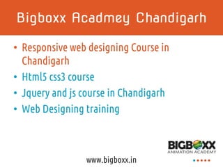
- 1. Bigboxx Acadmey Chandigarh • Responsive web designing Course in Chandigarh • Html5 css3 course • Jquery and js course in Chandigarh • Web Designing training www.bigboxx.in
- 2. What I do Teach web applications & LOB web apps Build websites www.bigboxx.in www.bigboxx.in
- 3. The Challenge Customers’ expectations have changed –Websites –Mobile web –Apps We need to know when and how to fulfill these expectations www.bigboxx.in
- 4. Strategy • A wide range, DRY approach to any website or web based UI • Deploy content in a progressive manner focused on the needs of the user –Start broad –Add features based on the requirements • How do we tackle this? www.bigboxx.in
- 5. A foundation for the web CONTENT WEB PRESENTATION (RESPONSIVE) ENHANCED BEHAVIOR NATIVE APPS www.bigboxx.in
- 7. The perceived world Current websites are built for the desktop. 1600 x 1200 1280 x 1024 1024 x 768 960 px www.bigboxx.in
- 8. This is a real problem We no longer browse only from our desktops ”With current growth rates, web access by people on the move — via laptops and smart mobile devices – is likely to exceed web access from desktop computers within the next five years.” -International Telecommunication Union 2006 www.bigboxx.in
- 9. The real world Phones Tablet Netbook Laptop Car Fridge What’s next? www.bigboxx.in
- 11. What is ideal? • Responsive websites • Enhanced behaviors and experiences • Device native applications • What does this strategy look like? www.bigboxx.in
- 12. Available Anywhere www.bigboxx.in CONTENT WEB PRESENTATION (RESPONSIVE) ENHANCED BEHAVIOR NATIVE APPS
- 13. What is Responsive Design Flexible Layout (grid) Flexible Content (images & videos) Media Queries www.bigboxx.in
- 14. Media queries A media query allows us to target device classes For example: www.bigboxx.in /* For small screens < 768px do not float columns */ @media only screen and (max-width: 767px) { .column { float: none; } }
- 15. Responsive Example www.bigboxx.in mobile tablet desktopdesktopdesktopmobile
- 16. Zurb Foundation • Platform independent • An easy to use, powerful, and flexible framework for building prototypes and production code on any kind of device. • Boilerplate (CSS, HTML, JS) • MIT license • foundation.zurb.com/ www.bigboxx.in
- 17. Demo time <!-- begin demos --> <demos> www.bigboxx.in
- 18. Foundation demo <!– css example --> <!– a row with two six column wide blocks of content --> <div class=“row”> <div class=“six columns”></div> <div class=“six columns”></div> </div> www.bigboxx.in
- 19. Mobile.CSS demo /* what makes this tick */ @media only screen and (max-width: 767px) { .row { width: 100%; /* max the width */ } .columns { width: auto !important; /* fill the width */ float: none; /* stack the columns */ } } www.bigboxx.in
- 20. Prototyping demo @* Html helpers example *@ @* Lorem Ipsum on the fly *@ @Html.Ipsum() @* a random length paragraph *@ @Html.Ipsum().h1() @* an h1 tag filled with ipsum*@ @Html.Ipsum().h1().p().ul() @* Fluent Ipsum*@ www.bigboxx.in
- 21. Questions? <!-- end demos --> </demos> www.bigboxx.in
- 22. Credits & Info • S.C.O. 146-147,Basement, Sector 34- A,Chandigarh – 160034, India • 0172-4612244 ,+918427023322 • info@bigboxx.in • www.bigboxx.in www.bigboxxacademy.com www.bigboxx.in
Notas do Editor
- Content = Content strategy, Web API, (think Google glass) Web Presentation = Responsive web design Enhanced behavior = Progressive enhancement Native apps = Specific to the device, can’t be reproduced on the web
- Until recently, we have assumed that everyone who browses the web does so using a desktop. Based on this assumption, we’ve created an informal standard of using 960 pixels
- This is the real world. Web browsers are everywhere. We can’t be sure what’s next.
- We are in a transition phase where mobile devices must adapt to the web. Pinch and zoom is an acceptable way to deal with the problem.
- But what is ideal.
- This is our focus.
- A media query allows us to target device classes by resolution.
- http://www.mediaqueri.es
- A really great framework for responsive web design.
- Navigation issues: http://bradfrostweb.com/blog/web/responsive-nav-patterns/