SlideShare uma empresa Scribd logo
1 de 6
The front cover of Mixmag follows general and layout conventions
    of a standard magazine front cover in the placement of things
    such as sell lines, the strapline and the masthead; the strapline
being located directly above the masthead, the masthead being
located at the top of the page and sell lines being located on the
 left and right hand side, going downwards in columns. The cover
    also looks similar to many of Mixmag‟s other magazine covers,
  reinforcing and maintaining Mixmag‟s brand identity in its layout,
 the use of vibrant colours and sell lines in the same font. Although
   it looks similar to other Mixmag covers, this particular front cover
 has an individual and unique look to it; the sell lines are placed at
       an unusual angle (they look slightly rotated to the left angle
  whereas on other Mixmag covers they are normally straight) and
the colours are extremely vibrant - although they usually stand out
   on Mixmag front covers, the pinks, yellows and whites catch the
       eye and will differ to any other magazine on the stand at a
                                newsagents.
o The masthead is the Mixmag logo, and is always on the
       front cover of Mixmag as the masthead, helping to create
       a symbiotic link between all the Mixmag covers and the
       Mixmag franchise. The masthead is also covering the artist
       on the front‟s forehead suggesting that the magazine isn‟t
       very established, however, it may be due to the 2006
       revamp that Mixmag had, which would have been recent
       when this particular magazine was released, therefore it
       suggests that Mixmag is trying to re-establish themselves,
       and create a new representation to the magazine. The
       name „Mixmag‟ suggests that the magazine focuses on
       dance music – the idea of a DJ mixing on turntables
       spings to the audience‟s mind and as they like dance
       music, they will be interested as to what the magazine will
       have in it. The masthead is also written in display font, with
       a curvy typeface in a large size) making it look
       sophisticated yet simple, thus appealing to the audience
       of males in their late twenties. It is clear and bold making it
       stand out – this is added to by the use of bright pink as the
       colour of the font. The font used for the masthead reflects
       the fun, euphoric freedom of dance music and dance
       culture. The „dot‟ on the „I‟ also resembles a CD or vinyl
       disc.


 The main image is of Calvin Harris – the featured artist – who is a
   internationally successful dance music artist; the audience will
  know of/about him and will know the majority of his songs. He is
     represented as being very cool and slick through his use of
costume. He‟s wearing red sunglasses, a yellow t-shirt and a white
    blazer; an odd combination which, in everyday life would go
      together and wouldn‟t look cool yet Calvin seems to look
effortlessly smooth. The image reflects the genre that it celebrates
(dance music) through its use of colour scheme; the fun, light and
  vibrant colours reflect a party/summery atmosphere, whereas if
  the magazine were to use dark colours such as black and grey,
the reader would assume it was a rock music magazine. Therefore
 the colour scheme helps to make sure that Mixmag attracts the
correct target audience. The way Calvin Harris also looks
 extremely cool, trendy and slick would attract the audience too –
   as males, they may find they desire to be like him and so, if they
 buy the magazine too, they may feel that they will be able to fulfil
  this desire. The image also helps to influence the readers musical
 preferences as it is an image which not only dominates the page,
but, an image that is memorable and will stick in the readers mind
      for a while, therefore, even if they don‟t listen to Calvin Harris
       usually, they could remember that, as he is on the cover of
      Mixmag, it means he is a trendy and established artist and of
   course as the audience is young males, they will have a natural
 desire to want to fit in and be on trend. Although there is no clear
genre specific iconography on the cover, we can see through the
          reflection of Calvin‟s glasses that he is stood above his
 turntables/decks, so iconography signalling genre is subtly hinted
   on the cover, making sure again that the right audience will be
attracted. The way it is subtly hinted also suggests Calvin Harris is a
 big enough artist who doesn‟t need to have blatant iconography
    signalling his genre of music on the cover; the audience should
   know and recognize him, therefore it makes Mixmag look more
  appealing – they haven‟t just got a random underground DJ on
the cover, they have infact chosen an internationally known chart
topping DJ to be on the cover, attracting more readers. The cover
      also follows Mixmag‟s own front cover conventions; it has no
   feature article photographs and the sell-lines are presented in a
column format on the left and right hand sides of the page, giving
 the cover a more sophisticated edge and maintaining Mixmag‟s
                               brand identity.

  The sell-lines are also key in attracting and enticing the target
audience of Mixmag; they will make the reader want to purchase
  and read the magazine as they will want to find out the story
behind them. In this instance, the sell-lines use mode-of-address to
  draw in and entice the reader. This is seen through the use of
    slang/colloquial language which the target audience will
recognize and understand, for example, phrases such as „mouth
to mouth‟ or „go ga-ga in ZaZa land‟. By using expressions like this,
     the audience will feel as though the magazine is on the same
    level as them, a bit like a friend that uses the same vocabulary
      and phraseology as them; this will lead them to recognise a
        shared affinity with the magazine and to be more likely to
    purchase it. In addition to this, the readership will experience a
       feeling of pride and accomplishment upon identifying and
        understanding the terms that appear on the front. Target
 audiences can feel clever knowing that they „get‟ the references
   that are made, and may even feel they belong to an exclusive
   club of „in the know‟ readers. The sell-lines are also presented in
      Mixmag‟s signature layout; with alternating colours for each
    individual sell-line and a bold font. Although this cover doesn‟t
     feature the common convention of direct address, it features
many other key language devices such as the rule of three (“how
    to get there, where to stay and how to loose it in style”), rhyme
    (“go ga-ga in ZaZa”) and alliteration (“Berlin to Brazil”). This will
help them to stick in the readers mind as they are catchy, fun and
  make the magazine appear friendly. The colour of the sell-lines is
     also important as it helps to draw the readers attention to the
         magazine; each sell-line is the colour pink with small text
underneath being black, and it follows this routine throughout. This
    helps to create the colour scheme on the front cover and also
   acts as a magnet to draw in the audience; rather than the sell-
   lines being a plain, boring colour such as black or grey, the sell-
lines bright colours help to catch the readers eye, maintaining the
 focus/attention of the audience. The bold typography and block
  capitals add to this, as they also help to make the sell-lines stand
 out, especially against the white background. The typography of
   the sell-lines also reinforces the brand identity of Mixmag, as this
same serif font appears to be used on all the sell-lines on Mixmag‟s
                                   covers.
The layout of this cover specifically, follows key conventions that
 Mixmag have created with the layout of their front covers, so that
     the magazine upholds brand identity. It has a similar look to all
  their other front covers; this is due to the fact that all the sell lines
  are placed in lengthy columns on the left and right hand sides, in
  the same font, with the masthead being at the top of the page,
 again in the same font. The date-line and the barcode are also in
     the same position as on other front covers (bottom right hand
 corner); the main sell-line is also placed in the top left hand side of
 the page, slightly near the centre; a convention once more that is
 commonly featured in Mixmag. The audience will recognise these
        conventions and so will know without even looking at the
   masthead that the magazine is Mixmag – it will make them feel
 comfortable and secure; they are familiar with the magazine and
  know it won‟t change the layout/confuse them, thus putting the
      reader at ease. The simplistic aspect of the layout also draws
  in/reflects the audience; young males do not want a front cover
  which is confusing or tacky as it could make them feel ashamed
  of their favourite genre. They will want a simple yet sophisticated
    layout which is clear and readable, and Mixmag demonstrates
 this. The layout also appears spacious, appealing to the reader as
it isn‟t bombarded with information on the front cover – they won‟t
feel intimidated by the magazine, therefore they are more likely to
                                    buy it.

Various fonts also appear on this front cover; the masthead is also
      seen as the Mixmag logo which is conventional of music
 magazine front covers. It is a display font and so this also adds to
     the magazines eye-catching elements on the front cover,
 however the bright pink colour exaggerates it that little bit more.
   The curvy font that the masthead and main sell-line appear in
almost give the front cover a fun and youthful feel, however, this is
contrasted highly by the block capital serif font which appears on
 the smaller sell-lines beneath them. The fonts, therefore, are used
     on this magazine cover to reflect the audience that will be
reading it; they like to have fun but when it comes down to the
nitty gritty in dance music, they take it seriously. They also maintain
  brand identity too, as extremely funky fonts tend to be used for
   the main sell-line, with the smaller sell lines in the same, normal
                                  font.

In conclusion, the Calvin Harris front cover of Mixmagis effective in
    drawing in the audience, as it has many elements such as a
 vibrant colour scheme, a dominating main image and effective
 use of mode-of-address to appeal to the reader and make them
 want to purchase the magazine. It will be successful in drawing in
the target audience as it has created the front cover with them in
mind; every inch of detail on the front cover somehow appeals to
  the audience in one way or another. Also, the elements stated
     above as well as many other elements on the front cover,
  combined together means that the audience will definitely be
           attracted to and interested in the magazine.

Mais conteúdo relacionado

Mais procurados

Mais procurados (20)

Unit 14 digital magazine production.
Unit 14 digital magazine production.Unit 14 digital magazine production.
Unit 14 digital magazine production.
 
Music Magazine Analysis Research
Music Magazine Analysis ResearchMusic Magazine Analysis Research
Music Magazine Analysis Research
 
Music Magazine Cover Analysis
Music Magazine Cover AnalysisMusic Magazine Cover Analysis
Music Magazine Cover Analysis
 
Ancillary tasks textual analysis
Ancillary tasks textual analysisAncillary tasks textual analysis
Ancillary tasks textual analysis
 
Neck deep kerrang analysis
Neck deep kerrang analysisNeck deep kerrang analysis
Neck deep kerrang analysis
 
Deconstruction of magazines 2
Deconstruction of magazines 2Deconstruction of magazines 2
Deconstruction of magazines 2
 
Analysis of music magazine one nme
Analysis of music magazine one nmeAnalysis of music magazine one nme
Analysis of music magazine one nme
 
Deconstruction of magazines
Deconstruction of magazinesDeconstruction of magazines
Deconstruction of magazines
 
Front cover
Front coverFront cover
Front cover
 
Magazine Analysis 1
Magazine Analysis 1Magazine Analysis 1
Magazine Analysis 1
 
Clash magazine front cover analysis
Clash magazine front cover analysisClash magazine front cover analysis
Clash magazine front cover analysis
 
Magazine front cover analysis
Magazine front cover analysisMagazine front cover analysis
Magazine front cover analysis
 
Analysing music magazines 3
Analysing music magazines 3Analysing music magazines 3
Analysing music magazines 3
 
Front cover essay
Front cover essayFront cover essay
Front cover essay
 
Magazinecontentsanalyses
MagazinecontentsanalysesMagazinecontentsanalyses
Magazinecontentsanalyses
 
Mojo
MojoMojo
Mojo
 
Codes and Conventions - FRONT COVERS
Codes and Conventions - FRONT COVERS Codes and Conventions - FRONT COVERS
Codes and Conventions - FRONT COVERS
 
Codes and Conventions - CONTENTS PAGES
Codes and Conventions - CONTENTS PAGESCodes and Conventions - CONTENTS PAGES
Codes and Conventions - CONTENTS PAGES
 
Evaluation
EvaluationEvaluation
Evaluation
 
Double page spread analysis 1
Double page spread analysis 1Double page spread analysis 1
Double page spread analysis 1
 

Destaque (8)

VOLCANOES
VOLCANOESVOLCANOES
VOLCANOES
 
Artikel bpm en groepsdynamica vs1.0
Artikel bpm en groepsdynamica vs1.0Artikel bpm en groepsdynamica vs1.0
Artikel bpm en groepsdynamica vs1.0
 
A
AA
A
 
LEARNING AIDS
LEARNING AIDSLEARNING AIDS
LEARNING AIDS
 
Uppuca 08 conclusiones
Uppuca 08 conclusionesUppuca 08 conclusiones
Uppuca 08 conclusiones
 
What Urban Planning Taught Me About Open Data
What Urban Planning Taught Me About Open DataWhat Urban Planning Taught Me About Open Data
What Urban Planning Taught Me About Open Data
 
In the real world
In the real worldIn the real world
In the real world
 
Ieuarq gestión r moris 09 instrumentos 20101112
Ieuarq gestión r moris 09 instrumentos 20101112Ieuarq gestión r moris 09 instrumentos 20101112
Ieuarq gestión r moris 09 instrumentos 20101112
 

Semelhante a Front cover analysis 1 (20)

Double page spread analysis 2
Double page spread analysis 2Double page spread analysis 2
Double page spread analysis 2
 
Front cover overview
Front cover overviewFront cover overview
Front cover overview
 
Task 3 research bmth
Task 3 research bmthTask 3 research bmth
Task 3 research bmth
 
3x cover analysis 2
3x cover analysis 23x cover analysis 2
3x cover analysis 2
 
Front Cover Overview
Front Cover OverviewFront Cover Overview
Front Cover Overview
 
Analaysius of front cover
Analaysius of front coverAnalaysius of front cover
Analaysius of front cover
 
Music magazine cover_analysis
Music magazine cover_analysisMusic magazine cover_analysis
Music magazine cover_analysis
 
Xxl Analysis[1]
Xxl Analysis[1]Xxl Analysis[1]
Xxl Analysis[1]
 
Magazine cover analysis1
Magazine cover analysis1Magazine cover analysis1
Magazine cover analysis1
 
Front cover analysis
Front cover analysisFront cover analysis
Front cover analysis
 
Front cover overview (media
Front cover overview (mediaFront cover overview (media
Front cover overview (media
 
Contents page analysis 2
Contents page analysis 2Contents page analysis 2
Contents page analysis 2
 
Components of a magazine!
Components of a magazine!Components of a magazine!
Components of a magazine!
 
Nme Magazine Analysis
Nme Magazine AnalysisNme Magazine Analysis
Nme Magazine Analysis
 
Contents page analysis 1
Contents page analysis 1Contents page analysis 1
Contents page analysis 1
 
Magazine analysis
Magazine analysisMagazine analysis
Magazine analysis
 
Magazine analysis
Magazine analysisMagazine analysis
Magazine analysis
 
XXL magazine analysis
XXL magazine analysis XXL magazine analysis
XXL magazine analysis
 
Contents page analysis 2
Contents page analysis 2Contents page analysis 2
Contents page analysis 2
 
Market research
Market researchMarket research
Market research
 

Mais de betsimegan

Sub genres betsi final
Sub genres betsi finalSub genres betsi final
Sub genres betsi final
betsimegan
 
Evaluation babyyy
Evaluation babyyyEvaluation babyyy
Evaluation babyyy
betsimegan
 
Font analysis for slideshare
Font analysis for slideshareFont analysis for slideshare
Font analysis for slideshare
betsimegan
 
Practice shots
Practice shotsPractice shots
Practice shots
betsimegan
 
Artist profile
Artist profileArtist profile
Artist profile
betsimegan
 
Location ideas
Location ideasLocation ideas
Location ideas
betsimegan
 
Double page spread analysis 2 betsi
Double page spread analysis 2 betsiDouble page spread analysis 2 betsi
Double page spread analysis 2 betsi
betsimegan
 
Double page spread overview final redraft feedback on blog
Double page spread overview final redraft feedback on blogDouble page spread overview final redraft feedback on blog
Double page spread overview final redraft feedback on blog
betsimegan
 
Exploring mise en scene final
Exploring mise en scene finalExploring mise en scene final
Exploring mise en scene final
betsimegan
 
Contents page overview
Contents page overviewContents page overview
Contents page overview
betsimegan
 
Final case study
Final case studyFinal case study
Final case study
betsimegan
 
Final questionnaire
Final questionnaireFinal questionnaire
Final questionnaire
betsimegan
 
Questionnaire analysis
Questionnaire analysisQuestionnaire analysis
Questionnaire analysis
betsimegan
 
Location ideas
Location ideasLocation ideas
Location ideas
betsimegan
 
Double page spread overview
Double page spread overviewDouble page spread overview
Double page spread overview
betsimegan
 
Contents page overview
Contents page overviewContents page overview
Contents page overview
betsimegan
 

Mais de betsimegan (20)

Pitch images
Pitch imagesPitch images
Pitch images
 
Sub genres betsi final
Sub genres betsi finalSub genres betsi final
Sub genres betsi final
 
Evaluation babyyy
Evaluation babyyyEvaluation babyyy
Evaluation babyyy
 
Font analysis for slideshare
Font analysis for slideshareFont analysis for slideshare
Font analysis for slideshare
 
Font analysis
Font analysisFont analysis
Font analysis
 
Focus group
Focus groupFocus group
Focus group
 
Practice shots
Practice shotsPractice shots
Practice shots
 
Artist profile
Artist profileArtist profile
Artist profile
 
Location ideas
Location ideasLocation ideas
Location ideas
 
Double page spread analysis 2 betsi
Double page spread analysis 2 betsiDouble page spread analysis 2 betsi
Double page spread analysis 2 betsi
 
Double page spread overview final redraft feedback on blog
Double page spread overview final redraft feedback on blogDouble page spread overview final redraft feedback on blog
Double page spread overview final redraft feedback on blog
 
Costume ideas
Costume ideasCostume ideas
Costume ideas
 
Exploring mise en scene final
Exploring mise en scene finalExploring mise en scene final
Exploring mise en scene final
 
Contents page overview
Contents page overviewContents page overview
Contents page overview
 
Final case study
Final case studyFinal case study
Final case study
 
Final questionnaire
Final questionnaireFinal questionnaire
Final questionnaire
 
Questionnaire analysis
Questionnaire analysisQuestionnaire analysis
Questionnaire analysis
 
Location ideas
Location ideasLocation ideas
Location ideas
 
Double page spread overview
Double page spread overviewDouble page spread overview
Double page spread overview
 
Contents page overview
Contents page overviewContents page overview
Contents page overview
 

Front cover analysis 1

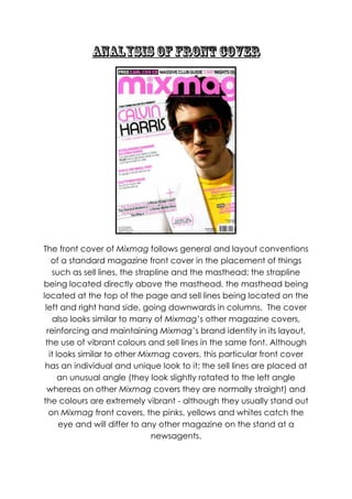
  • 1. The front cover of Mixmag follows general and layout conventions of a standard magazine front cover in the placement of things such as sell lines, the strapline and the masthead; the strapline being located directly above the masthead, the masthead being located at the top of the page and sell lines being located on the left and right hand side, going downwards in columns. The cover also looks similar to many of Mixmag‟s other magazine covers, reinforcing and maintaining Mixmag‟s brand identity in its layout, the use of vibrant colours and sell lines in the same font. Although it looks similar to other Mixmag covers, this particular front cover has an individual and unique look to it; the sell lines are placed at an unusual angle (they look slightly rotated to the left angle whereas on other Mixmag covers they are normally straight) and the colours are extremely vibrant - although they usually stand out on Mixmag front covers, the pinks, yellows and whites catch the eye and will differ to any other magazine on the stand at a newsagents.
  • 2. o The masthead is the Mixmag logo, and is always on the front cover of Mixmag as the masthead, helping to create a symbiotic link between all the Mixmag covers and the Mixmag franchise. The masthead is also covering the artist on the front‟s forehead suggesting that the magazine isn‟t very established, however, it may be due to the 2006 revamp that Mixmag had, which would have been recent when this particular magazine was released, therefore it suggests that Mixmag is trying to re-establish themselves, and create a new representation to the magazine. The name „Mixmag‟ suggests that the magazine focuses on dance music – the idea of a DJ mixing on turntables spings to the audience‟s mind and as they like dance music, they will be interested as to what the magazine will have in it. The masthead is also written in display font, with a curvy typeface in a large size) making it look sophisticated yet simple, thus appealing to the audience of males in their late twenties. It is clear and bold making it stand out – this is added to by the use of bright pink as the colour of the font. The font used for the masthead reflects the fun, euphoric freedom of dance music and dance culture. The „dot‟ on the „I‟ also resembles a CD or vinyl disc. The main image is of Calvin Harris – the featured artist – who is a internationally successful dance music artist; the audience will know of/about him and will know the majority of his songs. He is represented as being very cool and slick through his use of costume. He‟s wearing red sunglasses, a yellow t-shirt and a white blazer; an odd combination which, in everyday life would go together and wouldn‟t look cool yet Calvin seems to look effortlessly smooth. The image reflects the genre that it celebrates (dance music) through its use of colour scheme; the fun, light and vibrant colours reflect a party/summery atmosphere, whereas if the magazine were to use dark colours such as black and grey, the reader would assume it was a rock music magazine. Therefore the colour scheme helps to make sure that Mixmag attracts the
  • 3. correct target audience. The way Calvin Harris also looks extremely cool, trendy and slick would attract the audience too – as males, they may find they desire to be like him and so, if they buy the magazine too, they may feel that they will be able to fulfil this desire. The image also helps to influence the readers musical preferences as it is an image which not only dominates the page, but, an image that is memorable and will stick in the readers mind for a while, therefore, even if they don‟t listen to Calvin Harris usually, they could remember that, as he is on the cover of Mixmag, it means he is a trendy and established artist and of course as the audience is young males, they will have a natural desire to want to fit in and be on trend. Although there is no clear genre specific iconography on the cover, we can see through the reflection of Calvin‟s glasses that he is stood above his turntables/decks, so iconography signalling genre is subtly hinted on the cover, making sure again that the right audience will be attracted. The way it is subtly hinted also suggests Calvin Harris is a big enough artist who doesn‟t need to have blatant iconography signalling his genre of music on the cover; the audience should know and recognize him, therefore it makes Mixmag look more appealing – they haven‟t just got a random underground DJ on the cover, they have infact chosen an internationally known chart topping DJ to be on the cover, attracting more readers. The cover also follows Mixmag‟s own front cover conventions; it has no feature article photographs and the sell-lines are presented in a column format on the left and right hand sides of the page, giving the cover a more sophisticated edge and maintaining Mixmag‟s brand identity. The sell-lines are also key in attracting and enticing the target audience of Mixmag; they will make the reader want to purchase and read the magazine as they will want to find out the story behind them. In this instance, the sell-lines use mode-of-address to draw in and entice the reader. This is seen through the use of slang/colloquial language which the target audience will
  • 4. recognize and understand, for example, phrases such as „mouth to mouth‟ or „go ga-ga in ZaZa land‟. By using expressions like this, the audience will feel as though the magazine is on the same level as them, a bit like a friend that uses the same vocabulary and phraseology as them; this will lead them to recognise a shared affinity with the magazine and to be more likely to purchase it. In addition to this, the readership will experience a feeling of pride and accomplishment upon identifying and understanding the terms that appear on the front. Target audiences can feel clever knowing that they „get‟ the references that are made, and may even feel they belong to an exclusive club of „in the know‟ readers. The sell-lines are also presented in Mixmag‟s signature layout; with alternating colours for each individual sell-line and a bold font. Although this cover doesn‟t feature the common convention of direct address, it features many other key language devices such as the rule of three (“how to get there, where to stay and how to loose it in style”), rhyme (“go ga-ga in ZaZa”) and alliteration (“Berlin to Brazil”). This will help them to stick in the readers mind as they are catchy, fun and make the magazine appear friendly. The colour of the sell-lines is also important as it helps to draw the readers attention to the magazine; each sell-line is the colour pink with small text underneath being black, and it follows this routine throughout. This helps to create the colour scheme on the front cover and also acts as a magnet to draw in the audience; rather than the sell- lines being a plain, boring colour such as black or grey, the sell- lines bright colours help to catch the readers eye, maintaining the focus/attention of the audience. The bold typography and block capitals add to this, as they also help to make the sell-lines stand out, especially against the white background. The typography of the sell-lines also reinforces the brand identity of Mixmag, as this same serif font appears to be used on all the sell-lines on Mixmag‟s covers.
  • 5. The layout of this cover specifically, follows key conventions that Mixmag have created with the layout of their front covers, so that the magazine upholds brand identity. It has a similar look to all their other front covers; this is due to the fact that all the sell lines are placed in lengthy columns on the left and right hand sides, in the same font, with the masthead being at the top of the page, again in the same font. The date-line and the barcode are also in the same position as on other front covers (bottom right hand corner); the main sell-line is also placed in the top left hand side of the page, slightly near the centre; a convention once more that is commonly featured in Mixmag. The audience will recognise these conventions and so will know without even looking at the masthead that the magazine is Mixmag – it will make them feel comfortable and secure; they are familiar with the magazine and know it won‟t change the layout/confuse them, thus putting the reader at ease. The simplistic aspect of the layout also draws in/reflects the audience; young males do not want a front cover which is confusing or tacky as it could make them feel ashamed of their favourite genre. They will want a simple yet sophisticated layout which is clear and readable, and Mixmag demonstrates this. The layout also appears spacious, appealing to the reader as it isn‟t bombarded with information on the front cover – they won‟t feel intimidated by the magazine, therefore they are more likely to buy it. Various fonts also appear on this front cover; the masthead is also seen as the Mixmag logo which is conventional of music magazine front covers. It is a display font and so this also adds to the magazines eye-catching elements on the front cover, however the bright pink colour exaggerates it that little bit more. The curvy font that the masthead and main sell-line appear in almost give the front cover a fun and youthful feel, however, this is contrasted highly by the block capital serif font which appears on the smaller sell-lines beneath them. The fonts, therefore, are used on this magazine cover to reflect the audience that will be
  • 6. reading it; they like to have fun but when it comes down to the nitty gritty in dance music, they take it seriously. They also maintain brand identity too, as extremely funky fonts tend to be used for the main sell-line, with the smaller sell lines in the same, normal font. In conclusion, the Calvin Harris front cover of Mixmagis effective in drawing in the audience, as it has many elements such as a vibrant colour scheme, a dominating main image and effective use of mode-of-address to appeal to the reader and make them want to purchase the magazine. It will be successful in drawing in the target audience as it has created the front cover with them in mind; every inch of detail on the front cover somehow appeals to the audience in one way or another. Also, the elements stated above as well as many other elements on the front cover, combined together means that the audience will definitely be attracted to and interested in the magazine.