
Recomendados
Mais conteúdo relacionado
Mais procurados
Mais procurados (19)
Semelhante a Movie Poster Research
Semelhante a Movie Poster Research (20)
Último
Último (19)
Movie Poster Research
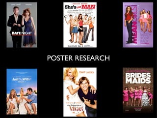
- 2. Purpose: Background: This poster is to advertise the The background of the poster film, but also shows who the is a light grey colour. This plain main characters are played by. Date Night Movie Poster colour doesn’t give us any ideas about the contents of the Colour: film. Grey, white are the main colours used. The white, bold Realism: writing stands out within the picture because everything else The poster looks realistic around the text is a darker because of the non-edited colour. This draws the eye to picture. the title of the film first. Key Image: Text Colour: The poster depicts a romantic film. The text colour has been The title gives us the romantic chosen to contrast from the element ‘Date Night’ and then other darker colours used clothing and staging in the image already. The title text colour is gives us the impression that big, bold white which draws something happens within the ‘Date the viewers eye to the title. Night’. This gives us a sense of mystery.
- 3. Layout: My Opinion: The layout of the poster is I like this poster, however, I clear. The image is directly in think it is a little too simplistic. the centre of the page. Date Night Movie Poster There isn’t enough to tell us Because the image is in the about the film. We don’t know centre, our eyes are drawn to the rating or audience it is the image and text. The layout targeting. is very simple. I do like the colour scheme. It is subtle and the white shows up really well compared to the Target Audience: other colours. Text The target audience isn’t obviously shown in this image, there is no rating on the poster either.
- 4. Purpose: Background: This poster is to advertise the The background of the poster film, but also shows who the is white. This plain colour main actress is. The shaded doesn’t give us any ideas about text behind the image gives us She’s The Man Movie Poster the contents of the film. But a sense of the context of the does make the image stand film. out. Colour: Text Colour: The only colour that stands There are different text out is the white background. I colours. Black, Red and Grey. wouldn’t say there is a colour The title text colour is big, scheme. The only colours that bold and black and red which are repeated is the red and draws the viewers eye to the black. title. Key Image: The poster depicts a romantic comedy film. The image shows the main group of peers. The text behind the key image also gives you the rough outline of the storyline.
- 5. Layout: My Opinion: The poster is very busy, with a I think the poster is very lot of text and a large image. She’s The Man Movie Poster crammed and too busy. The The image is in the middle but audience won’t know where to lower down the page. The look for the information they writing is large and at the top. are looking for. We don’t know the rating or audience it Target Audience: is targeting. The target audience isn’t obviously shown in this image, there is no rating on the poster either. You can see that it’s going to contain a romance as there are both male and female characters in the image.
- 6. Purpose: Key Image: This poster is to advertise the The poster depicts a school based film, but also shows who the film. The clothing from the right main characters are played by image gives us the impression that and who directed it. It also Mean Girls Movie Poster they are girly and bossy by the says when the film will be colour and the posture of the girls. released in cinemas. The left image shows a girl who is probably quite normal as she wears Colour: simple clothing. The red clashes with the pink and this is reflects the Pink and Purple are the main personalities between the pink girls colours used. The pink title and her. contrasts with the purple Text Colour: background and draws your eye into the title. The text colour has been chosen to reflect the colour Background: scheme in the film. The film is based on a girl click so The background of the poster therefore the colouring is pink, is a light purple colour. This purple and white. plain colour fits well with the pink theme also running through the poster.
- 7. My Opinion: Layout: I like the poster almost being The layout of the poster is in split in half by the two groups two. The ‘mean girls’ on the and different worlds being right and Lindsay Lohan on the Mean Girls Movie Poster divided. The colour scheme fits left. The writing ‘Watch Your well and the text is a simple Back’ is placed underneath the font. ‘mean girls’ this reflects the I like how the poster has a tag personalities of them. line and that the text reflects I like the layout as the different the ‘mean girls’ attitudes. sides are also from different worlds in the film. Target Audience: The target audience clearly female as the colours reflect a stereotypical female. However, there is no rating on the poster so you can’t see the target age group.
- 8. Purpose: Key Image: This poster is to advertise the The poster depicts a romance film, but also shows who the comedy film as a couple are sitting main characters are played by. Just Go With It Movie Poster on the beach, but the female has a It also says when the film will smirk on her face. be released in cinemas. Text Colour: Colour: The text colour is white and light blue. I think the light blue The main colour of blue is a wrong colour for the doesn’t give any features away poster as the text is over a about the film. blue sky. The text is hard to read. The white text however, Background: is a good colour as it is clear and easy to read. The background of the poster is the image of the two main characters sitting on a beach with a female standing in the middle of the image between the two main characters.
- 9. Layout: My Opinion: The layout has a rule of thirds. I don’t like the text colour in The centre image of the girl this poster as it’s hard to read must have a part in the film as and I don’t think the image otherwise she wouldn’t be Just Go With It Movie Poster gives enough away about the there. This could reflect that film. something gets in the way of the two either side’s relationship. Target Audience: There is no rating on the poster so you can’t see the target audience group. The image’s connotations say that the film is a romance.
- 10. Purpose: Background: This poster is to advertise the The background of the poster film, but also shows who the is white and makes the image main actors are. and text stand out. What Happens in Vegas Movie Poster Colour: Text Colour: The colours are light and The text colours are mainly bright. The white background orange and a little black. The contrasts with the orange orange contrasts with the text . It also makes the white background and is easy characters stand out more. to read. Key Image: The poster depicts a romantic comedy film. The image shows a couple with the male have a cheeky look on his face and the female character have a smile (laugh) expression. These are connotations of fun and comedy.
- 11. Layout: My Opinion: The layout is simple. The image is large and dominates I really like the layout, image, the poster. colour and text choice in this What Happens in Vegas Movie Poster poster. The white really contrasts the image and text. Target Audience: There is no rating on the poster so you can’t see the target audience group. The image’s connotations say that the film is a romantic comedy, so it would be aimed to a older audience.
- 12. Purpose: Background: This poster is to advertise the The background of the poster film, but also shows who is a brick wall which contrasts produced the film. Brides Maids Movie Poster with the rest of the images. Colour: Text Colour: The colours are mainly pink The text colours are mainly and white. The white big bold white and pink. These colours text catches your eye and are connotations of females. draws you into the poster. Key Image: The poster depicts a romantic comedy film. The image is of a bride and the bridesmaids, this has connotations of romance and the bridesmaids are all in different poses so this shows a comedy aspect. The colours of pink and white contrasts on the brick wall.
- 13. Layout: My Opinion: The layout is almost half and I really like the layout, image, half. The text taking one half colour and text choice in this and the image taking the other. Brides Maids Movie Poster poster. The brick wall contrasts with the image and text. Target Audience: There is no rating on the poster so you can’t see the target audience group. The image’s connotations say that the film is a romantic comedy, so it would be aimed to a older audience.