Train station-name signs | creating more conspicuous train-signs

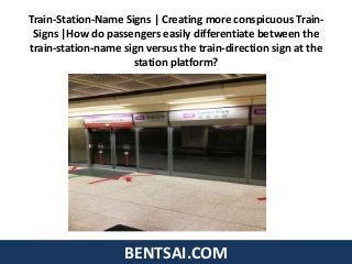
How do passengers easily differentiate between the train-station-name sign versus the train-direction sign at the station platform? Noticed that the "train-station-name" and the "train-direction" sign are of the same color, same font size, and same font type. When you alight the Singapore Train or from within the Singapore Train, how easy would it be for the passenger to determine which station name or train direction he or she is currently at; when every sign looks the same? Singapore-Train-Company-Management who are resistant to change; costs would affect bonus would say that there are electronic information-directories inside the train together with voice announcement. Would that reflect the excessive waste of company funds to install the train station name/direction signs along the entire platform at every single station in Singapore? Does this shows poor planning? If there is a need for the signs to be installed along the platform (see picture below), would it be so expensive to hire talented designers to create ergonomic signs along the platform? This cost money and affect management bonus thus there would be other reasons to avoid change. Feedback has been escalated to Land-Transport-Authority (LTA). Received reply from principal manager - Ms Salmah Bte Buang (LTA) that they would be improving this for Downtown Line stations. If well received, they would be implementing for the entire Singapore-MRT-system. Email dated 17 Oct 2012. I am glad a few hours of my time, the effort to think through and courage to send an email to the authorities bring convenience and time-savings (translated to productivity for rich and powerful bosses) to the people of Singapore for the foreseeable lifespan of the Singapore-MRT-train-system (100 years or more?)

Recomendados
Recomendados
Mais conteúdo relacionado
Mais de Jianfa Ben Tsai
Mais de Jianfa Ben Tsai (20)
Último
Último (20)
Train station-name signs | creating more conspicuous train-signs
- 1. BENTSAI.COM Train-Station-Name Signs | Creating more conspicuous Train- Signs |How do passengers easily differentiate between the train-station-name sign versus the train-direction sign at the station platform?
- 2. Train-Station-Name Signs | Creating more conspicuous Train-Signs • Noticed that the "train-station-name" and the "train-direction" sign are of the same color, same font size, and same font type. When you alight the Singapore Train or from within the Singapore Train, how easy would it be for the passenger to determine which station name or train direction he or she is currently at; when every sign looks the same? BENTSAI.COM
- 3. Train-Station-Name Signs | Creating more conspicuous Train-Signs • Singapore-Train-Company-Management who are resistant to change; costs would affect bonus would say that there are electronic information-directories inside the train together with voice announcement. Would that reflect the excessive waste of company funds to install the train station name/direction signs along the entire platform at every single station in Singapore? BENTSAI.COM
- 4. Train-Station-Name Signs | Creating more conspicuous Train-Signs • Does this shows poor planning? If there is a need for the signs to be installed along the platform (see picture below), would it be so expensive to hire talented designers to create ergonomic signs along the platform? This cost money and affect management bonus thus there would be other reasons to avoid change. Feedback has been escalated to Land-Transport-Authority (LTA). BENTSAI.COM
- 5. Train-Station-Name Signs | Creating more conspicuous Train-Signs • Received reply from principal manager - Ms Salmah Bte Buang (LTA) that they would be improving this for Downtown Line stations. If well received, they would be implementing for the entire Singapore-MRT- system. BENTSAI.COM
- 6. Train-Station-Name Signs | Creating more conspicuous Train-Signs • Email dated 17 Oct 2012. I am glad a few hours of my time, the effort to think through and courage to send an email to the authorities bring convenience and time-savings (translated to productivity for rich and powerful bosses) to the people of Singapore for the foreseeable lifespan of the Singapore-MRT-train- system (100 years or more?) BENTSAI.COM
- 7. Train-Station-Name Signs | Creating more conspicuous Train-Signs • Shared to: - Land Transport Authority - SBStransit - SMRT - Linkedin - Marketing-Marketers | Mystery-Shoppers | Market-Researchers Facebook - Miigle Facebook - REACH (Active Citzenry Feedback website) - SG Club Forum - Slideshare - Twitter - YELP - Yahoo Answers - Pinterest BENTSAI.COM
- 8. Train-Station-Name Signs | Creating more conspicuous Train-Signs BENTSAI.COM