Hebrew Typography1
•Transferir como PPT, PDF•
1 gostou•364 visualizações

Part 1 of a talk on Hebrew Typography

Recomendados
Recomendados
Mais conteúdo relacionado
Mais de Ari Davidow
Último
Último (20)
Hebrew Typography1
Notas do Editor
- Some notes about Hebrew typography. First presented at Type90, Oxford, UK
- Hebrew has a strong calligraphic tradition. The Torah, the most holy of Jewish texts, must be handwritten on a scroll if used for ritual readings in a synagogue.
- The first form of Hebrew, pre-dating the Babylonian exile
- In Bar Kochba’s time, the newer, square letters were used for everything, =except= coinage. One theory is that the Jews brought the “square” Aramaic script back from the first exile with them. By declaring anything written in the old script “unkosher,” Ezra would have eliminated variants of holy books written in Judea and Samaria, that had changed in unfamiliar ways. At the same time, they wanted to emphasize their newly granted “independence”, so kept the unique pre-exilic Judaean script on coinage through the Bar Kochba rebellion. You can find letters written by Bar Kochba using modern Hebrew “square letters.”
- A tracing of a letter by bar kochba. This characters are perfectly readable (beyond issues of legibility) to anyone who knows current Hebrew lettering
- Likewise, this script form of the letters is familiar to Hebrew readers
- From the Dead Sea Scrolls
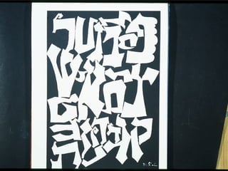
- Micrography, in which the flow of letters shapes pictures. You can pick up very bad micrography in places like Tzfat, today.
- Hebrew from Germany in the Middle Ages, reflecting the influence of fraktur
- One of the first printed Hebrew books. When Conat died, his wife continued the trade, making her the first woman to print Hebrew books.
- From the Prague Hagaddah.
- Different widths of some characters were used to help justify lines.
- A backwards character is used to fill space
- The hyphen did not yet exist, so a word would simply break in the middle, if necessary.
- Note special display characters used to imitate what had been lavish illustrations in handwritten editions
- Mixing Hebrew and English. Here, the English is underneath the Hebrew. In terms of actual typesetting, the Hebrew consonants were set on one line. Then, the vowels were on their own line, and finally, in this case, the English below the Hebrew.
- Without fonts prepared to work together, mixing languages could look awkward—but printers could and did print in many languages.
- A better choice, with the Hebrew and Latin sharing a common starting point. Much easier for the polyglot reader.
- The nadir of Hebrew typography
- Part of the ferment in the late 19 th century/early 20 th century in Eastern Europe and the United States was an explosion of new typefaces and of playfulness with Hebrew letterforms—whether for Hebrew or Yiddish
- Several editions of “Satan in Goray” by Isaac Bashevis Singer, each based on the last
- Sadly, there was little progress on better text fonts, although the art-deco “Frank-Ruehl” type was a major improvement over 19 th century “Modern”-influenced designs
- The Miriam typeface, another Art Deco design still popular today.