We're not designing posters, here!
•
6 gostaram•1,883 visualizações

Video available here: http://videos.sapo.pt/wy1ZFfifIG6PFBAcWgWh

Recomendados
Recomendados
Mais conteúdo relacionado
Semelhante a We're not designing posters, here!
Semelhante a We're not designing posters, here! (20)
Mais de André Luís
Último
Último (20)
We're not designing posters, here!
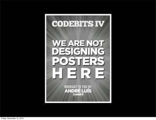
- 1. WE ARE NOT DESIGNING POSTERS H E R E BROUGHT TO YOU BY ANDRÉ LUÍS CODEBITS IV cbn @andr3 Friday, November 12, 2010
- 3. INTRODUCTION whoamI? I have this thing for sticking my finger in pointy monuments. I’m all over the web. Check http://id.andr3.net or @andr3. Friday, November 12, 2010
- 4. INTRODUCTION whoamI? Been speaking on a variety of topics, including... JavaScript microformats HTML5 CSS more at http://slideshare.net/andr3 Friday, November 12, 2010
- 6. INTRODUCTION What’sabouttogodown... I’m here to make you a proposition… Friday, November 12, 2010
- 7. INTRODUCTION What’sabouttogodown... By standing on the shoulders of giants I’ll propose we take our websites d e a d s e r i o u s Friday, November 12, 2010
- 8. INTRODUCTION What’sabouttogodown... First... I have nothing against P o s t e r s Friday, November 12, 2010
- 9. INTRODUCTION What’sabouttogodown... But they’re static, they’re not hypertext. The web is dynamic and interactive. Friday, November 12, 2010
- 10. Evolution of Webdesign Aquickhistorylesson Friday, November 12, 2010
- 11. Evolution of Webdesign Aquickhistorylesson 1991 The CERN years Friday, November 12, 2010
- 12. Evolution of Webdesign Aquickhistorylesson 1991 The CERN years 1998 tables for layout & framesets Friday, November 12, 2010
- 13. Evolution of Webdesign Aquickhistorylesson 1991 The CERN years 1998 tables for layout & framesets 2003 Designing with web standards by J. Zeldman CSS Zen Garden by Dave Shea & Friday, November 12, 2010
- 14. Evolution of Webdesign Aquickhistorylesson 1991 The CERN years 1998 tables for layout & framesets 2003 Designing with web standards by J. Zeldman CSS Zen Garden by Dave Shea & 2005 microformats Friday, November 12, 2010
- 15. Evolution of Webdesign Aquickhistorylesson 1991 The CERN years 1998 tables for layout & framesets 2003 Designing with web standards by J. Zeldman CSS Zen Garden by Dave Shea & 2007 CSS3 features become more widely adopted 2005 microformats Friday, November 12, 2010
- 16. Evolution of Webdesign Aquickhistorylesson 1991 The CERN years 1998 tables for layout & framesets 2003 Designing with web standards by J. Zeldman CSS Zen Garden by Dave Shea & 2007 CSS3 features become more widely adopted 2005 microformats 2009 HTML5 features become more widely adopted Friday, November 12, 2010
- 17. Evolution of Webdesign Aquickhistorylesson 1991 The CERN years 1998 tables for layout & framesets 2003 Designing with web standards by J. Zeldman CSS Zen Garden by Dave Shea & 2007 CSS3 features become more widely adopted 2010 What now? 2005 microformats 2009 HTML5 features become more widely adopted Friday, November 12, 2010
- 18. Evolution of Webdesign Aquickhistorylesson Role of the Webdesigner 1991 Write HTML. 1998 Draw boxed layouts & write HTML. ... 2010 Design layout, do Information Architecture, cover every interaction, content strategy, etc. Friday, November 12, 2010
- 19. The Web is dead. Long live the Internet. http://www.wired.com/magazine/2010/08/ff_webrip/ http://6s0t.sl.pt Friday, November 12, 2010
- 20. Evolution of Webdesign Aquickhistorylesson Every year has been The Year of the Mobile. Friday, November 12, 2010
- 21. Evolution of Webdesign Aquickhistorylesson Every year has been The Year of the Mobile. source: AdMob Operating System Share, May 2010. Friday, November 12, 2010
- 22. Evolution of Webdesign Aquickhistorylesson Every year has been The Year of the Mobile. source: AdMob Operating System Share, May 2010. Friday, November 12, 2010
- 23. Evolution of Webdesign Aquickhistorylesson User habits vary with platform. Friday, November 12, 2010
- 24. Evolution of Webdesign Aquickhistorylesson User habits vary with platform. source: Gartner Q1 2010: Market Share. source: AdMob Operating System Share, May 2010. Friday, November 12, 2010
- 25. Evolution of Webdesign Aquickhistorylesson Myriads of browsers/user-agents! Feature phones & Smartphones iPhone, iPod touch & iPad PSP & other portable gaming devices Boxee box & other STB Netbooks Desktop & more... Friday, November 12, 2010
- 26. Why target one resolution out of these? Evolution of Webdesign Aquickhistorylesson Friday, November 12, 2010
- 27. Why target one resolution out of these? Evolution of Webdesign Aquickhistorylesson Friday, November 12, 2010
- 28. Why target one resolution out of these? Evolution of Webdesign Aquickhistorylesson Friday, November 12, 2010
- 29. Why target one resolution out of these? Evolution of Webdesign Aquickhistorylesson Friday, November 12, 2010
- 30. Flexibility flex·i·ble (adj.) capable of bending easily without breaking. khalid-almasoud http://6s4a.sl.pt Friday, November 12, 2010
- 31. Flexibility flex·i·ble (adj.) capable of bending easily without breaking. khalid-almasoud http://6s4a.sl.pt standing on the shoulders of: Dan Cederholm http://simplebits.com Friday, November 12, 2010
- 32. Flexibility Whatisit,exactly&whyweneedit? 800x600 1024x768 SAPO Login http://login.sapo.pt/ http://6s3e.sl.pt Friday, November 12, 2010
- 33. Flexibility Whatisit,exactly&whyweneedit? 800x600 1024x768 SAPO Login http://login.sapo.pt/ http://6s3e.sl.pt Friday, November 12, 2010
- 34. Flexibility Whatisit,exactly&whyweneedit? 800x600 1024x768 SAPO Login http://login.sapo.pt/ http://6s3e.sl.pt Friday, November 12, 2010
- 35. Flexibility Whatisit,exactly&whyweneedit? 800x600 1024x768 SAPO Login http://login.sapo.pt/ http://6s3e.sl.pt float:left; width: 26em; margin-left: 27em; Friday, November 12, 2010
- 36. Flexibility Whatisit,exactly&whyweneedit? TIP Think proportionally instead of statically. font-size: 16px; (base) Heading 1 Heading 2 Heading 3 target: 22px; font-size: 22/16 = 1.375em; target: 18px; font-size: 18/16 = 1.125em; target: 12px; font-size: 12/16 = 0.75em; Friday, November 12, 2010
- 37. Size: normal Flexibility Whatisit,exactly&whyweneedit? SAPO.pt http://www.sapo.pt/ http://b.kp.sl.pt Friday, November 12, 2010
- 38. Size: normalSize: +2 Flexibility Whatisit,exactly&whyweneedit? SAPO.pt http://www.sapo.pt/ http://b.kp.sl.pt Friday, November 12, 2010
- 39. seandreilinger http://6s4b.sl.pt Friday, November 12, 2010
- 40. Flexibility Whatisit,exactly&whyweneedit? Off by default Friday, November 12, 2010
- 42. Size: +2 Flexibility Whatisit,exactly&whyweneedit? mytvshows http://mytvshows.org http://6siq.sl.pt Friday, November 12, 2010
- 43. Flexibility Whatisit,exactly&whyweneedit? mytvshows http://mytvshows.org http://6siq.sl.pt Tamanho: +2 txt only Friday, November 12, 2010
- 45. Flexibility Whatisit,exactly&whyweneedit? TIP Avoid setting widths on both parent & child elements. width: 500px; width: 480px; width: 500px; margin-right: 20px; x ✓ Friday, November 12, 2010
- 46. Flexibility Whatisit,exactly&whyweneedit? UX SAPO http://ux.sapo.pt http://6suv.sl.pt x ✓ Friday, November 12, 2010
- 47. Flexibility Whatisit,exactly&whyweneedit? RULE Don’t set a height unless you really have to. Content dictates height. Friday, November 12, 2010
- 48. Responsive Design re·spon·sive (adj.) 1. reacting or replying quickly to a suggestion, etc. 2. responsive architecture: spaces responding to presence of people passing through them. standing on the shoulders of: Ethan Marcotte http://unstoppablerobotninja.com Friday, November 12, 2010
- 49. Responsive Webdesign Whatcanourwebsitesreactto&how? Remember the amount of user-agents? width? height? device-width? device-height? orientation? aspect-ratio? device-aspect-ratio? color? color-index? monochrome? resolution? scan? grid? Friday, November 12, 2010
- 50. Responsive Webdesign Whatcanourwebsitesreactto&how? You can query all of them! Remember this? <link rel="stylesheet" type="text/css" href="style.css" media="screen"> That’s a query! Friday, November 12, 2010
- 51. Responsive Webdesign Whatcanourwebsitesreactto&how? You can query all of them! Remember this? <link rel="stylesheet" type="text/css" href="style.css" media="screen and (max-device-width:480px)"> CSS3 Friday, November 12, 2010
- 52. Responsive Webdesign Whatcanourwebsitesreactto&how? You can query all of them! Remember this? @media screen and (max-device-width: 480px) { .column { float: none; } } CSS3 Friday, November 12, 2010
- 53. Responsive Webdesign Whatcanourwebsitesreactto&how? So, what can we do? @media screen and (orientation: landscape) { .column { float: none; } } orientation: landscape Friday, November 12, 2010
- 54. Responsive Webdesign Whatcanourwebsitesreactto&how? Can I use it now?! When can I use... http://caniuse.com http://6tnl.sl.pt Friday, November 12, 2010
- 55. Responsive Webdesign Whatcanourwebsitesreactto&how? Can I use it now?! CSS3-media-queries.js http://code.google.com/p/css3-mediaqueries-js/ http://6tns.sl.pt Friday, November 12, 2010
- 56. Responsive Webdesign Whatcanourwebsitesreactto&how? Can I use it now?! CSS3-media-queries.js http://code.google.com/p/css3-mediaqueries-js/ http://6tns.sl.pt Do you really need it? Friday, November 12, 2010
- 57. Responsive Webdesign Whatcanourwebsitesreactto&how? Avoid the mistakes of the One Web... DEGRADE TO Friday, November 12, 2010
- 58. Responsive Webdesign Whatcanourwebsitesreactto&how? Avoid the mistakes of the One Web... DEGRADE TO ENHANCE TO Friday, November 12, 2010
- 59. Responsive Webdesign Whatcanourwebsitesreactto&how? Steps to make our sites Responsive™ 1 2 3 Adapt layout to different environments. (through media-queries) ✓ Friday, November 12, 2010
- 60. Responsive Webdesign Whatcanourwebsitesreactto&how? Steps to make our sites Responsive™ 1 2 3 Adapt layout to different environments. (through media-queries) ✓ Fluid Grids (if you’re using them) Friday, November 12, 2010
- 61. Responsive Webdesign Whatcanourwebsitesreactto&how? Steps to make our sites Responsive™ 1 2 3 Adapt layout to different environments. (through media-queries) ✓ Fluid Grids (if you’re using them) Flexible Images Friday, November 12, 2010
- 62. Responsive Webdesign Fluidgrids from “Fluid grids” — A List Apart #279 http://www.alistapart.com/articles/fluidgrids/ http://6to8.sl.pt Friday, November 12, 2010
- 63. Responsive Webdesign Fluidgrids from “Fluid grids” — A List Apart #279 http://www.alistapart.com/articles/fluidgrids/ http://6to8.sl.pt 144px; 988px 700px; Friday, November 12, 2010
- 64. Responsive Webdesign Fluidgrids from “Fluid grids” — A List Apart #279 http://www.alistapart.com/articles/fluidgrids/ http://6to8.sl.pt width: 700px; margin-left: 144px; 144px; 988px 700px; Friday, November 12, 2010
- 65. Responsive Webdesign Fluidgrids from “Fluid grids” — A List Apart #279 http://www.alistapart.com/articles/fluidgrids/ http://6to8.sl.pt width: 700px; margin-left: 144px; 988/700 = 0.7085 988/144 = 0.14575 144px; 988px 700px; Friday, November 12, 2010
- 66. Responsive Webdesign Fluidgrids from “Fluid grids” — A List Apart #279 http://www.alistapart.com/articles/fluidgrids/ http://6to8.sl.pt width: 700px; margin-left: 144px; width: 70.85%; margin-left: 14.575%; 988/700 = 0.7085 988/144 = 0.14575 144px; 988px 700px; Friday, November 12, 2010
- 67. ✓ Responsive Webdesign Whatcanourwebsitesreactto&how? Steps to make our sites Responsive™ 1 2 3 Adapt layout to different environments. (through media-queries) ✓ Fluid Grids (if you’re using them) Flexible Images Friday, November 12, 2010
- 68. Responsive Webdesign FlexibleImages from “Responsive Web Design” — A List Apart #279 http://www.alistapart.com/articles/responsive-web-design/ http://350m.sl.pt Friday, November 12, 2010
- 69. Responsive Webdesign FlexibleImages from “Responsive Web Design” — A List Apart #279 http://www.alistapart.com/articles/responsive-web-design/ http://350m.sl.pt Friday, November 12, 2010
- 70. Responsive Webdesign FlexibleImages from “Responsive Web Design” — A List Apart #279 http://www.alistapart.com/articles/responsive-web-design/ http://350m.sl.pt img { display: block; max-width: 100%; } Friday, November 12, 2010
- 71. Responsive Webdesign FlexibleImages dConstruct 2010 http://2010.dconstruct.org/ http://3q9e.sl.pt Friday, November 12, 2010
- 72. Responsive Webdesign FlexibleImages dConstruct 2010 http://2010.dconstruct.org/ http://3q9e.sl.pt .top_row { position: absolute; left: -10%; } .bottom_row { position: absolute; left: -32%; } Friday, November 12, 2010
- 73. ✓ ✓ Responsive Webdesign Whatcanourwebsitesreactto&how? Steps to make our sites Responsive™ 1 2 3 Adapt layout to different environments. (through media-queries) ✓ Fluid Grids (if you’re using them) Flexible Images Friday, November 12, 2010
- 74. Responsive Webdesign Whatcanourwebsitesreactto&how? Final thoughts on Responsive Webdesign™ “That’s the thing about responsive web design: you can’t just think of it as a sprinkle of pixie dust that can be applied to any site. It requires the right mindset. It requires that sites be built on solid foundations of best practice. If those foundations are in place—a flexible layout, flexible images, optimised performance—then responsive web design can work its magic.” Jeremy Keith in “A responsive mind” http://adactio.com/journal/1696/ http://6tqn.sl.pt Friday, November 12, 2010
- 75. Appropriate typefaces ap·pro·pri·ate (adj.) suitable or fitting for a particular purpose. biblarte http://6u8a.sl.pt Friday, November 12, 2010
- 76. Appropriate Typefaces Usingtherightonesandnottheavailableones Back in the day, print shops had boxes of type. Designers picked the ones they needed, not what the readers had around their house. The web has finally caught up! Friday, November 12, 2010
- 77. Appropriate Typefaces Usingtherightonesandnottheavailableones @font-face { font-family: 'Gotham'; src: url('gotham.eot'); src: local('☺'), url('gotham.woff') format('woff'), url('gotham.ttf') format('truetype'); } Bulletproof Font-face by Paul Irish http://paulirish.com/2009/bulletproof-font-face-implementation-syntax/ http://6tts.sl.pt Friday, November 12, 2010
- 78. Appropriate Typefaces Usingtherightonesandnottheavailableones Just because you can, doesn’t mean you should. Heads up: Render issues on all browsers in Windows. Performance: more bytes to download. Character map: make sure the typeface supports the entire set of latin chars (or your language, for that matter). Friday, November 12, 2010
- 79. Appropriate Typefaces Usingtherightonesandnottheavailableones TIP Avoid solutions based in JavaScript. Host the files if possible. fontsquirrel.com fontspring.com fontdeck.com Friday, November 12, 2010
- 80. In review... Friday, November 12, 2010
- 81. Flexibility Whatisit,exactly&whyweneedit? TIP Think proportionally instead of statically. font-size: 16px; (base) Heading 1 Heading 2 Heading 3 target: 22px; font-size: 22/16 = 1.375em; target: 18px; font-size: 18/16 = 1.125em; target: 12px; font-size: 12/16 = 0.75em; Friday, November 12, 2010
- 82. Flexibility Whatisit,exactly&whyweneedit? TIP Avoid setting widths on both parent & child elements. width: 500px; width: 480px; width: 500px; margin-right: 20px; x ✓ Friday, November 12, 2010
- 83. Flexibility Whatisit,exactly&whyweneedit? RULE Don’t set a height unless you really have to. Content dictates height. Friday, November 12, 2010
- 84. ✓ ✓ Responsive Webdesign Whatcanourwebsitesreactto&how? Steps to make our sites Responsive™ 1 2 3 Adapt layout to different environments. (through media-queries) ✓ Fluid Grids (if you’re using them) Flexible Images Friday, November 12, 2010
- 85. Appropriate Typefaces Usingtherightonesandnottheavailableones TIP Avoid solutions based in JavaScript. Host the files if possible. fontsquirrel.com fontspring.com fontdeck.com Friday, November 12, 2010
- 86. Questions? Friday, November 12, 2010
- 87. WEARENOT DESIGNING POSTERS HERE BROUGHTTOYOUBY ANDRÉLUÍS cb n @andr3 CODEBITSIV THEENDThank you for your time. Downloadthis presentation (PDF) http://talks.andr3.net/2010/codebits/posters.pdf http://6tuv.sl.pt cb Downloadthis presentation (.key) http://talks.andr3.net/2010/codebits/posters.key http://6tvj.sl.pt Friday, November 12, 2010