
Recomendados
Mais conteúdo relacionado
Mais procurados
Mais procurados (20)
Destaque
Destaque (16)
Semelhante a Development of Digipak
Semelhante a Development of Digipak (20)
Mais de alexhester
Mais de alexhester (20)
Último
Último (20)
Development of Digipak
- 2. Front The digipak of the product we produced at first glance has nothing to do with the songs and vibe of the album however we did take an image (a chicken mask/head) and give it quite a rocky vibe by opening its beak and wrapping the eyes around the face making it look like something you wouldn’t see on any other genre of album due to the hardcore feel you get from it. Also in relation to the mascot feel, we realised that mascots normally wear large animal suits and when thinking of animal suits we instantly thought of a chicken as it seems to be the most popular and would apply to the audience of teenagers. We decided for a dominant white colour as to maintain the focus on the frontal image and keep away from other genres that bombard their digipaks with bright and deep colours as to maintain our Bands image.
- 3. Back On the back we made reference to the frontal image of the digipak by wrapping the eyes around the cover to keep away from having just a plain white background and boring our audience, also we placed our song at the top named ‘Covet’ with other songs appropriately named to the feeling of the album such as ‘Pine’ and ‘Bad Apple’. We then have the usual things such as the Bar Code and copyright information to show a sense of legitimacy that is obviously seen on all real products. We maintained the colourless feel on the rear side of our album as to show that our album is more about the musical contents than the bright colours and flashy texts that are used a lot these days predominantly on albums of the pop genre.
- 4. Thank You Page We realised that many Digipaks have a thank you panel in their digipak dedicated to those who helped make the album possible mostly in the Indie Rock genre so to add to the genuine feel of our album we chose to include one thanking all who helped out with our album, this panel also features the spine of our album where you can see the name of the album again in the same black font as previously seen on the title panel and below you can see the logo and brand of Gideon Records which helps us create a brand identity with our product. You can also see the product number just to give it a legitimate feel also the logo of Gideon Records is the only thing that has colour so therefore it pulls the audiences attention towards it making them familiar with the logo and therefore similar products in the future that hold this brand which could mainly be products from our band.
- 5. Star Image On the first panel of the inside we jump from the light and bright coloured cover to a dark and mysterious inside and on this particular panel we see Lewis who is the main protagonist and lead singer and band member in our music video, this helps the audience accept the theory put forth by Richard Dyer and Andrew Goodwin that an audience relates to the main or who can be seen to be the main figure in a music video and this panel helps put this forward by singling out Lewis on his own panel putting forth the idea that he is of some importance to the video itself and the album. We also made sure he was dresses in dark clothes to put emphasis on his face to help the audience get acquainted with his face as to help make him better recognised when in certain emotions and this would help us put forward what he was feeling in the narrative. Also his tattoo helps reinforce the rock feel that the album is going for with the dark black ink and its image.
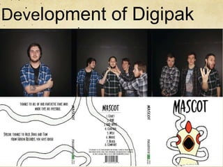
- 6. Being Themselves On the disc page we wanted the audience to have a glimpse at the actual band and what they are actually like when not performing in a band or in the narrative which can sometimes be used in a digipak and we thought it would be fun to place this idea in our digipak and it turned out quite well. It shows the band in a comical pose all feeling Josh’s beard which is not something you would expect to see from what you get from them in the video, basically this helps the audience get a little more insight into what the band is actually like.
- 7. The Rest of the Band Throughout the digipak there has been a lot of credit given to the lead singer (lewis) however the final inside panel was used to show the 3 other band members who helped create the live performance sections and music. This does go against the theory of Star Image put forward by Richard Dyer and Andrew Goodwin stating that there in a music product there is always a key figure that the audience is supposed to connect to and therefore make it easier to relate to the video and the message that it is attempting to put forth. We show them in casual clothing as we do not intend to look like a heavy rock band and wish to keep the identity that we created throughout our video as average teenagers.