
Recomendados
Mais conteúdo relacionado
Mais procurados
Mais procurados (20)
Destaque
Destaque (20)
Semelhante a Media poster analysis
Semelhante a Media poster analysis (20)
Mais de alexdabriel
Mais de alexdabriel (20)
Media poster analysis
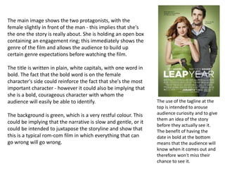
- 1. The main image shows the two protagonists, with the female slightly in front of the man - this implies that she's the one the story is really about. She is holding an open box containing an engagement ring; this immediately shows the genre of the film and allows the audience to build up certain genre expectations before watching the film. The title is written in plain, white capitals, with one word in bold. The fact that the bold word is on the female character's side could reinforce the fact that she's the most important character - however it could also be implying that she is a bold, courageous character with whom the audience will easily be able to identify. The background is green, which is a very restful colour. This could be implying that the narrative is slow and gentle, or it could be intended to juxtapose the storyline and show that this is a typical rom-com film in which everything that can go wrong will go wrong. The use of the tagline at the top is intended to arouse audience curiosity and to give them an idea of the story before they actually see it. The benefit of having the date in bold at the bottom means that the audience will know when it comes out and therefore won't miss their chance to see it.
- 2. The main image is of a man who is half human, half avatar. This gives the impression that his personality and his heart are divided in two - he is undecided about which part of him to choose. The fact that there's a small avatar below his face implies that there is more than one element to the story and that more characters than just the man are involved. The title is in a large, mystical looking font in light blue capitals. Having it in capitals makes it stand out against the background image, as does the fact that it is such a light colour in comparison to the darkness of the picture behind. Having the title, 'Avatar' in a light colour could imply that the avatars are the good force in the story, as opposed to the evil of the humans.
- 3. The main image is of two characters, chained together by a pair of handcuffs and glaring at each other. The woman's black dress implies that she's the 'baddie' of the film, although her blonde hair could connote a feeling of innocence, allowing the audience to relate to her a bit more. The man's shirt is splattered with dark stains, which may be blood; this relates to the title of the film. The background of the image is a sunny, generic looking road, which contrasts well with the slightly out of the ordinary appearance of the protagonists in the foreground. The title is written on a red banner across the image. The use of the colour red implies passion and danger, which links in well with the blood on the male character's shirt. The title itself is in a mixture of bold white and yellow, with the main actors' names above. Writing the names here has been done to attract the audience in and attempt to make up for the somewhat tacky looking film poster. The date of the film's release is written underneath the title, tied in by the use of the phrase 'the pursuit begins...'.
- 4. The main image is of the two protagonists kissing in the rain, which is a widely acknowledged idea of a romantic thing to do. This immediately tells the audience the genre of the film; however the rain and the fact that their lips aren't actually touching could imply that the film doesn't actually have a happy ending or that they don't end up together. The background of the image is made up of quite dull colours, but there are streaks of white in the sky, which could imply that there are elements of happiness within the story. The title is written in plain black capitals, but the line from the K and going underneath the word represents the story well, showing that even things that seem dull can have an underlying magic. The use of the dashes either side of the word makes it look old fashioned, adding another element of romance to the story. The actors' names are written in small font, showing that the film relies on the image to entice viewers rather than a well known cast.
- 5. The main image is comprised of numerous pictures of various cast members; this has been done to show that the film features an ensemble cast rather than one or two protagonists. This is reinforced by the ‘busy-ness’ of the picture, which also implies that there is quite a lot going on in the film. The title is written in block capital letters spread across the screen; the font they’re in connotes a rough, very masculine feel and could imply that the film is set in a harsh environment. The use of the colour red for the letters connotes ideas of passion and danger, which is very representative of the storyline. Each letter is on a stark, white background, which could represent the fact that the film is ultimately about love and friendship; however the fact that the squares of white are dirty shows that there will be lots of difficulties to overcome throughout the film. The dirt does not completely obscure the white, though, which implies that love will triumph in the end.