Codes and conventions of film review pages
•Transferir como PPTX, PDF•
1 gostou•2,717 visualizações

Codes and conventions of magazine review pages to accompany my main production task.

Recomendados
Mais conteúdo relacionado
Mais procurados
Mais procurados (20)
Semelhante a Codes and conventions of film review pages
Semelhante a Codes and conventions of film review pages (20)
Mais de Adrianna Paniak
Mais de Adrianna Paniak (14)
Último
Último (20)
Codes and conventions of film review pages
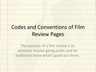
- 1. Codes and Conventions of Film Review Pages The purpose of a film review is to advocate movies going public and let audiences know what's good out there.
- 2. Empire: The Master Description of the image. Main image dominating the page, a still screen shot or image taken from the film –directly from an in-film shot. The purpose of using an image is varied; to identify a famous actor as a protagonist, to give an overview of the tone of the film or even just provide a teaser, essentially the purpose is to entice the audience into finding the film interesting. Name of the reviewed film. The title of the film as a main selling point. Typically the title is not in bright colours or diverse fonts, the reviewer wants the page to be simple and easier to read from not just a long distance – also there is a sense of professionalism, there is no need for flashy colours to entice the audience. Secondary image. More information about the film (Look Closer). Main article (review). The rating system will be ranked as number out of 10, or 5, as this is the simplest convention and is easy for the audience to understand. Empire for examples uses star ratings out of 5 stars. The importance of the rating is underlined in the trust and respect the audience has for the reviewer, while a high review will attract an audience just as easily as an extremely low one.
- 3. Analysis • The main feature of the review is a massive picture dominating the page and taking up most of the A3 spread. It is of the protagonist, Freddie Quell (Joaquin Phoenix) alone on a beach suggesting his struggle to adjust to the society as a World War II veteran. There is also a secondary image showing him with other two characters (Philip Seymour Hoffman and Amy Adams). The main purpose of both images is to attract the audience and to encourage them to read the article. The images also give the audience a greater knowledge of the genre of the film which in this case is drama. • The name of the film is in bold and capitals and it clearly shows what the article is about. The film review also has further details of the film such as the release date, certificate, director, cast, running time and plot. As a result of this the audience can decide whether they want to continue reading the review just by reading the first few lines. • Below there is the main article where the text is of the same font through out the article except for the title. The two page article ends with the writers verdict of the film and gives it a star rating.
- 4. Tagline for the review. Total Film: Rush Several magazines utilise a caption to describe the context of an image within the film. The purpose of this can merely be interaction with the audience, but sometimes it can provide depth and context which will encourage the audience to read the review. Image giving further details about the film. The title of the magazine review is often depicted in high-profile magazines or exclusives. Essentially the title is the banner to attract the audience, as the reader relates the title to that of a film reviewer . ‘Total Film’, ‘Empire’ or ‘Sight & Sound’ are renowned for their reviews and many will simply choose these names before any others. Information about other films similar to this one which might influence your choice. (See this if you liked...) Quotes, either from the film itself or from interviews form a common convention. A quote from the film will engage the audience in an active interaction with the film before even watching it. As well as this, a quote from an interview gives the audience depth and context to the reality of the actors or director, which the audience can relate to. Important details about the film including release date, certificate, director, cast, running time and plot.
- 5. Analysis • It has many of the features that the other review had but has a different layout and some of the features are different because of the different publisher. The main image still dominates the article but takes up one A4 page unlike the other two which spreads across two A4 pages. This article uses a graph to express a review of all the different stages/chapters of the film which is good because it shows how detailed the review is. • Just as with the review in the ‘Empire’ magazine the name of the film is in bold and capitals followed by a tagline and the main article which is meant to give the reader a greater knowledge of what the film is about. • The image doesn't overlap the text however the text boxes overlap onto the image. The text used is of a consistent font and size accept from the title of the film which is in a larger font. Furthermore the text is in the same colour throughout the article. The only acceptation to this rule is the dropped capital under the title however this fits with the layout and design of the page.
- 6. Sight & Sound: Blue Jasmine The main body of the review page is often the review itself, which consists of several ‘strands’ which create it. The in-depth analysis is just one, albeit large aspect of the review, which the majority of the time takes up a large portion of the page or a whole page in a double page spread. Often the analysis will piece together the positive and negative aspects of the film while attempting to add human feeling to it with emotions. Colours of the page (tone – black and white often connotes a dull sense, while colours spark up an interest) however sometime the content is more important than the house style in serious magazines which cater for specific audiences. Significant sentence taken from the review. No verdict leaving it up to the audience to make up their own minds about going to see that film at the cinema. Witty description or quote for the secondary image. In many high-budget films, a major selling point is the inclusion of famous ‘Hollywood Actors’ and Directors, who have in the past featured in popular films. Review pages will often pick up on this, depicting an image of the actors as a screen shot or including them in a headline next to the title of the film which increases the interest of the audience massively. The plot of the film is summarised without any ‘spoilers’ to give a brief overview of the film, so as to entice the audience into watching it. Most of the time the plot is written as briefly as possible, giving the opening developments of the film or what has already been revealed on trailers and interviews.
- 7. Analysis • The review usually is of an A3 spread and a large part of it is dominated by images which are arranged in a linear manner with a border around the images. The primary image informs the audience that the film may be of a drama genre because Cate Blanchett’s character Jasmine seems to be drowning her sorrows in alcohol. • The main article has highlighted quotes from it which are inserted to entice readers to actually read the review. • The reviews have very different layouts, however despite their appearance their content in terms of conventions, such as the dominating image, look closer box and basic information box, are very similar.
- 8. Conclusion •In most film review pages, there is large use of images from the film. The images give the reader a sense of the genre of the film showing key events from the film. Furthermore the text is the same colour throughout the article. Some review pages also have a highlighted quote from the text by changing the colour and font size. You can find small amounts of text added to the top hand right corner of the images explaining what they are showing. Overall codes and conventions of film review pages are easy to spot and aren’t often broken by magazine publishers without an explainable reason. • These reviews are what I will use as a template for content and layout when I come to create my own film review. I believe that my magazine review should include many features including a main image, maybe a secondary image (but not necessary), an overall rating of the film, a clear title, tagline and an overview of the film. My review will have to be quite detailed and take up vast amounts of space on the double page spread in order to attract readers and encourage them to read the review.