1. Using Qplot and R Tutorial 1
Abhik Seal
This tutorial will guide you how to use ggplot2 (an R package for visualizing data). This
tutorial will not cover every function of ggplot2 but will cover basic and some important
functions how you will use the data for visualization.
1. Getting R
http://www.r-project.org/ Link for downloading R for windows ,linux and Mac.
2. Install ggplot2
Type install.packages(“ggplot2”) in the R command window and select any
of the mirror sites for downloading ggplot2.
3. After downloading the ggplot2 package use the command
library(ggplot2) to load the package
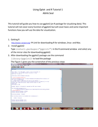
The Figure 1 gives you the screenshot of the previous steps
2. Fig1
1. Learning qplot()
qplot() stands for “quick plot”. It can produce complex plots with a single line of code. The
qplot function in the ggplot2 package and it is based on the grammar of graphics.
2. Datasets used: ggplot2 comes with various datasets. For time being we will use diamonds
dataset in ggplot2 package.
To see how the diamonds data look like you can type
>diamonds #to get the idea of the diamond data or to visualize in Excel type
>write.csv(diamonds,”E:/diamonds.csv”)
Open the file diamonds.csv. Figure 2 give you the table of the diamonds containing
Carat, cut ,color and clarity and 5 physical measurements i.e depth, table and the
dimensions x,y,z .
Fig2
3. Since the dataset contain around more than 50000 rows we will use a small sample of the
data around 250 randomly selected rows to analyse and visualize. To select a random
sample from the data use
>dsmall <- diamonds[sample(nrow(diamonds), 250), ]
>dsmall # dsmall contains the sampled data from diamond dataset.
Plotting the data with qplot()
The general syntax of a simple call to qplot is as follows:
> qplot(x = ???, y = ???, data = ???, color = ???, shape = ???, geom =
???, main = "my plot title").
The arguments are:
x - The x values to plot; they must be a variable in the data frame you specify and there are no quotes
around the name.N ote that if you give only x values (no y values), you are plotting univariate data and
qplot figures this out.However, you have to give a geom that makes sense for univariate data.
y- The y values to plot; they must be a variable in the data frame you specify, and again, no quotes
around the name. If you are providing y values, you have to specify a geom that makes sense with
bivariate data. The name of data frame which contains the x and y values.
Color- Perhaps surprisingly, not a set of colors to use, but rather a "mapping" of the color scheme onto
some variable in your data frame. You are basically telling qplot to use different colors for different
values of the variable you specify; hence this variable should be a factor, not a number. qplot decides
which colors to use.
Shape- Exactly as for color, except different symbols will be used for each value of the variable you
specify. Note that you can use either color = ?? or shape = ?? or both, depending upon how you want
your plot to look. Qplot decides which symbols to use.
Geom- A "geom" specication, which is basically a list of keywords describing what to plot. Common
examples are "histogram", "density", "line", "point" which pretty much do what they say. The geom must
make sense for the kind of data you are supplying.
Main- The title for the plot.
> qplot(price, carat, data = dsmall) # price is taken in x axis and carat in y axis fig 3 a
#Fig 3a shows the distribution of diamonds price and carat. As the carat (weight) increases the price also
increases
> qplot(log(price),log(carat), data = dsmall) # taking log of the data. fig 3 b
#Fig3b shows the logarithmic scale of the data. Logarithmic scales are used when amount of data is huge
so as the range.The figure shows a linear relationship of data in logarithmic scale.
>qplot(carat,x*y*z,data=dsmall) # x*y*z indicates the volume of the diamond. fig 3 c
4. # Fig 3c shows weight of the diamond i.e carat with respect to the x*y*z i.e volume of the diamond.
>qplot(carat, price, data = dsmall, color =I("red")) # set color of dots to red
a Fig 3 b c
> qplot (carat, price, data = dsmall, colour = cut) fig 4a
# The graph gives the idea of different cuts in the dsmall table sampled with carat in the x axis and price in
the y axis . It has been observed that premium and very good quality diamonds price and carat increase
linearly .Some variations are observed in the good and fair diamonds. This command assigns colors to the
plot.
> qplot (carat, price, data = dsmall, shape= cut) Fig4b
# Here the plot is similar to fig4a but in place of color shapes being added to the plot.
> qplot (carat, price, data = diamonds, alpha = I(1/100))
# alpha aesthetic is for transparency which ranges in the value in between 0(complete transparent) and
1(complete opaque) This is applied for diamond dataset Fig4c . The alpha transparency is applied to see
where the points are located at maximum.
A Fig4 b c
5. Adding many points to the plot it becomes very difficult to see what trend is actually shown by the data.
Adding a trend line or a smoothed line to the plot will help to visualize the data at which direction it is
moving. The span parameter maintains the wiggliness of the line when the span is close to 0 the line covers
as much points as possible making the line crooked.
> qplot(carat, x*y*z, data = dsmall, geom = c("point", "smooth"),span=1)
Fig 5a
> qplot(carat, price, data = dsmall, geom = c("point", "smooth"),span=1)
Fig 5b
> qplot(carat, price, data = dsmall, geom = c("point",
"smooth"),span=0.2) Fig5c
Fig5a fig5b fig5c
> qplot(color, price/carat, data=dsmall,geom=c("boxplot", "jitter")) Fig 6c
#Here the box plot summarizes the data with only five numbers i.e the sample minimum, lower quartile,
median, upper quartile and the largest observation. Though you will find Box plots are much more
informative than the jitter plots. Here jitter plots have shown some overplotting such as Fig 6a . When we
increase the transparency by the alpha parameter we can easily find out where the maximum points lie.
> qplot(color, price / carat, data = diamonds, geom = "jitter", alpha =
I(1 / 5)) Fig 6a
#Jitter and box plots shows the distribution of categorical variable and continuous variable .Categorical
variables are those which are not quantitative. Quantitative variable means whose value is naturally
measured. The jittering helps to investigate distribution of price per carat conditional on color. Here as the
color improves the spread of values decreases.
>qplot(color, price / carat, data = diamonds, geom =
"jitter",alpha=I(1/100)) Fig 6b
6. Fig 6a fig6b fig6c
Histogram and density plots shows the distribution of univariate data. These provides more information
about the distribution of Univariate data than box plots do.
>qplot (price, data = diamonds, geom = "density", color=color) #fig7a
In figure 7a it shows that the distribution of diamonds with respect to price for each level of diamond color.
>qplot (price, data = diamonds, geom = "histogram",fill=color) #7b
In fig 7b you can see that within a price range around 1200 you can find the maximum color of diamonds
> qplot (color,data = diamonds,geom = histogram", weight=carat)
+scale_y_continuous("carat")
Fig 7a Fig7b Fig7c
>qplot(carat, ..density.., data = diamonds, facets = color ~ .,geom =
"histogram", binwidth = 0.1, xlim = c(0, 3))
#xlim is the limit of x axis and binwidth is the width of the histograms facets which are choosen by the form row
variable ~ column variable. Use of more than one variable like 2 and three will make the graph very long time to
compute and also making the graph much complex. Color facet used as row variable.
> qplot(carat, ..density.., data = diamonds, facets = . ~ color,
geom="histogram", binwidth=0.1,xlim=c(0,3))
# when color facet is used as column variable.
7. From the two figure 8a and 8b it is observed that 8a is much more informative than 8b because we can see in 8b
the bars are much more congested and difficult to interpret than bars in 8a. High-quality diamonds (colour D) are
skewed towards small sizes, and as quality declines the distribution becomes more flat.
Fig 8a Fig 8b
Now to use the maps package( the maps package contains maps of USA,World,Italy,New Zealand,France
To install maps
>install.packages(“maps”)
Mapss pacakage has various datasets among them one is us.cities to see the dataset type to use the data
us.cities
> data(us.cities)
Now the cities have populations as a variable. I want to make a sample of data of population >500000
> sample_city<-subset(us.cities,pop>500000)
> qplot(long ,lat,data=sample_city)+border(“state”,size=0.5)
There is one problem in R while plotting maps you have to provide the longitude and latitude of the
destination otherwise the point will not be plotted on map.
8. >qplot(long,lat,data=sample_city,size=pop)+ borders(“state”,size=0.5)
The size attribute will help you to visualize the state’s population in the form of size of points
Note size attribute in the border function indicates the size of the boundaries if I increase it the border
length from 0.5 to 1.0 will increase for example the diagram given below shows it.