2. In shops, the left third of the magazine is
usually the only area on show and therefore
magazines have to concentrate on this area
in particular to make sure that it can catch
the attention of customers. The left third of
this image contains information on Toy
story, batman and Jonnah Hex. These three
media texts have the ability to attract a wide
range of different magazine readers. And
the way they are presented fits into the
theme of main advertisement for ‘Inception’
and therefore the style and the text is likely
to push a customer to pick up this magazine
to see what it is about.
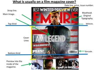
Strap line: The worlds biggest movie magazine.
Not completely visible but empire is a well known
magazine and therefore the title speaks for itself.
Masthead shows the magazine title: ‘EMPIRE’, it is
eye catching because the text is in red and the
word is in capitals.
Main image of Leonardo DiCaprio. Covering the
masthead. This could be a technique to draw
peoples eyes to the film instead of focusing on the
magazine title. The expression on his face is very
intense and if a magazine is being stacked on shelves
to the point when the top of the magazine is only
visible then this will stand out on a shelf and
encourage people to purchase it and read it.
3. Coverlines allow
people to know
the essential
articles inside
the magazine.
Middle third. The
typography of the films
title is large, with the
same style as the title
of the magazine title.
Why? This could be to
highlight the
importance of this
magazine along with
the film.
The placing of
Leonardo Dicaprio
in the foreground
of the image seems
as though he is
almost stepping
out of the image
which links to the
word and title
‘inception’.
Inception is defined
as the starting
point of an activity.
The use of mise-en-
scene with his
costume (suit) and
prop (gun) all
suggests to the
reader that this is
the beginning of
some type of
operation/mission.
4. Website allows
readers to research
into this magazine
company and find out
more information
about upcoming films.
Date, price and issue
number.
Tag placed on the left
third. Typography is in
bold, capital letters
which is eye catching.
Background colour is dark
and misty which links to the
mysterious nature of harry
potter film storylines.
C
O
V
E
R
L
I
N
E
S
5. Tag – ‘WORLD EXCLUSIVE!’
used to encourage people
to buy the magazine as it
shows that it has high
compliments.
Barcodes allows customers
to see how much the
magazine will cost them to
purchase.
Top strip and bottom strip are often used to show
what else may be included in the magazine. In this
case, the top strip informs the reader that 10 of the
coolest movies that are currently.
The bottom strip informs the reader that they will
gain information from being on set with Robert
Downey Jr. This is likely to be an interview, with
images etc which will encourage fans of this actor
and fans of this film.