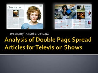
2. Main Image –The main image is a medium close up or MCU of a Secondary Imagery –
Main Heading/Headline – The conventional heading for this
woman presumably linked to the TV show. The image fills the whole The secondary image
double page spread is ‘Class Warrior’ and is situated in the top left
of the right hand page, and on the shoulder on the left, text here is embedded
corner of the page, aligned left with the body text below. This
wrapping has been used. The resulting effect is a very eye-grabbing within the body text
presents an root of insight into the show.
feature on the page that stands out against the rest. gives the reader an
alternative view upon
the woman. A white
Show Name, Channel text is layered on top to
and Time – This small develop the image’s
common feature of the significance to the TV
spread here is used to show.
inform the reader of the
show title, channel and
showing time. This is Side Quote – The
rather conventional as double page spread
the magazine is contains a side quote
primarily used to located here in the top
advertise the TV show. right corner of the
spread. This is used
here to link to the main
image.
Body Text/Copy Text –
Quote Line – This double
page spread uses a quote
line to introduce the Page Number – A
article. The use of a common and
question is especially conventional page
effective in sucking the number is located in the
reader into wanting to bottom left/right of the
know more. The quote spread, generically
line is rather common in labelling the page
double page spreads. number so the spread is
Body Text/Copy Text – The body text of this article is in a standard times new roman typeface for
easy to find in the
simplicity, with several conventional drop caps which is presumably to divide the paragraphs. The
magazine.
use of a pull quote is also quite common but is effective in grasping the reader’s attention.
3. In conclusion, the article is very
effective and eye catching in its
simplicity. I especially like the use
of the large main imagery because
of this. The combined use of
secondary imagery develops this
alternative side to the woman,
generating the interest needed to
convince the magazine buyer to
read onwards. With regards to this
double page spread, it simply uses
the common conventions and
nothing more really. However I
will be sure to utilise the stylistic
drop caps on paragraphs, as well
as a large title and possibly
secondary imagery also.
4. The Main Image – Here the main image is of an older teenager lying
Caption – The caption used here for the main image is ‘behind
on a bed. The image intelligently links the diary with the mise-en- Secondary Imagery –
the scenes’ but due to the positioning of the text it appears to
scene of his books and pen he holds to his chin. The image presents This page has been
be a title. The viewer is then to be diverted to the main image
the idea that the teen is a typical student but later we realise this designed with
and main heading to realise exactly what the caption means.
isn’t the case. secondary imagery to
appeal to the viewer to
watch the TV show,
plus this is developed
with text over the
images and in doing this
Main
it develops further
Heading/Headline –
information which has
The main headline ‘A
the possibility to
diary of courage’ is used
persuade viewers to
to interest the reader in
watch the TV show.
what’s to come in the
text below. The reader
is then to expect a Side Bar – The use of a
captivating read, which side bar here allows the
is then introduced by reader to view
alternative shows to
the quote line.
this one. There are
images used to
illustrate the shows and
text to introduce them.
Body Text/Copy Text –
Quote Line – The quote
line here is slightly larger Page Number, date and
that the body text but a publisher – Aligned right
common type face. This is at the bottom corner of
to introduce the rest of Body Text/Copy Text – The common body text develops the introduction from the quote line and the spread is the page
article to the reader advertises the show further. The body text here is used solely to entice the reader to watch the number, and the on the
which should lead them show and so it is essential that it be interesting. The timed structure using a red digital clock face, left, the date and
to read onwards. challenges conventions of typical articles but is very effective in dividing the text in alternate publisher. This is very
fashion to drop caps. generic and conventional.
5. In conclusion, the double page
spread for ‘Alex: a Passion for Life’
uses a range of the common
conventions of articles such as the
side bar main header, images,
secondary images etc. I believe that
the use of more secondary imagery
would be more suited to our double
page spread. Stylistic ideas such as
the side bar and channel listening
could be used in our article as they
appear to be very effective here.