
Recomendados
Mais conteúdo relacionado
Mais procurados
Mais procurados (20)
Destaque
Semelhante a Website Analysis - Cancer Research
Semelhante a Website Analysis - Cancer Research (20)
Mais de Zahra06
Mais de Zahra06 (20)
Website Analysis - Cancer Research
- 1. Website Analysis - Cancer Research
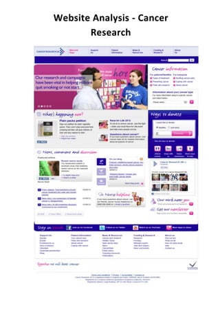
- 2. The website above is a website for the campaign ‘Cancer Research.’ At the top hand corner they have their logo. This logo is not very big and doesn’t stand out very much, however as this logo is used in all aspects for the cancer research, many people are familiar of the logo. Personally I would like my logo to also be on the top left hand corner as I feel it is at the top so it is still seen as important and it should be on all pages. The colour scheme has been kept consistent throughout the website. The colours are blue and pink which are the colours that are associated with this campaign.I would like to use very few colours throughout the campaign just like this one because I think it looks much more professional. The website has a slideshow on the homepage in which there are a few central images with text that changes every few seconds. Emotive language has been used in each of the texts with images to engage the reader. In my campaign I would like to have a central image on my homepage to grab my audience’s attention, however I don’t think I would like several main images as it can be quite distracting and lose the impact of one main image and text. They have tabs at the top of the page leading to several other pages which are very easily accessible. They also have tabs on the right hand side, these link to information e.g. about types of cancer. I would definitely include the tabs leading to other pages, preferably at the top of my website, however I don’t think I would include loads of other tabs as it may make things a little confusing. On the right hand side of the website they have a box that is made very clear which is for the public to donate money for this charity. I really like the way in which this box is made very clear and stands out even though it isn’t in the centre of the website. I would like to create a donation box on my website; however I don’t think it is needed for my campaign and is more specific to charitable campaigns and more serious issues. At the bottom of the page the website includes links to other aspects of their campaign such as: social networking sites and YouTube. These will definitely be included in our website as they give our audience more ways of keeping in touch with what’s going on within the campaign. The lower half of the webpage they have included a part witch tells the viewer what news has been updated and it also allows you to have a discussion with others. I personally feel this section is a little confusing compared to the top half as there are loads of links for various different topics without sub-headings stating clearly what they are about. Lastly at the bottom of the page they have included more tabs which link to pages that they may have already been stated previously, however this way just shows all the tabs clearly all in one place. I don’t think I would make any more tabs on my webpage other than the ones at the top as I wouldn’t want the page to get too cramped.