Portfolio Z&G.Branding (max)(Eng)
•
2 gostaram•5,230 visualizações

"Z&G. Branding" is one of the first Russian companies offering the service of developing the Brand with legal protection. "Z&G. Branding" is included in the Russian Top 25 in category "Brand Design" (Russian Association of Communication Agencies).

Recomendados
Mais conteúdo relacionado
Semelhante a Portfolio Z&G.Branding (max)(Eng)
Semelhante a Portfolio Z&G.Branding (max)(Eng) (20)
Mais de Z&G. Branding
Mais de Z&G. Branding (20)
Último
Último (20)
Portfolio Z&G.Branding (max)(Eng)
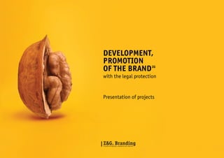
- 1. Development, Promotion of the Brand ZG with the legal protection Presentation of projects 1
- 2. About us “Z&G. Branding” is one of the first Russian companies offering the service of developing the Brand with legal protection. Z&G. Branding is included in the Russian Top 25 in category “Brand Design” (Russian Association of Communication Agencies). 5 benefits you get contacting us: 1. The Brands we develop are professional and attractive, what is proved by number of Russian and International Awards: “Logolounge” (USA), “Advision Awards” (USA), “Granddesigno”(Russia), “IDEA!” (Russia), “MIAF” (Russia). 2. We develop legally protected Brand Names and Logos with Registration at Rospatent (Federal Institute of Industrial Property — FIPS). 3. “Z&G. Branding” employs a patent attorney to check the Brand Name at FIPS (and save you up to 4 000 EUR). This service is included in costs. 4. Clients ordering the service of the Brand Name Development and Registration get annual New Brand Protection Service for free. 5. Our Strong Advantage is Result. We are working on your project until you say “Agreed”! Our Professional Approach is recognised by authoritative Russian and international contests such as: “Logolounge” (USA), “Advisio Awards” (USA), “Grandisaino” (Russia), “Idea” (Russia), “MMFR” (Russia). On the moment “Z&G. Branding” completed more than 100 projects on branding. 2 Top 25. Russia “Z&G. Branding” is in the Top-25 in the Russian segment of “Brand Design” (Russian Association of Communication Agencies, 2010). Top 50. International The Logo “Brandoholik”(designed by “Z&G. Branding”) entered into the top 50 of Best World Trend Logos (“Logolounge”, USA). We can develop for you: Market Research Brand Positioning Brand Name Logo Design Corporate Identity Brand Book Package and Label Design Advertising Concept Trademark Registration Moreover, we offer: Turn-key Brand Development Copywriting Catalogues / Company’s Presentation Website design Promotional and Media Planning Strategy Brand Character Our Clients: Olimpstroy (Moscow) Russian product (Moscow) Good News (Moscow) Delta Commercial (London) Action pour Guerison (Paris) Tcherkashin and Partners (Ekaterinburg) FORUM Group (Ekaterinburg) UTB (Ekaterinburg) Uralkeramika (Ekaterinburg) The Government of Sverdlovsk region (Ekaterinburg) Administration of Ekaterinburg (Ekaterinburg) SportMaxi (Ekaterinburg) R-modul («Monetka» retail chain centre) (Russia) Behagen (Samara) Aurent (Ekaterinburg) Sevencom (Pishma) Active Park (Ekaterinburg) K Telecom (Ekaterinburg) Ural Isolit (Ekaterinburg) GAVROCH’Iya (Ekaterinburg) Tisol (Ekaterinburg) Rosbakaleya (Ekaterinburg, Russia) Mebelton (Volgodonsk) Prirodnyi Standard (Ekaterinburg) Eeletech (Ekaterinburg) Solovyov’s Wine Shop (Ekaterinburg) Iv Production(Ekaterinburg) Arkom trading house (Ekaterinburg) Zlatoust Machine-Building Plant (Zlatoust) If you have questions, do not hesitate to contact us: Vladimir Zholobov, CEO “Z&G” zg-company@list.ru Nikolai Solovyov, head of “Z&G.Branding” zg-brand@list.ru.
- 3. Contests and Awards Grandisaino 2008 Design Contest for ambitious and talented (Russia) Idea 2009 National Advertising Fest (Russia) Advision Awards 2008, 2010 International Advertising Competition (New York, USA) Logolounge 2009, 2010 World-famous Logo Catalogue (USA) 3
- 4. Why do we need Brands? Firstly, the Brand precisely identifies the company’s product (service). Moreover, the established Brand helps to increase the company’s performance and profitability. For example: Market research Russian knitting factory Zara 120 EUR 20 EUR 2 EUR 1,5 EUR 1 EUR Profitability 400% 1 330% 500 units 30 000 units 10 000 units Income 1 500 000 EUR 700 000 EUR 1 100 000 EUR 620 000 EUR 20 000 EUR Promotion Strategy Brand Book Advertising Concept Market Entry 30 000 EUR Profit Package Design 4 900% The number of sales per month Corporate Identity 6 EUR Costs per unit Brand Name D&G Price per T-shirt Positioning Concept Logo Design Producer 4 The stages of Brand Development process
- 5. Сustomer Reviews M. Ershov , CEO «Behagen» — “Z&G.Branding” implemented a very important project of creating the New Brand Name for our Company. We found the task very ambitious and difficult, but they did it well! I would like to point out the high degree of responsibility and attention paid to the strategic component of the project . Moreover, we got helpful consultancy and successfully applied it in practice. We thank the the team and looking forward to working together on new projects. Yulia Litvinova, advertising manager of the clothing retail chain “SportMaksi” — “Z&G” has developed several Brand Names for our clothes lines. We are very pleased to had this collaboration and therefore I would particularly like to highlight the company’s strengths in the field of Brand Development and Trademark Registration. It helped us to save time and money on checks at FIPS (service is included in the costs). Berezkina Elena, Head of Public Relations and Advertising “Uraltransbank” — Thank you for an excellent job on creating the Corporate Style and Brand Book for “Uraltransbank”. The experts from “Z&G” coped with this task professionally and in time-efficient manner. The federal retail chain «Mebelton» — “Z&G” developed the Brand Name, Logo, Corporate Identity and Brand Book or our company. The work of experts surpassed the most optimistic expectations, and it seems like we were not alone in our estimations. Our New Brand had been featured on the National Furniture Fair and we had been awarded with five diplomas, and one of them for the Best Brand. We are looking forward to further successful collaboration! Catherine Sobolina, CEO “Action pour Guerison” Foundation (Paris, France) — We like the proposed version of Logo and Corporate Identity, because it will have the same meaning in all countries we plan to develop our fund in. Popok Daria, supervisor of advertising and trade-marketing at “Tcherkashin PARTNER” — Thank “Z&G. Branding” for designing Label Design and Brand Character for our baby-sausages. You met our expectations and offered a qualitative service. Petrukovich Alex, Project Manager “Press House” (Russia, Moscow) — Thanks to the company “Z&G” for the conscientious and efficient work on the number of “Press House“ projects: cafes “Nuage” and “Red cafe O’lya”, restaurant “Sacvoyage” (airport “Koltsovo”). Serious attitude to work, the trusted experts, high standards and meeting the deadlines. Alexander Arutyunov, CEO of the European Construction SuperMarket “MANE” — We thank the company “Z&G” for such a pleasant cooperation! The company’s specialists have implemented a project from a scratch: conducted Market Research, then developed a Positioning Strategy, The Brand Name, Logo, Corporate Identity, Brand Book and all necessary Corporate Identity. Moreover, they proposed the original advertising idea (“Parquet Zebra MANE” at pedestrian crossings) that worked flawlessly and had been featured in the media! 5
- 6. Brandogolik An international Brand Contest Our Goal To develop Brand Concept for the International Brand Contest. Our Solution We came up with the Brand Name “Brandogolic”, which symbolises the consumer who is attached to his favourite brands. The created Logo represents a bright and versatile letter “B”: different Industries, different Brands, different Consumer Emotions. Logo contest is primarily designed to symbolise and evoke the positive consumer emotions. Recognition/Awards “Brandogolik” entered the top 50 Trending Logos in the World, according to the famous American project “Logolounge”. Short-list of Moscow International Advertising and Marketing Festival (Red Apple). 6
- 7. 7
- 8. 8
- 9. 9
- 10. Balalaika Music Bar Our Goal To develop Brand Name, Logo, Corporate Identity and Advertising Model for a Music Bar. The idea behind it was to create the visual image that would merge together Russian traditions with contemporary music in a cosy atmosphere of the bar. Our Solution Logo is built on the ‘mark of Russian soul’, balalaika music instrument, and the symbol of celebration - a glass. There are 2 fonts used: for the main part of the Name the font is strict and clear, while the extra inscription looks like handwriting, contributing emotions to geometrical forms of the Logo.The colour scheme is contrasting. Victory / Awards The Logo and Advertising Model “Balalaika” won the international contest “Advision Awords” (USA, New York). Short-list of Moscow International Advertising and Marketing Festival (Red Apple) and “Idea”. 10
- 11. 11
- 12. 12
- 13. 13
- 14. The Year of Teacher 2010 Federal project Our Goal Ministry of Education and Science of Russian Federation had announced a competition to design the Logo for Federal Programme “The Year of Teacher, 2010”. The aim was to improve the creative and professional skills of teachers, improving their social status and the creation of a new modern image of the Russian teacher. Our Solution The contest received more than 2000 works. The Logo, proposed by ”Z&G”, on the first step entered the Top 200, and on the second tour of competition was awarded with the 3rd place (as a result of user preferences in professional web-portal Sostav.ru). The emblem comprises the picture of a pen made from flames associated with such expressions as the “Fire of Knowledge”, “The light of knowledge.” Also our team created the original font design. Natalia Mitrofanova, the teacher and the Head of the Educational work of the Ekaterinburg College of Electrical Engineering — I am for this concept, because it possesses a deep semantic knowledge without excess of details. Many proposed logos exploit children’s drawings and various images of children, which is, in my opinion, not correct approach: on the one hand, teachers are working with students of all ages, not only with children. On the other hand, the project is firstly addressed to teachers, and indirectly to students. The concept of “Z&G” represents the Mission of the Teacher: transferring the knowledge and “ighting the fire” in the people’s hearts. 14
- 15. 15
- 16. Hercule Law firm Our Goal To develop the Brand (Brand Name, Logo, Corporate Identity), and website design for the law firm “Hercule”. Our Solution We pursued the idea to create a charismatic image that would stand out from the competitors. Therefore, as the basis of the Brand Name and Logo we took the well-known literature character and professional detective “Hercule Poirot”. Brand “Hercule” attaches to the company the relevant image of reliability, pedantry and confidence. 16
- 17. 17
- 18. Dainet Internet cafe Our Goal To develop the Brand Name, Logo and Corporate Identity for Internet cafe. The Logo have to be creative and innovative. Our Solution Before selecting the Brand Name “Dainet”, we tested about a hundred titles. It is worth mentioning that when implementing the project we decided not to go the classical way (we usually start with Brand Name and then go on with Logo Design). But this time we came up firstly with the Logo Design and then created the Name for the new Brand — “Dainet” (“dai” = give, so it means “Give me (Inter) Net” and, on the same time, “Da”= yes, and we finally have “Yes to (Inter) Net”). And the logo ... The logo is a stylized interpretation of a computer mouse and spoons. The logo appeals to specialization of the place (Internet cafe). The Logo Design reflects the personalities of people coming to the cafe — they are modern, creative, ambitious young people consuming large flows of information in the Internet. 18
- 19. 19
- 20. Miller Beer Brand Our Goal To develop the Package Design and Advertising Model for a beer can (limited edition for night club) a beer can with regard to style of “Miller”. Our Solution The Package Design should target active young people who spend their free time in the clubs. We used the stroboscope flashes to show versatility of night life, as well as energy and motion of the dance floor. As the Slogan says, “Miller go beyond”. 20
- 21. 21
- 22. 22
- 23. 23
- 24. State Farm Sukholozhsky Dairy products Our Goal To re-brand “State Farm Sukholozhsky”, the dairy products producer since 1964. The project comprised developing Logo, Corporate Identity, Packaging Design for dairy products line, and also organizing all the corporate identity elements in the Brand Book. Our Solution Our starting point was to formulate the product line concept as “qualitative dairy products, which have the trust of consumers and made with modern standards”. Then we formulated the slogan — “Useful products since 1964”. During the meeting, we remembered that client talked about the beautiful nature and rich history of the place where the production is located, so we decided to reflect it in the Logo. We designed a special font to emphasize company’s rich in traditions, and therefore intentionally did not use any modern font types. The Logo is a stylized image of the wheat ear — the symbol of fertility, rebirth, the divine gift of life. We realised that the Russian dairy companies do not use any descriptive words except from “milk” and “dairy”. Considering this, we added the word that would reflect the product qualities. Such a phrase became the expression “polesnui” (from Russian, healthy, necessary). So, the product appeared in the market as “Healthy Milk”. Packaging Design is simple and concise, and we purposely did not use any out-of-box approaches considering the preferences of target audience. As the final step, we created the detailed Brand Book, where we included the recommendations for advertisement, marketing communications and the further strategic development for the brand “State Farm Sukholozhsky”. 24
- 25. 25
- 26. Tcherkashin and PARTNER Sausages “Kroha” (from Russian, “Baby”). Our Goal To create Label Design and Brand Character for children’s sausages “Kroha” (Russian, “Baby”). Our Solution We started with analysing of market research data which was provided by the client. So, we identified vector of the project and started to develop a general idea for the character. We decided to use the images of the Musketeers (novel of A. Dumas) because this image is easy recognizable among the target audience: both children and parents . The final idea was consisted of several points: – musketeers like to eat meat products, – musketeers are taking active part in adventures and battles, – musketeers are the example of loyalty and friendship, – musketeers are successful in terms of BTL promotion. We proposed to client three variants of characters, tested them on target audience (children and parents). The chosen final image of Brand Character Musketeers is portrayed as a cat. 26
- 27. 27
- 28. Coffitel Chicory drink Our Goal To develop a new Package Design for instant chicory drink, which will work for sales increase and help to get bigger share on the market. Customer: JSC “Russian Product”. Our Solution As the idea for the entire product line we selected European, “Vienna” style, which is primarily demonstrates the emotional component of product and transfers the cozy atmosphere of old European city. Chicory is a specific product, consumed by people who care about their health, and sometimes for reason to refuse the use of coffee. The Label Design is detailed and deeply elaborated. The Product attracts attention and distinguishes the product from the competitors. 28
- 29. 29
- 30. Kellany Tea Our Goal To develop Package Design for tea. Our Solution The client already had a Brand Name and provided us with all the materials and information about the project and the tea market, which certainly helped us in ideas elaboration. We proposed 3 concepts: The first concept had a minimalist style and was based on the main stylistic picture, having advantages such as simple reading of information from the packaging. The second concept was designed in a similar way as the first one, with addition of a stylistic misted glass of hot tea. The third concept (finally chosen by our client) comprised elaborated scenery emphasizing the emotional component attached to the product. 30
- 31. 31
- 32. Pragmen Beer Our Goal Turn-key Brand Development for beer. Our Solution We conducted the detailed study of the market and then defined the idea of positioning strategy to attract consumers — “Czech Tradition”. Target Group 1: Men 35–45 y.o., senior and top-management. By this age, men are usually successful in the chosen field. Target Audience 2: Men 25–35 y.o. claiming to be beer connoisseurs and therefore raise their status in the eyes of others. We chose the Brand Name “Pragmen”, with a close connection to the producer of the one of the best beer in the world. Brand Name “Pragmen” is formed from two English words: “Prague” — Prague and “Men” — men, males. “Prague Men” prefer only the best beer. Phonosematic signs are: brave, big, simple. The slogan is “Pragmеn” — the connoisseur of Czech beer traditions. The Logo comprised the individually designed font. The Logo’s task is to highlight the individuality of the product on the functional and emotional level. The functional level is easy readable and identified product name, while the emotional one play on the association with Europe. Creating the Label Design, we thought about the sentimental romance of Czech Republic with its old castles. As an example, we took the 350 years old castle on the banks of the Vltava. This is a wonderful symbol creating the atmosphere of 16th century, and it has its reflection in the Label of beer “Pragmеn”. Also, we used “expensive” color shades — black and gold. Our message is that “Pragmеn” is not only a Beer Brand, but the ambassador of Czech traditions! By purchasing “Pragmеn” customers automatically acquire the status of a beer connoisseur. 32
- 33. 33
- 34. Pervyi Dvor Meat delicacies (premium) Our Goal Develop the Brand Name for meat and sausage products in the premium segment. The project comprised Market Research, Positioning, Name, Logo, Corporate Identity, Brand Book, Advertising Concept. Our Solution On the market research step (Ekaterinburg market) we analyzed such factors as: the share in consumers mind and soul, association that consumers have for competitors brands, the reasons to buy the particular brand, the purchase influencing factors, the criteria of the quality evaluation. After analysing the market, we began to develop Positioning Strategy. The basis of positioning strategy laid on the surface — “High quality meat products made in Russian countryside”. The survey showed that respondents says that the taste of some meat brands is regularly changing, which in turn indicates the irresponsible quality control of raw materials. This fact was mentioned by many consumers and it was time for us to act. The next step was developing of the Brand Name and the registration of the trademark. We created two hundred Brand Name variants to check in “Rospatent“ (Federal Institute of Industrial Property) and then tested them on the target audience. After that the new Project and Brand Name appeared — “Pervyi Dvor“. For the visual Brand Identity we chose black-andwhite colour range, sending back to the times of the “Russian Empire” in the late 19th century. As an additional element of Corporate Identity we selected the Russian Empire coat of arms (1825) that would express the spirit of that time. After that, we developed all the elements of Corporate Identity and included them in Brand Book. 34
- 35. 35
- 36. HiMANS Household appliances Our Goal Develop the Brand Name, Logo, Corporate Identity, Brand Book for home appliances manufacturer. Our Solution Development of the project began with an analysis of the market and discussing the strategic differences of the particular Brand from competitors. After a few sessions the future concept of positioning strategy was formulated as “higher level”, the concept that our client also stated in his mission. Then we began to implement the one of the most complex Brand Naming processes in our portfolio. When developing the titles we used all sorts of “associative maps” to construct Brand Name, and checked at FIPS more than 600 different variants of which only 20 could be registered. Finally, we chose the Brand Name “HiMANS”, combination of the two ideas: first one that “HiMANS” are user-friendly appliances (Hi, man; hi, humans), and according to the last one “HiMANS” possesses a high level (Higher in Manners). As the idea for the Logo we took inclined letter “i”, which has to highlight the strict logo design. Further we worked on the development of the Brand Book and systematized all the constants of Corporate Identity. 36
- 37. 37
- 38. Sevencom ISP provider Our Goal To re-brand ISP cable and Internet service provider. It is necessary to conduct Market Research and develop Positioning, Brand Name, Logo, Corporate Identity, BrandBook, Advertising Concept and Trademark Registration. Our Solution In order to better understand the market and identify its main characteristics we conducted market research. Also it helped to found out the strengths and weaknesses of competitors. During the Brand Name development we have worked out (developed , tested, checked at ”Rospatent“) about 250 potential names, and chose 5 to presented to the client. After discussion of the all options and testing on consumers, we agreed on the Brand Name “Sevencom”. Then we developed Logo, Corporate Identity and Brand Book. Then went to the most creative stage — the development of Advertising Concepts. It was decided to create a Brand Characters (drawn like in pencil), do not use any dominant color and make no accent on tariffs and prices. We appealed to emotional side of the consumer and bet on the concise slogans designed in the style of “spelling errors”. 38
- 39. 39
- 40. Detland Online shop of clothing for children Our Goal To develop a bright, original Logo and Corporate Identity for an online store selling children’s clothing (Russian and foreign brands) at reasonable prices. Our Solution As the basis of Logo and Corporate Identity we took plasticine that fully associated with children’s creativity. Logo and Corporate Identity of “Detland” look like made from plasticine and show the world of children’s emotions and first art experiences. Such a sculpted by small children hands Logo is a unique symbol of the children’s creativity. 40
- 41. 41
- 42. Behagen Windows, gates and ceilings Our Goal Turn-key Brand Development (Positioning Strategy, Brand Name, Logo, Corporate Identity, Website Design, Sogan, Advertising Concept) for company “Cheryomushki”. The old Brand “Cheryomushki” existed for more than 15 years and had customer recognition in Busuluk (Orenburg region). Aiming to enter new Russian markets (Samara) the headquarters decided to make a re-branding to stand the competition from major national brands. The New Brand should reflect some values of leading foreign construction brands. Our Solution The segment we chose was ”professional brands”, because Russian consumers are willing to pay more for reliable professional product. Speaking about emotional component of the Brand, preference was given to the German philosophy of doing business. After working out 146 different variants of Brand Names, we chose “Behagen” (from German — contentment, comfort). Phonosemantic analysis describes the Name as Short, Funny, Fast, Safe, Vivid. The domain www.behagen.ru was registered. When designing Logo and Corporate Identity, we took “German” colours as a basis — black and yellow. Advertising Concept comprised a series of ads designed to explore the New Brand and deliver value to the minds of target audience. In the first layout we placed slogan of “Behagen” — “Reliability is still important!” (we did not put a logo to avoid any direct association with the advertising layout). The next advertising models have been devoted directly to the products that company offer, for instance, windows, gates, ceilings. In the given framework they have to convey the message of reliability of German products with honest factual information, for example, for window we used the slogan “Durable window can be opened 500,000 times!”. In parallel to these advertising layouts we created 5 videos and audio messages to broadcast in the media. 42
- 43. 43
- 44. 44
- 45. 45
- 46. Action pour Guerison Foundation (Paris, France) Our Goal To design Logo for the charity foundation helping Russian children in France. Our Solution We like the proposed version of Logo and Corporate Identity, because it will have the same meaning in all countries we plan to develop our fund in. Catherine Sobolina, CEO “Action pour Guerison” Foundation (Paris, France). 46
- 47. 47
- 48. KINOME Professional movie production studio Our Goal To develop Brand Name, Logo, Corporate Identity for professional movie production studio (production of films and commercials). Our Solution Extraordinary, emotional, creative — these are the characteristics of products made by the production studio “KINOME”. The logo is a stylized cracker used in process of filming and consists of the words that belong the cinema industry. For the employees of “KINOME” we specially developed the “personal crackers” to use them in film production. Corporate Identity is aiming to create an image of a company specializing in creative movies. The Style of studio “KINOME” merging together two eras of film making. Black and white associated with the atmosphere of an old cinema, while blue and pink are the colors that transformed the era of white-and-black cinema to contemporary one. 48
- 49. 49
- 50. 50
- 51. 51
- 52. BuddaOil Petrol stations Our Goal To develop Logo, Corporate Identity for the network of petrol stations “BuddaOil”. 52
- 53. 53
- 54. 54
- 55. 55
- 56. Uraltransbank Bank Our Goal To develop Corporate Identity and Brand Book. 56
- 57. 57
- 58. MANE The Construction Supermarket Our Goal Turn-key Brand Development for the construction supermarket. The project comprised: Market Research, developing of Positioning Startegy, Brand Name, Logo, Corporate Identity, Brand Book, Advertising Concept, as well as defining the marketing strategy and launching the Supermarket in the Ekaterinburg market. Our Solution After the conducting the market analysis, it was decided to position the Brand as “European Construction Supermarket”. We decided to identify the market niche as complex equipment of constructing materials of European quality at affordable and reasonable prices. We reflected that in the slogan “Nice renovation for a reasonable price”. As in today’s Europe, priority is given to quality materials at medium prices together with the friendly service. We developed about 250 variants for Brand Name and in collaboration with client selected the Name “MANE”. The idea behind is to compare our unique project with the greatest impressionism artist Edouard Manet. The Logo looks like the lily — the symbol of purity, majesty and innocence. Next, we developed the Brand Book with description of all the branded items and rules for their application. After that we came up with the concept of advertising. 58
- 59. 59
- 60. 60
- 61. 61
- 62. Arioso Lingerie shop Our Goal Develop the Brand Name, Logo, Corporate Identity, Brand Book for company selling underwear in the mid-price segment. Our Solution We chose the image of Spain, because on the one hand, the country is open and friendly, and on the other hand, this image is rarely in the Russian market. We created more than 250 names variants for Brand Name, from which we finally selected 10. After the presentation of the project to the client, we agreed on the name “Arioso” (from Spanish, expressive). Semantics and phonetics impressed both the client and target audience. After the registration at Rospatent we started to develop Logo made in the laconic style with minimum of details. 62
- 63. 63
- 64. Helfer Law Firm Our Goal To develop Trademark (Brand Name, Logo, Corporate Identity) for a law company. Our Solution It is believed that German companies are accurate, reliable and thorough — all the qualities we need to characterise the new Brand. We came up with about 150 names to choose and selected 5 for final presentation to the customer. The final Brand Name was “Helfer” (in German,”assistant”), which fully meets the legal nature of the agency. After successful completion of the first phase, we began to develop Logo and Corporate Identity. For Logo, we select the first letter of the company’s name — “H”, that could be further used as monogram on different branded items. 64
- 65. 65
- 66. KRSU Corporation of the Middle Urals Our Goal To develop Logo, Corporate Identity for “KRSU” (Corporation of the Middle Urals). 66
- 67. 67
- 68. 68
- 69. 69
- 70. RED cafe O’lya Cafe of Russian cuisine Our Goal To develop Logo, Corporate Identity for the cafe Russian cuisine “Red CAFE Olga”. Petrukovich Alex, Project Manager “Press House” (Russia, Moscow) — Thanks to the company “Z&G” for the conscientious and efficient work on the number of “Press House“ projects: cafes “Nuage” and “Red cafe O’lya” , restaurant “Sacvoyage” (airport “Koltsovo”). Serious attitude to work , the trusted experts, high standards and meeting the deadlines. 70
- 71. 71
- 72. valise Restaurant Goal To develop Logo, Corporate Identity for the restaurant “Valise”. 72
- 73. 73
- 74. CherriDom Household goods supermarket chain Goal Turn-key Brand Development (the Brand Name, Logo, Corporate Identity, Brand Book) for the retail chain of goods for home. Sevryukov Eugeniy, chief development officer of the retail chain “CherriDom” (household goods) — The company “Z&G” used the creative approach in designing Logo and Corporate Identity(organised in Brand Book). Moreover, experts from “Z&G” consulted us on the future strategic development of the Brand. We express our gratitude for the mutual understanding and efficiency of collaboration. 74
- 75. 75
- 76. Uralkeramika The producer of ceramic products Our Goal To develop a new Corporate Identity, Brand Book and Advertising Concept for the ceramics producer (“Uralkeramika” factory). Our Solution Firstly “Uralkeramika” arranged the tender, where several companies were invited. Each company was asked to develop a strategy to promote the Brand “Uralkeramika”. After 2 weeks of searching for creative solutions, we brought our concept to final presentation with “Uralkeramika” headquarters, who gave their preference to our expert team. Our concept comprises the following elements of corporate identity: rectangles symbolizing ceramic tile ( the most popular product of factory) in corporate colours (blue and red). For Promotion Strategy, we proposed to use the series of images designed in corporate colours and consisted of rectangles (ceramic tiles). Therefore, we came up with 3 images: 1) vase with a flower, 2) sofa and 3) girl. Each of these advertising layouts had to be used for 3 months. After visualization of ideas and advertising campaign coordination we developed Brand Book. 76
- 77. 77
- 78. Brenmark School of Marketing and Branding Our Goal Turn-key Brand Development (the Brand Name, Logo, Corporate Identity, Brand Book) for School of Branding and Marketing. 78
- 79. 79
- 80. Madam Patiserrie Bar & confectionery Our Goal To design Logo for bar of sweets and candies (located at the airport “Koltsovo”, Ekaterinburg) Our Solution We designed the Logo in the style of the early XX century Europe. To fill it with emotions, we added to the font design elements that could be often found in the European kitchen interiors. 80
- 81. 81
- 82. The history of the brand “Canon” year 1934 year 1934 year 1935 year 1956 82 year 1953
- 83. The history of the brand “Apple” year 1973 year 1976 year 1998 83