Drupal south 2014 - bootstrap vs foundation deathmatch - v.1.1
•
3 gostaram•3,218 visualizações

Slides from Drupal South 2014 (15-Feb-2014) talk: bootstrap vs foundation death match.

Recomendados
Recomendados
Mais conteúdo relacionado
Mais procurados
Mais procurados (19)
Semelhante a Drupal south 2014 - bootstrap vs foundation deathmatch - v.1.1
Semelhante a Drupal south 2014 - bootstrap vs foundation deathmatch - v.1.1 (20)
Mais de Vladimir Roudakov
Mais de Vladimir Roudakov (20)
Último
Último (20)
Drupal south 2014 - bootstrap vs foundation deathmatch - v.1.1
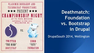
- 1. Deathmatch: Foundation vs. Bootstrap in Drupal DrupalSouth 2014, Wellington
- 2. ● Drupal consultant at Technocrat ● Drupal educator ● Mobile developer: iOS and Android ● Twitter: @VladimirAus @TESDev About me
- 4. I MEAN: Let’s install Drupal! ...and show it’s to potential client
- 5. Let’s install Drupal! Insert Bartik
- 6. Let’s install Drupal! Insert Bartik
- 8. ● Fluid grid ● Images that resize ● CSS3 media queries Responsive design
- 9. Responsive design: fluid grid
- 10. Images that resize ● client side? server side? JS decides! CSS3 media queries ● No JS, pure CSS Responsive design
- 11. ● DIY ● Packaged theme ● Responsive Framework Frontend approaches
- 12. HTML and CSS-based design templates for ● typography ● forms ● buttons ● navigation ● other interface components ● optional JavaScript extensions Responsive framework
- 13. ● This is frontend intermediate session! ● Not an endorsement ● I think both Frameworks are great ● Goal: no coding and inspiration! Disclaimer
- 14. ● Company behind: Twitter ● No.1 of Github ● Current Version 3: ○ 3.0: 19-Aug-2013 ○ 3.1: 30-Jan-2014 In the red corner: Bootstrap
- 15. ● License: MIT License ○ Apache License 2.0 prior to 3.0.1 ● Community! ● Website: http://getbootstrap.com ● Bootstrap Expo ● Components In the red corner: Bootstrap
- 16. In the red corner: Bootstrap
- 17. In the red corner: Bootstrap
- 18. In the red corner: Bootstrap
- 19. ● Company behind: Zurb ● No 10+ project on GitHub ● Current Version 5: 5.0: Nov-2013 5.1: 05-Feb-2014 In the blue corner: Foundation
- 20. ● License: MIT License ● Help ● Website: foundation.zurb.com ● Kitchen Sink ● Showcase In the blue corner: Foundation
- 21. In the left corner: Foundation
- 22. In the left corner: Foundation
- 23. In the left corner: Foundation
- 24. Components
- 27. ● Theme or library? ● Bootstrap library ○ https://drupal.org/project/bootstrap_library ● Themes! Installation
- 28. ● https://drupal.org/project/bootstrap ● Bootstrap 3 ● CDN or Local ○ Library is not bundled with theme ● Requires jQuery 1.7+ ○ jQuery_update module Bootstrap on Drupal
- 30. ● Subtheme ○ Copy starterkit ○ Rename info file ○ Update info file ● IE Compatibility ● Respond.js Bootstrap on Drupal
- 32. ● https://drupal.org/project/zurb-foundation ● Foundation 4!!! ● CDN or Local ○ Library is bundled ● Requires jQuery 1.7+ ○ jQuery_update Drupal module Foundation on Drupal
- 34. ● Does not support IE7 ○ downgrade to Foundation 2 ● Build subtheme ○ with drush ○ manually Foundation on Drupal
- 37. Visually?
- 39. Grid
- 40. ● 2 columns ○ Desktop: 8-4 ○ Tablet: 6-6 ○ Mobile: 12-12 (stacked) Grid: creating one
- 41. Carousel Round 3
- 42. ● Depends on libraries, dev branch of media, file_entity ● https://drupal.org/project/field_orbit ● http://foundation.d7ds. loc/admin/structure/types/manage/car ousel/display ● Foundation: ZURB Orbit
- 43. ● https://drupal. org/project/bootstrap_carousel ● Depends on library and juery_update Bootstrap Carousel
- 45. ● Supports Foundation 3 and 4 ● https://drupal. org/project/foundation_group ● http://foundation.zurb. com/docs/v/4.3.2 /components/section. html#panel3 ● requires field_group Foundation: ZURB Section
- 46. ● Supports Bootstrap 3 ● https://drupal. org/project/bootstrap_fieldgro up ● requires field_group Bootstrap fieldgroup
- 47. ● Responsive lightboxes ● https://drupal. org/project/zurb_clearing ● http://foundation.zurb. com/docs/components/clearing.html ● Depends on media 2.x-dev & File Entity ● Foundation 4 Foundation: ZURB Clearing
- 48. ● Need to highlight the differences between two images? ● https://drupal. org/project/zurb_twentytwenty ● http://zurb. com/playground/twentytwenty ● Foundation 4 Download pligin to sites/all/libraries/twentytwenty Foundation: Twenty-Twenty
- 49. ● Loads only one image for resolution ● https://drupal. org/project/zurb_interchange ● http://foundation.zurb. com/docs/components/interchange. html ● Uses media queries ● Foundation 4 ● Requires field_formatter_setting Foundation: ZURB Interchange
- 51. Views Round 5
- 52. ● Supports Bootstrap 2 and 3 ● https://drupal. org/project/views_bootstrap ● Supports ○ Grid ○ Tables (dev) ○ Thumbnail ○ Media object (dev) ○ Accordion ○ Carousel ○ Tabs Bootstrap: Views Bootstrap
- 53. Panels Round 6
- 54. ● https://drupal. org/project/panels_bootstrap_layouts ● Supports Bootstrap 1,2 & 3!!! Bootstrap: Panels Bootstrap Layout
- 55. ● https://drupal. org/project/panels_bootstrap_layout_ builder ● Supports Bootstrap 2 & 3 Bootstrap: Panels Bootstrap Layout Builder
- 56. ● https://drupal. org/project/panels_bootstrap_styles ● Supports Bootstrap 3 ● Currently Supported styles: ○ Panel ○ Jumbotron ○ Well ○ Alert (Pane only) Bootstrap: Panels Bootstrap Styles
- 58. ● https://drupal. org/project/twitter_bootstrap_modal ● Supports Bootstrap 3 ● Depends on jQuery AJAX Load ● https://drupal. org/project/jquery_ajax_load Bootstrap: Twitter Bootstrap Modal
- 61. Separate module for Bootstrap ● https://drupal.org/project/ds_bootstrap_layouts Foundation: Bootstrap
- 62. ● Built in into Foundation Foundation: Display suite
- 64. ● LESS is based on JavaScript ● You must use either a local LESS preprocessor or install and enable the LESS module - 7.x-3.0-rc1 or higher ● https://drupal.org/project/less Bootstrap: LESS
- 65. ● Requires Ruby ● Can use https://drupal.org/project/sass Foundation: SASS
- 66. Example
- 67. And the winner is... Results
- 68. ● Bootstrap looks solid ○ updated regularly ○ extra modules more stable ○ more examples than Foundation ● Foundation 5 was just released ○ 5 days ago ○ requires jQuery 1.10 (jQuery_update) Right now in Drupal...
- 69. What about Drupal 8? Dessert
- 70. ● Standalone framework + web services? Drupal 8
- 72. ● Bootstrap has way more elements than Foundation ● Bootstrap UI elements looks cooler UI elements
- 73. ● Bootstrap doesn’t have semicolons in JavaScript ● Coding standards Coding style
- 74. ● Bootstrap uses pixels, Foundation: em (4), rem (5) ● REM affects whole component, no cascading issues ● Use SASS mixin for conversion .element { width: rem-calc(10px); // will be converted to REMs } Measuring: px VS em
- 75. ● Bootstrap was designed mobile first for 4 platforms: mobile, tablet, desktop & large desktop ● Foundation was designed for any 4 screens Mobile first VS mobile also
- 76. ● Foundation: grid size depends on browser width ○ Adapts flexibly ● Bootstrap grids are predefined for main devices and sizes ○ Changes it's grid on breakpoint Grids
- 77. ● Bootstrap can be used without JS ● Fondation needs JS to start Start me up!
- 78. Questions? Twitter: @VladimirAus @TESDev LINKS Scripts and tools ● https://gist.github. com/VladimirAus/8900681 Slides ● https://drupalsouth2014.drupal.org. nz/sessions/frontend/foundation-vs- bootstrap-death-match-responsive- frameworks-drupal Thanks for attending!