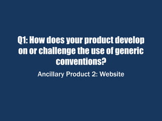
1. Q1: How does your product develop
on or challenge the use of generic
conventions?
Ancillary Product 2: Website
2. Analysis of Generic Conventions in existing websites
Example 2: http://www.insidious2-movie.net/site/
Film’s title in
largest text
displayed
clearly on
homepage.
Navigation bar
Social Media
sharing
capabilities
Production
company logo
Integration of
soundtrack
Extracts from film
loop on homepage
Red, black and
white colour
scheme.
Erratic
aesthetic
suggests
tampering and
malice within
the site.
To allow easy navigation
around the site’s different
pages.
To give the viewer the
opportunity to share the
film amongst their friends
and family to inspire hype
for the film.
To inform the viewer of
who produced the film.
Boosts interactivity with
site making it a more
immersive experience
whilst also portraying a
certain atmosphere.
Give a notion of what to expect from the film,
the use of this generic convention is somewhat
off brand as the norm is to have the trailer on
the homepage as it is the central piece of
marketing and often the main attraction to the
site.
Tagline
To summarise the film and
create a buzz around it.
Usually found next to the
film’s title/logo.
Synopsis Page
To condense the film down
to its key plot points and
let viewers understand
what the film offers in
terms of storyline. The use
of this convention in this
instance is abnormal as
the synopsis is not usually
found on the homepage.
‘Cast’ Page
To inform the viewers of
whos in the film as certain
actors can draw a large
audience in.
The official website for ‘Insidious Chapter 2’ is largely conventional in its layout making it easy to navigate. The site also has all the interactive features a site
needs to make it immersive and employs a colour scheme and aesthetic that clearly portrays the atmosphere of a supernatural Horror Movie.
3. Analysis of Generic Conventions in existing websites
Example 3: http://www.paranormalmovie.co.uk/#
Red, black and
white colour
scheme.
Erratic
aesthetic
suggests
tampering and
malice within
the site.
Film’s title in largest text displayed
clearly on homepage.
Navigation bar
Social Media
sharing
capabilities
Production
company logo
To allow easy navigation
around the site’s different
pages.
To give the viewer the
opportunity to share the
film amongst their friends
and family to inspire hype
for the film.
To inform the viewer of
who produced the film.
Synopsis Page
To condense the film down
to its key plot points and
let viewers understand
what the film offers in
terms of storyline.
The official website for ‘Paranormal Activity : The Ghost Dimension’ largely abides by the generic
conventions of Horror movie websites although it lacks interactivity, with no music nor moving image the
site differs from the status quo to its detriment.
4. Analysis of Generic Conventions in existing websites
Example 1: http://thewitch-movie.com/
Film’s title in
largest text
displayed
clearly on
homepage. Release date
Navigation bar
Social Media
sharing
capabilities
Production
company logo
Integration of
soundtrack
Extracts from film
loop on homepage
Informs the viewers of
when the film is to be
released. To allow easy navigation
around the site’s different
pages. Typically the
navigation bar would be at
the top of the site.
To give the viewer the
opportunity to share the
film amongst their friends
and family to inspire hype
for the film.
To inform the viewer of
who produced the film.
Boosts interactivity with
site making it a more
immersive experience
whilst also portraying a
certain atmosphere.
Give a notion of what to expect
from the film, the use of this
generic convention is
somewhat off brand as the
norm is to have the trailer on
the homepage as it is the
central piece of marketing and
often the main attraction to the
site.
Tagline
To summarise the film and
create a buzz around it.
Usually found next to the
film’s title/logo.
Synopsis Page
To condense the film down
to its key plot points and
let viewers understand
what the film offers in
terms of storyline.
The official website for ‘The Witch’ strays quite drastically from the status quo in its use of generic conventions. The layout
is unconventional and the whole aesthetic quite understated although its abundance of interactive features makes it
immersive as a site.
5. Generic conventions used on my website
http://hughestom22.wixsite.com/media
Film’s title in
largest text
displayed
clearly on
homepage.
Release date
Navigation bar
Social Media
sharing
capabilities
Production
company logo
Integration of
soundtrack
Informs the viewers of
when the film is to be
released.
To allow easy navigation
around the site’s different
pages. Typically the
navigation bar would be at
the top of the site.
To give the viewer the
opportunity to share the
film amongst their friends
and family to inspire hype
for the film.
To inform the viewer of
who produced the film.
Boosts interactivity with
site making it a more
immersive experience
whilst also portraying a
certain atmosphere.
Synopsis Page
To condense the film down
to its key plot points and
let viewers understand
what the film offers in
terms of storyline.
Red, black and
white colour
scheme.
Erratic
aesthetic
suggests
tampering and
malice within
the site.
Trailer
integrated into
homepage
To allow the viewer to see
the best bits of the film
instantly upon first viewing
the site.
Overall my site largely conforms to the generic conventions of horror movie websites. I compiled the
bloodied and dirty aesthetic to suggest gritty violence. I organised the individual aspects of my site in the
generic fashion to ensure the user is familiar with the layout and can navigate it easily which I believe
makes for greater immersion within the site, furthering the interactivity between the user and the site.