App Home Screen Card Study
•
0 gostou•95 visualizações

This document summarizes the findings of a usability study conducted for the Dick's Sporting Goods mobile app home screen. 50 users tested the app, providing feedback on cards they would want on the home screen and how they would arrange them. Users generally preferred the Offers, Weekly Ad, and MOVE cards. They also suggested additional cards like order history and product recommendations. Users rated the prototype design highly and felt it matched Dick's brand well, though some pages could be simplified. Minor issues included confusion over account/rewards setup and multiple store location pages.

Recomendados
Recomendados
Mais conteúdo relacionado
Semelhante a App Home Screen Card Study
Semelhante a App Home Screen Card Study (20)
Mais de Tim Broadwater
Mais de Tim Broadwater (20)
Último
Último (8)
App Home Screen Card Study
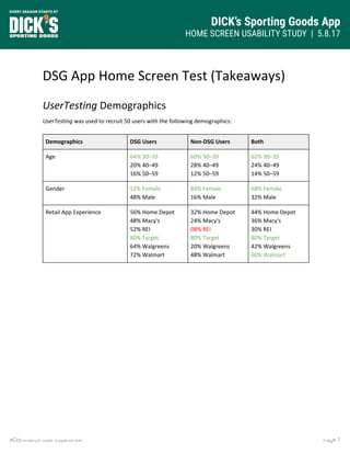
- 1. DICK’s Sporting Goods App HOME SCREEN USABILITY STUDY | 5.8.17 Page 1eCommerce User Experience DSG App Home Screen Test (Takeaways) UserTesting Demographics UserTesting was used to recruit 50 users with the following demographics: Demographics DSG Users Non-DSG Users Both Age 64% 30–39 20% 40–49 16% 50–59 60% 30–39 28% 40–49 12% 50–59 62% 30–39 24% 40–49 14% 50–59 Gender 52% Female 48% Male 84% Female 16% Male 68% Female 32% Male Retail App Experience 56% Home Depot 48% Macy's 52% REI 80% Target 64% Walgreens 72% Walmart 32% Home Depot 24% Macy's 08% REI 80% Target 20% Walgreens 48% Walmart 44% Home Depot 36% Macy's 30% REI 80% Target 42% Walgreens 60% Walmart
- 2. DICK’s Sporting Goods App HOME SCREEN USABILITY STUDY | 5.8.17 Page 2eCommerce User Experience Card Selection Imagine that you have opened the Dick's Sporting Goods smartphone app, and you had the ability to choose any of the following cards to appear in the app's' home screen. Select which of the following cards you would choose. + Popularity - Don’t Want Home Screen Card DSG Users Non-DSG Users Both Credit Cards 19.23% 16.67% 17.95% Gift Cards 15.38% 4.17% 9.78% Message 7.69% 20.83% 14.26% MOVE 38.46% 29.17% 33.82% Offers 57.69% 62.50% 60.10% My Store 30.77% 29.17% 29.97% My Wallet 46.15% 45.83% 45.99% Recommended for You 50.00% 33.33% 41.67% ScoreCard 53.85% 45.83% 49.84% The Shoe Shop 50.00% 41.67% 45.84% Twitter 7.69% 0.00% 3.85% Weekly Ad 50.00% 50.00% 50.00%
- 3. DICK’s Sporting Goods App HOME SCREEN USABILITY STUDY | 5.8.17 Page 3eCommerce User Experience Card Ranking These are the cards that you have selected to appear on your app home screen. Now drag-and-drop each card to arrange the order as you would want to see them in your app. Top Card 2nd Card 3rd Card * Home Screen Card DSG Non DSG Non DSG Non Credit Cards 0% 50% 0% 25% 40% 0% Gift Cards 0% 0% 25% 100% 50% 0% Message 0% 0% 0% 0% 50% 0% MOVE 30% 29% 10% 43% 20% 14% Offers 40% 20% 27% 33% 13% 20% My Store 0% 0% 38% 29% 13% 0% My Wallet 33% 36% 8% 9% 17% 27% Recommended for You 0% 0% 31% 0% 31% 63% ScoreCard 21% 27% 43% 18% 29% 27% The Shoe Shop 54% 80% 15% 20% 8% 0% Twitter 0% 0% 0% 0% 50% 0% Weekly Ad 23% 17% 31% 42% 23% 25% * The above chart displays the name of each answer option, the percentage of respondents who assigned the option, and callouts for options that have a clear standout.
- 4. DICK’s Sporting Goods App HOME SCREEN USABILITY STUDY | 5.8.17 Page 4eCommerce User Experience Card Follow-Up Questions Ranking Question DSG Users Non-DSG Users Rank the enjoyment of ordering cards on home screen by clicking and dragging each bar. * 028% Minimum 079% Mean 100% Maximum 005% Minimum 071% Mean 100% Maximum Rank the usefulness of ordering cards on home screen by clicking and dragging each bar. * 047% Minimum 088% Mean 100% Maximum 010% Minimum 083% Mean 100% Maximum Would you expect that you could adjust the order of the cards on the app home screen at any time? 65.38% Yes 30.77% Maybe 03.85% No 66.67% Yes 12.50% Maybe 20.83% No * Users could assign percentages from 0% to 100%, and the numbers reflect the mean.
- 5. DICK’s Sporting Goods App HOME SCREEN USABILITY STUDY | 5.8.17 Page 5eCommerce User Experience Qualitative Question Sample Are there any other cards for your Dick's Sporting Goods app home screen that we didn't think of, or that you would like to see? Please write your response below. DSG Users ● “Order history, order status.” ● “To have like a sports season card. So soccer season card that i can click on and it will open all that stuff. It would change for the sport seasons Tball, football, lacrosse.” ● “Recent orders may be helpful - perhaps I want to initiate a return or check the status of an order.” ● “I would probably like to see game schedule & scores especially for the teams I choose on the app to make it more personalized.” ● “Previous Purchases.” ● “Deals by sport, so I could see what sales or deals you have by sport. I am usually there for something specific so it would be nice to be able to browse deals by sports or category.” ● “Status of any orders or shipments I am expecting from Dick's.” ● “I think you should add a card where I can customize my shopping according to gender, specially when it comes to sports wear. I would like to see everything that is related to women's apparel. That's something to consider.“ ● “Coupons for percentages off my order and possibly a rewards section.” ● “Settings to be able to quickly make email changes or general account personal information.” ● “Reviews of new/interesting products, or maybe product demos.” Non-DSG Users ● “Recent Purchases.” ● “Local sports events and leagues that I could possibly become involved with.” ● “The only card missing is "my account" or "history" or "order tracking." If I could easily track my orders or the shipping, that would be super convenient.I would appreciate being able to check an order's status, and especially track the shipping from the app.” ● “I think a "recent orders" skinny style banner up at the top of the home screen would be a great addition! I like to check up frequently on my purchases and shipments. Having this on the home screen would allow for quick access to that!” ● "Prior purchases - to reorder, check warranties, return policies.” ● “Current orders - check for arrival, shipping." ● “I would like to see a card for my profile. From there I can navigate to my account, my wallet and MOVE. These things could be included in my profile for me to click on.” ● “Your sport - items and offers related to the sport you like or the sports yours kids are playing. (maybe this is more recommended for you).” ● “Last purchase.” ● “Purchase history.”
- 6. DICK’s Sporting Goods App HOME SCREEN USABILITY STUDY | 5.8.17 Page 6eCommerce User Experience Prototype Questions Ranking Question DSG Users Non-DSG Users Does the prototype feel like it’s “on brand” for Dick’s Sporting Goods? 100% Yes 100% Yes Please rate the overall design of the prototype. 4.68 / 5.00 4.68 / 5.00 Please rate the overall flow and ease of use of the prototype. 4.68 / 5.00 4.68 / 5.00 Qualitative Question Sample What are your overall thoughts of the like look and feel of the prototype’s design? Write your response below. DSG Users ● “I think there is a little too much content on the app. I like the overall look of the app, and the feel of it as well. Although I feel as if there should be less content for people who may be overwhelmed.” ● “I found the design engaging. I wanted to click on various tabs to find more details about it. I only thing that was off was there was too much of green shades. I know green is the main color but different color elements can be added to make the site more visually appealing.” Non-DSG Users ● “Clean and clear. No real wow factor, but very nice, good use of white space, easy to scan and read all the info.” ● “It's very boxy, there are a few pages that stand out that don't fit with the rest of the app (maps, move section), I rather enjoy the look and feel. It isn't groundbreaking but it looks and feels like other apps I have used before which makes it comfortable and easy to use.” ● “I feel the overall design is a bit overkill. I like a more simplified app and some of these pages are repetitive. Those pages can be included in other pages on the app and therefore simplify the shopping process. I like the pictures and I do like how on the shop page the offers for different items are displayed.”
- 7. DICK’s Sporting Goods App HOME SCREEN USABILITY STUDY | 5.8.17 Page 7eCommerce User Experience Did you find anything confusing? Were there any pain points? DSG User ● “I do wish the the My Store card was above the weekly deals but other than that I didn't find anything confusing or difficult to use." ● “1) details on what sending the my mobile (SMS) does would be helpful 2) overall description of the purpose of this screen 3) notes on how to change my picks if I don't like them after using them for a while 4) when will these changes become active on my smartphone." ● “The only complaint I have is the amount of information I have to scroll through. The only thing was the Fitbit Move Daily Activity. I guess that's nice for some users, but to me it felt out of place on the homescreen and kind of forced.” Non-DSG Users ● “I was a bit confused with the offers section. Is there a general offers section and a ‘personal’ or ‘my offers’ section?” ● “Easier way to contact with issues, view and pay bill and learn about the rewards points on the front page.” ● “The only thing slightly confusing was whether I need to create a main account and then a separate rewards account-the sign-in pages appeared different. i would only want to have to create one account and that would be good for everything.” ● “Lack of a drop down menu, but that may be due to the fact that this is a prototype.” ● “I was a bit confused as to why there are two pages giving the location of the store and directions. These should be all on one page. It is also confusing to have so many areas for shopping instead of simplifying it. For instance, there could be one filter for youth and then you can see the baseball clothing and shoes within that filter instead of having another filter for just baseball. Less is more--it saves time by not having to click around so much.”